Anatomy
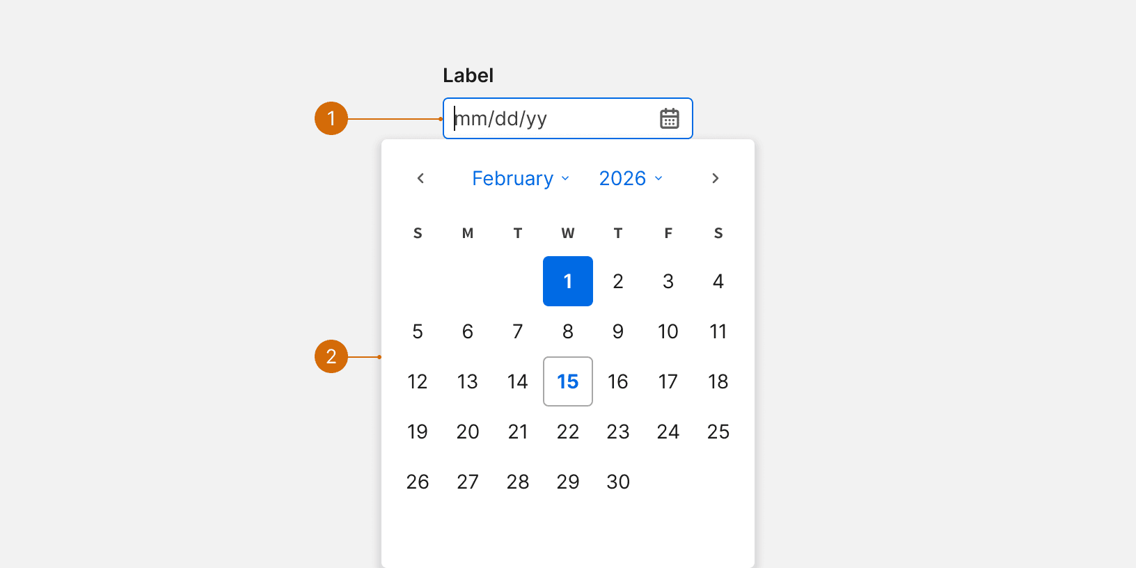
Input
Calendar
Variants
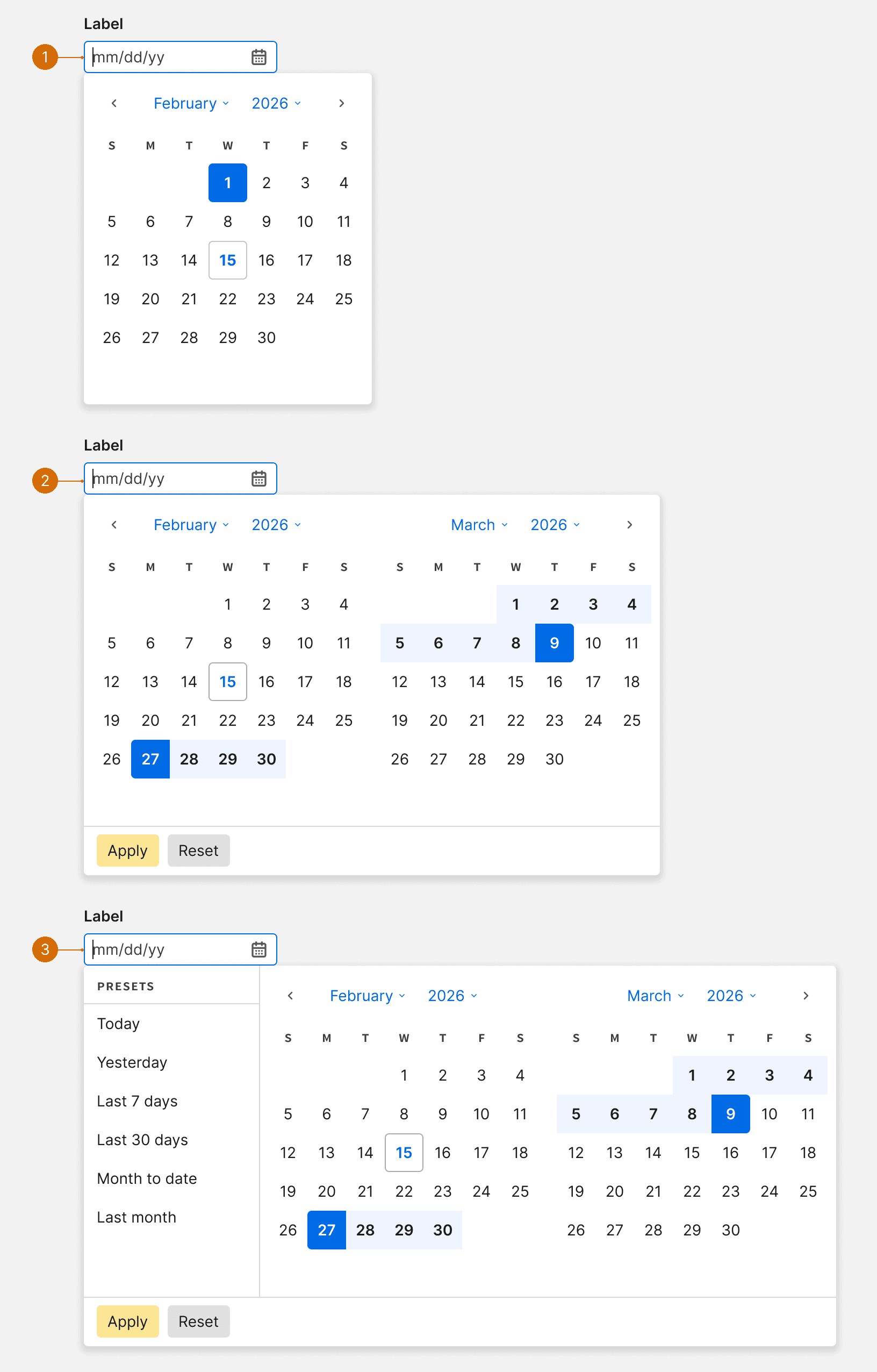
Default
Range
Range with Presets
States
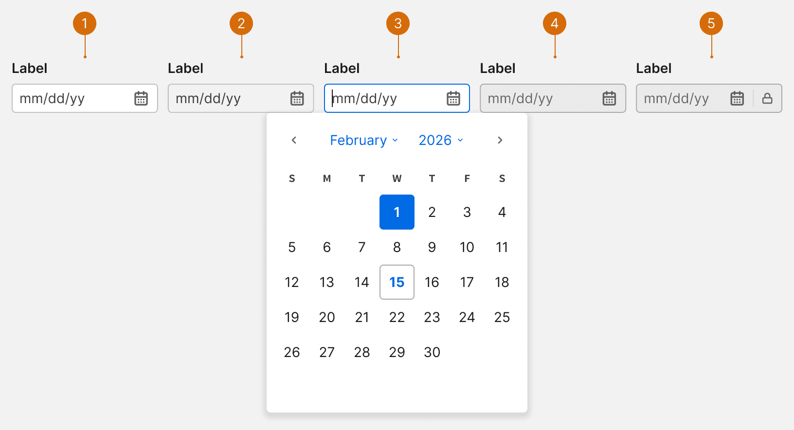
Default
Hover
Focus
Disabled
Locked
Error and Warning
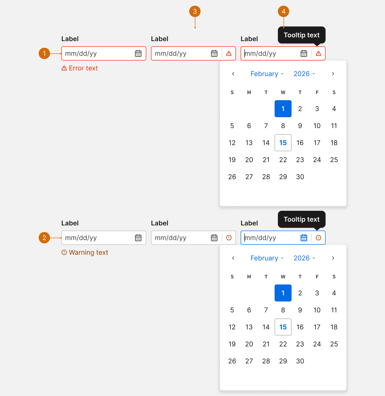
Error: Helps users identify and fix critical issues.
Warning: Alerts users to potential issues that don't block the workflow
Tooltip: Use when space is limited and text cannot be displayed below the input
Tooltip Focus: Displayed error or warning message
Behaviors
Auto Formatting
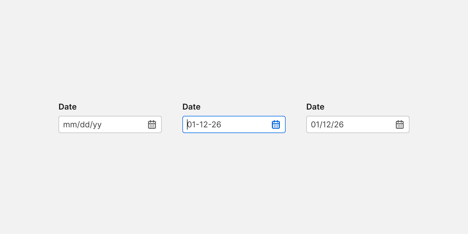
If a date is entered using alternate separators, the date will be auto formatted to use "/" instead.
Best Practices
Default Month
Date picker should default to the month of the current selection. Setting random values for the user will introduce extra work and increase the interaction cost.
Dismissal
When selecting a single day, the Calendar should automatically disappear once a date is selected.
Illogical Date Options
Date picker should eliminate illogical date options to reduce human error. For instance, the date picker should not allow users to enter a campaign end date before the start date.

Do
Typing
Allow user to type the date. Typing the date is the most basic option for date input, especially when the date is further away in the past. It is the most effective way to allow users to type the date.
More
Related Pages


Additional Reading
Date-Input Form Fields: UX Design Guidelines https://www.nngroup.com/articles/date-input/
Date Picker Design Best Practices https://uxplanet.org/date-picker-design-best-practices-41bd522f10a5
Designing The Perfect Date And Time Picker https://www.smashingmagazine.com/2017/07/designing-perfect-date-time-picker/
Tips and tricks to design better date pickers https://ergomania-ux.medium.com/tips-and-tricks-to-design-better-date-pickers-98c57fab3bdc