Content
1
Short
Headers should be short and descriptive. Column labels should clearly describe the item or data presented.
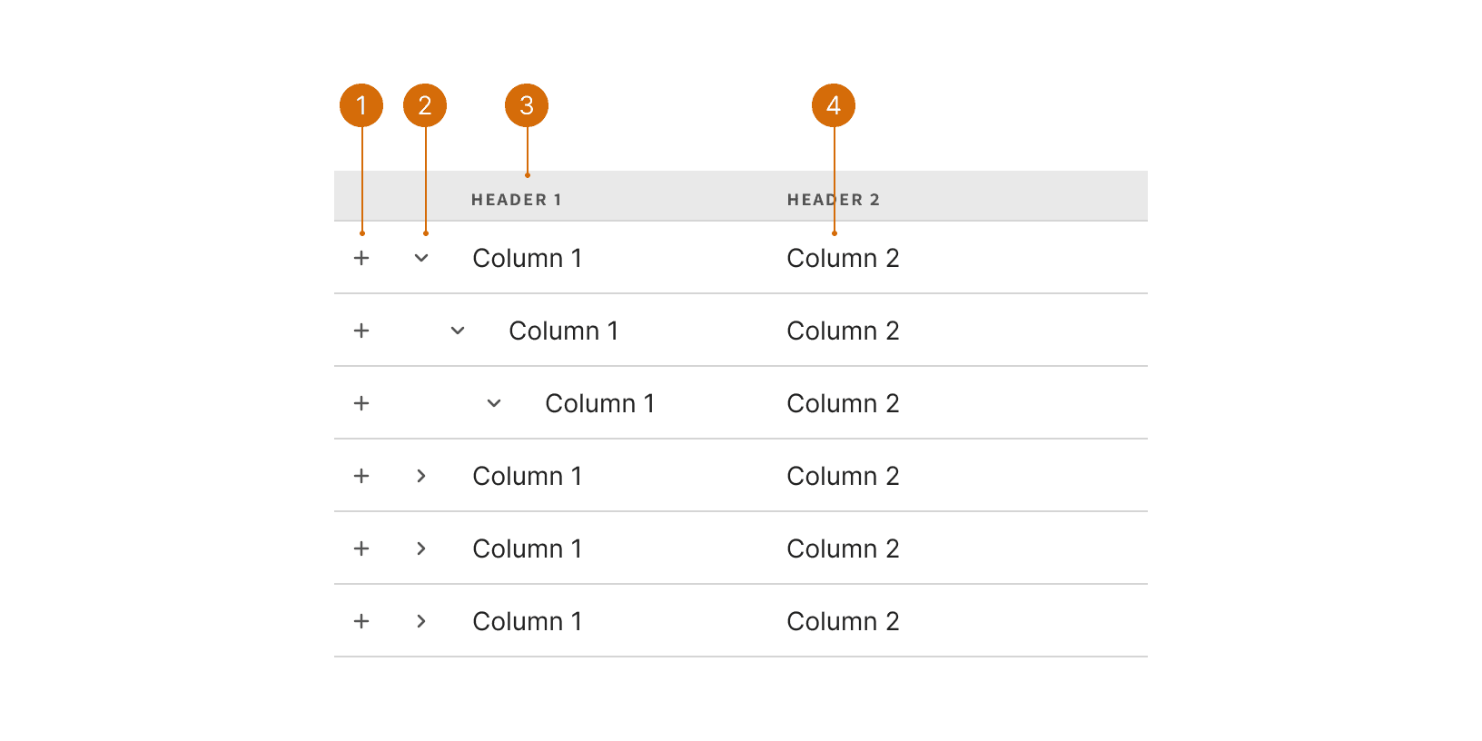
Row Selector
Column Header
Expand / Collapse
Cell
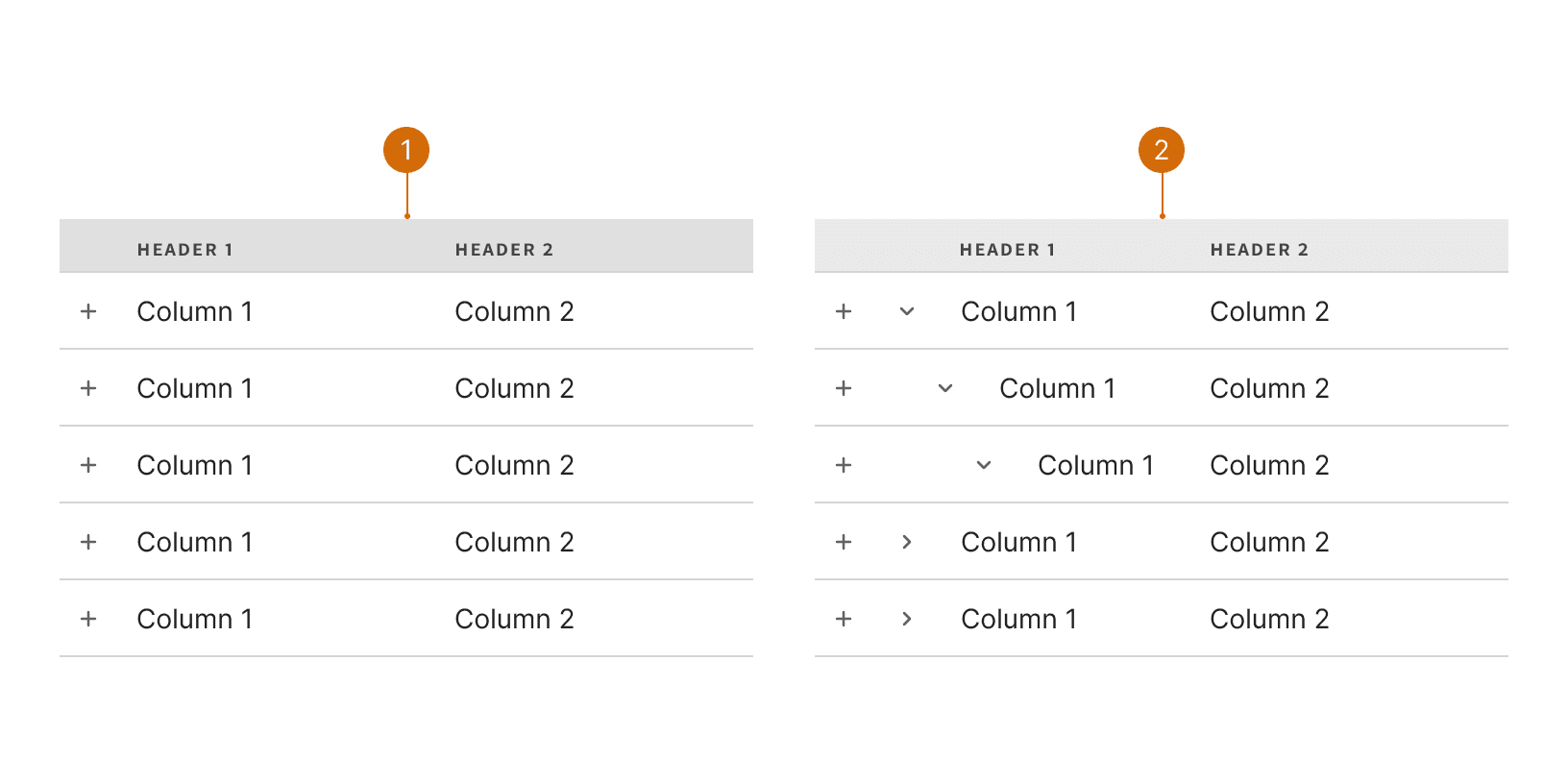
Parent Child
Select
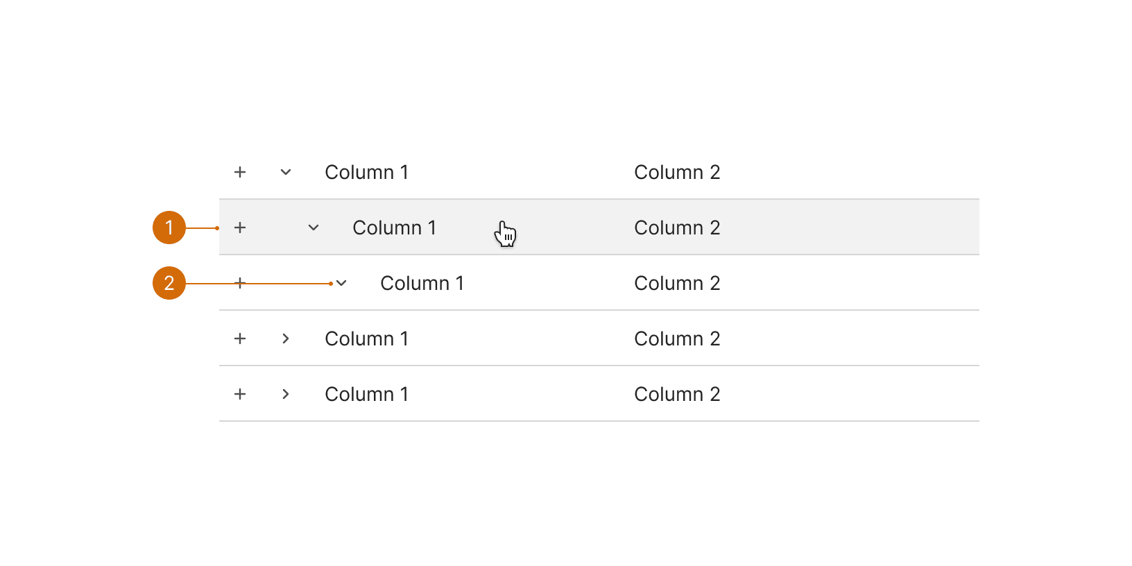
Row Hover
Row Expanded
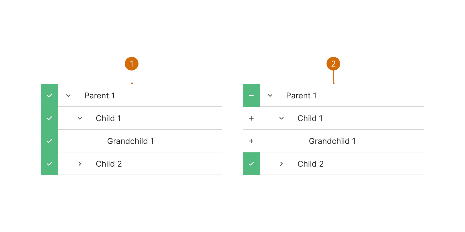
When a row is selected at the parent level, the children and grand children become selected as well
When not all of the children rows are selected, the parent row selector will use the intermediate state
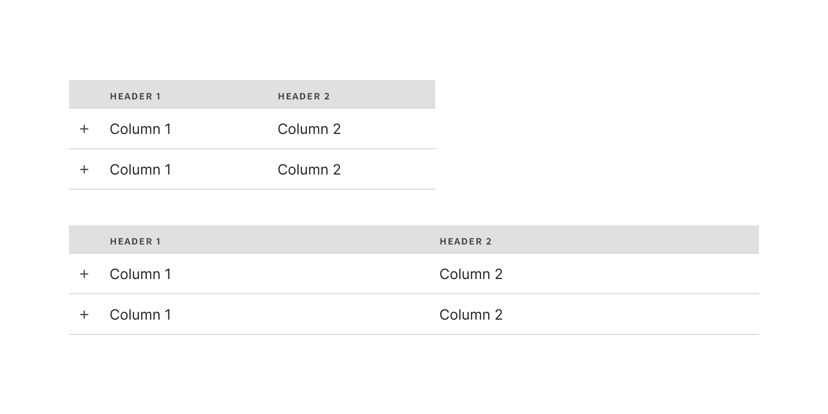
Columns will grow to fill the available horizontal space.
The Tree Selector should be used to pick from a list that contains a hierarchy. Don't use the Tree Selector component for lists that have no hierarchy. Use a normal list with the Row Selector elements instead.
Do not display expand control at the bottom level. If there is no child to further expand, then no control should be present.

Do

Don't
Some rows may not be selectable, but all data of the hierarchy should be shown. It is still valuable to show child data rows even if they are not selectable. It allows the user to parent child relationships and inform decisions.
Headers should be short and descriptive. Column labels should clearly describe the item or data presented.
Tree View. A tree view widget presents a hierarchical list. https://material-ui.com/components/tree-view/
Lists. Lists are continuous, vertical indexes of text or images. https://material.io/components/lists

