
Icon
Message Text
Dismiss Control

Info: Use to give a non-critical or general information or instruction.
Confirm: Use to indicate a successful, completed, or desirable state when it’s important to provide positive reinforcement to the user.
Warning: Use to provide status updates that the user should watch. A warning message may require the user’s attention and potential action.
Alert: Use to communicate an error, decline, failure, removal or critical state that requires user attention.

Default
Hover
1. Links
Message card may contain a single navigation link. This can be used to direct the user to additional resources or to another area of the application.

2. Dismissible
The "Dismissible" property gives the user the ability to remove the message card. When the message card is removed, the other elements and parent container should adjust to fill the space. Message cards should be dismissible unless they contain critical information or an important step users need to take.

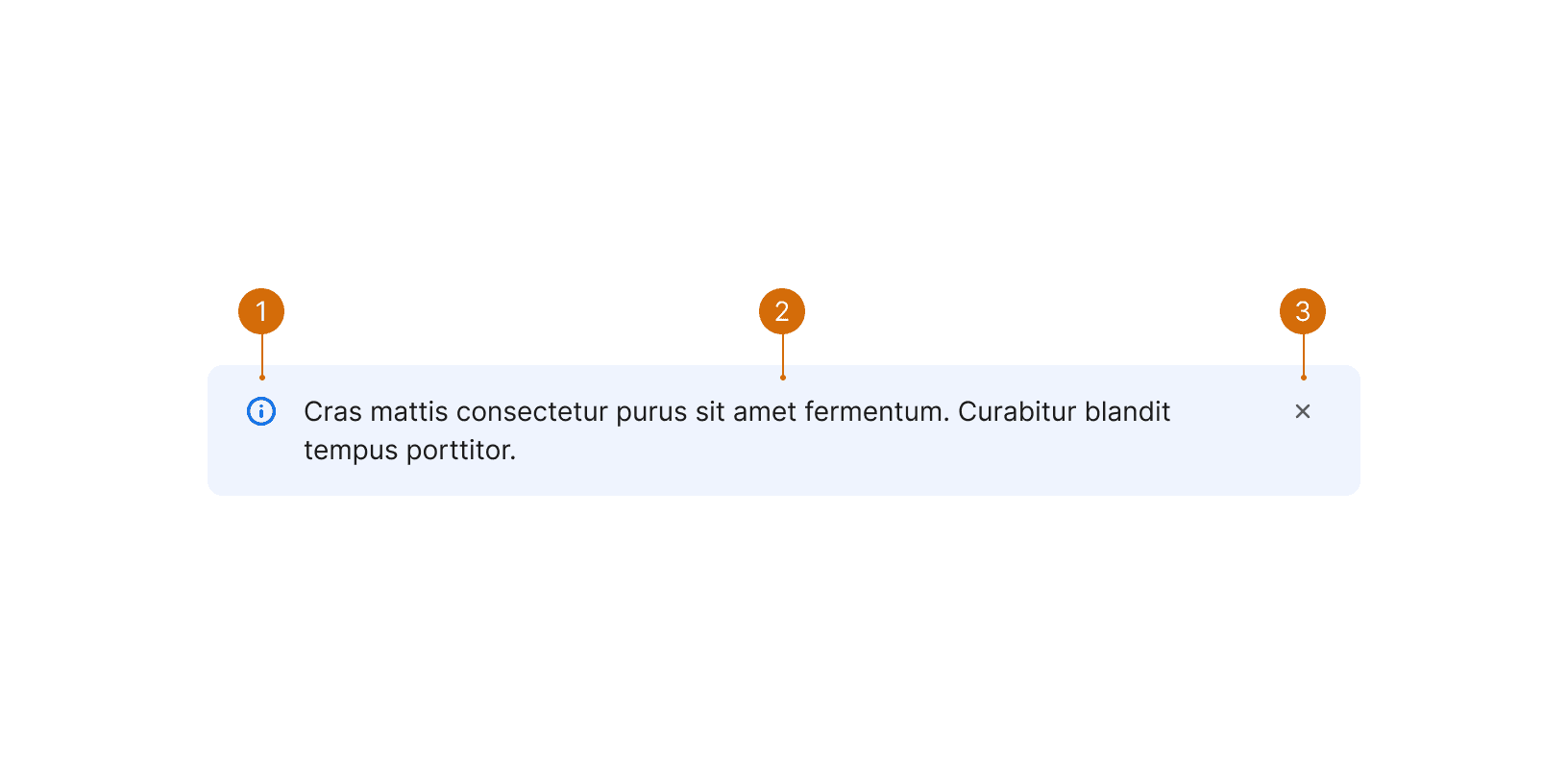
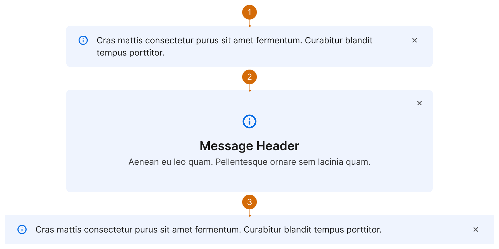
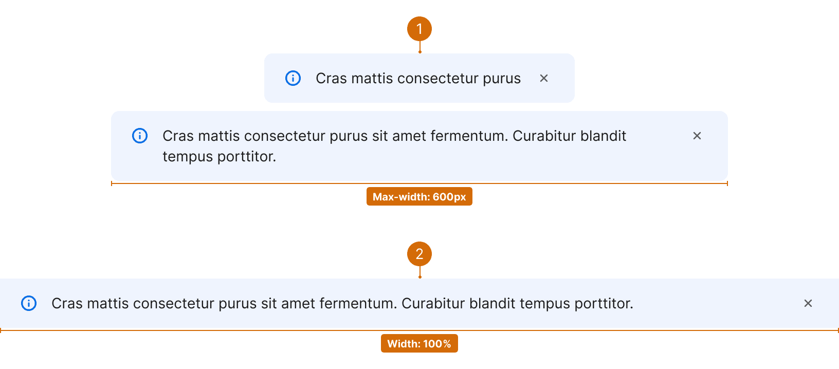
Keep the information in message cards brief and to-the-point--one or two short sentences maximum in most cases. Include a single navigation link if necessary. For links to the help center, write them as “See [page title].”
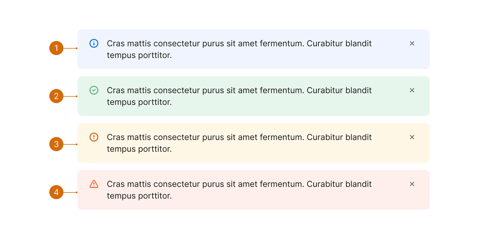
See Error Handling for warning and alert message guidelines.

Related Components
Additional Reading
Cards: UI-Component Definition https://www.nngroup.com/articles/cards-component/