


Content
Types
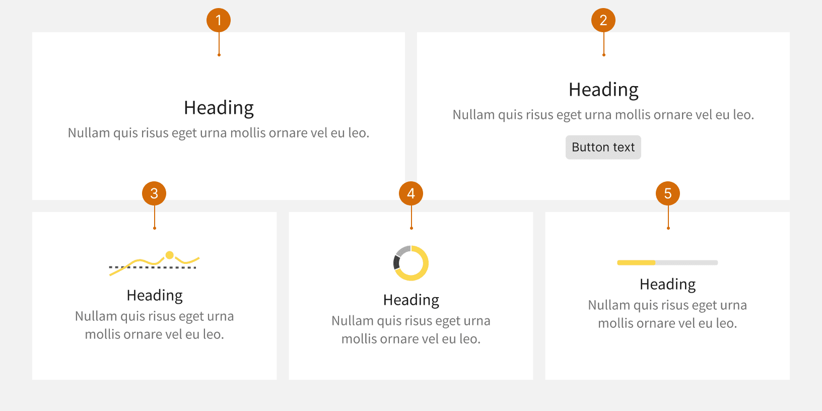
Empty states consist of a header, a message, or both. There are different types of empty states:
First touch, initial state, or “getting started” empty states are displayed when the user accesses a feature for the first time and it has no content
No search results
No data
All done / Success
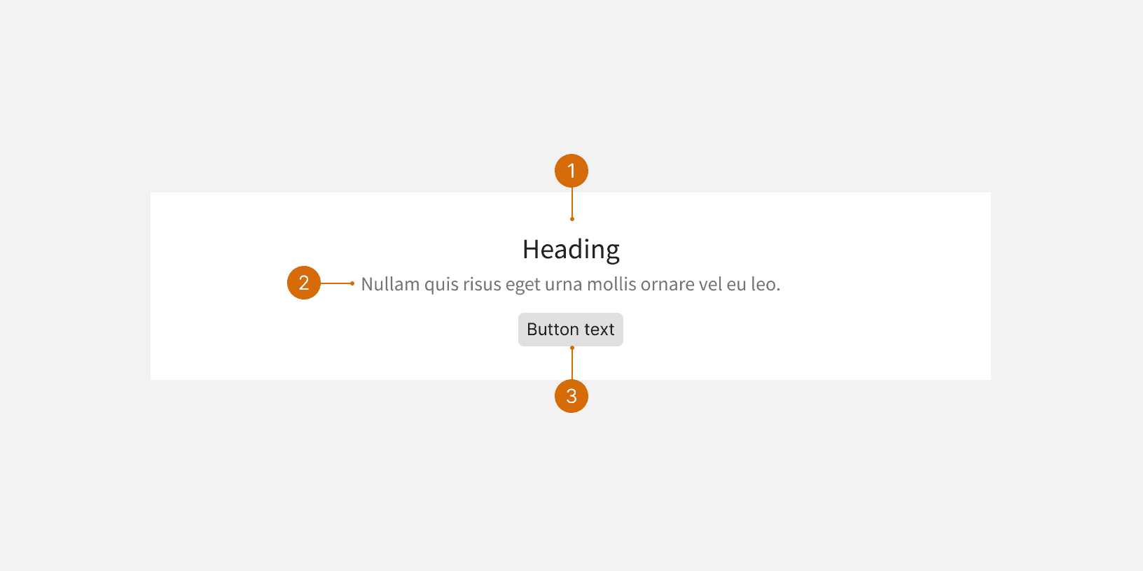
Header
The header should succinctly describe why there is no content.¹ It should be short, clear, and scannable, containing the most important info that the user needs to know. It should be able to stand on its own without an additional message, especially if there isn't an actionable next step.
Do
No campaigns
No Properties
Don't
Nothing to see here!
No properties found for this vendor
Message
The message can provide instructions or elaborate on why the user is seeing the empty state. If the user needs to take an action, the message should provide guidance. Use a header and a message together when more detail and clarity is needed.
Do
Create a new campaign or adjust the filters.
Select "Create campaign" or adjust the filters.
Select "Add property" to get started.
Don't
There aren't any campaigns.
Select Create campaign above to get started.
Select Add properties to add properties for this vendor.
Button
If there is a button that the user should select, include it under the empty state if possible. Otherwise, include explicit instructions in the message. Put quotation marks around the button label. Don't say "above" or "below" to help the user locate the button.
Sentence case
Use sentence case. For the message text, use punctuation when necessary and include a period at the end. Headers never have punctuation. Only use title case for proper nouns, referring to other items on the page, or for acronyms. Put quotations around words that refer to buttons or links on the page.²