

Content
1
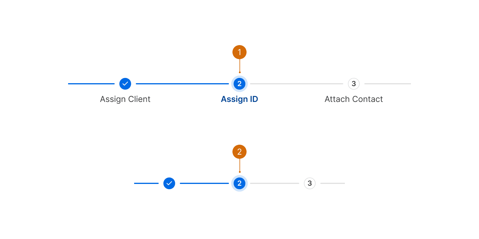
Labels
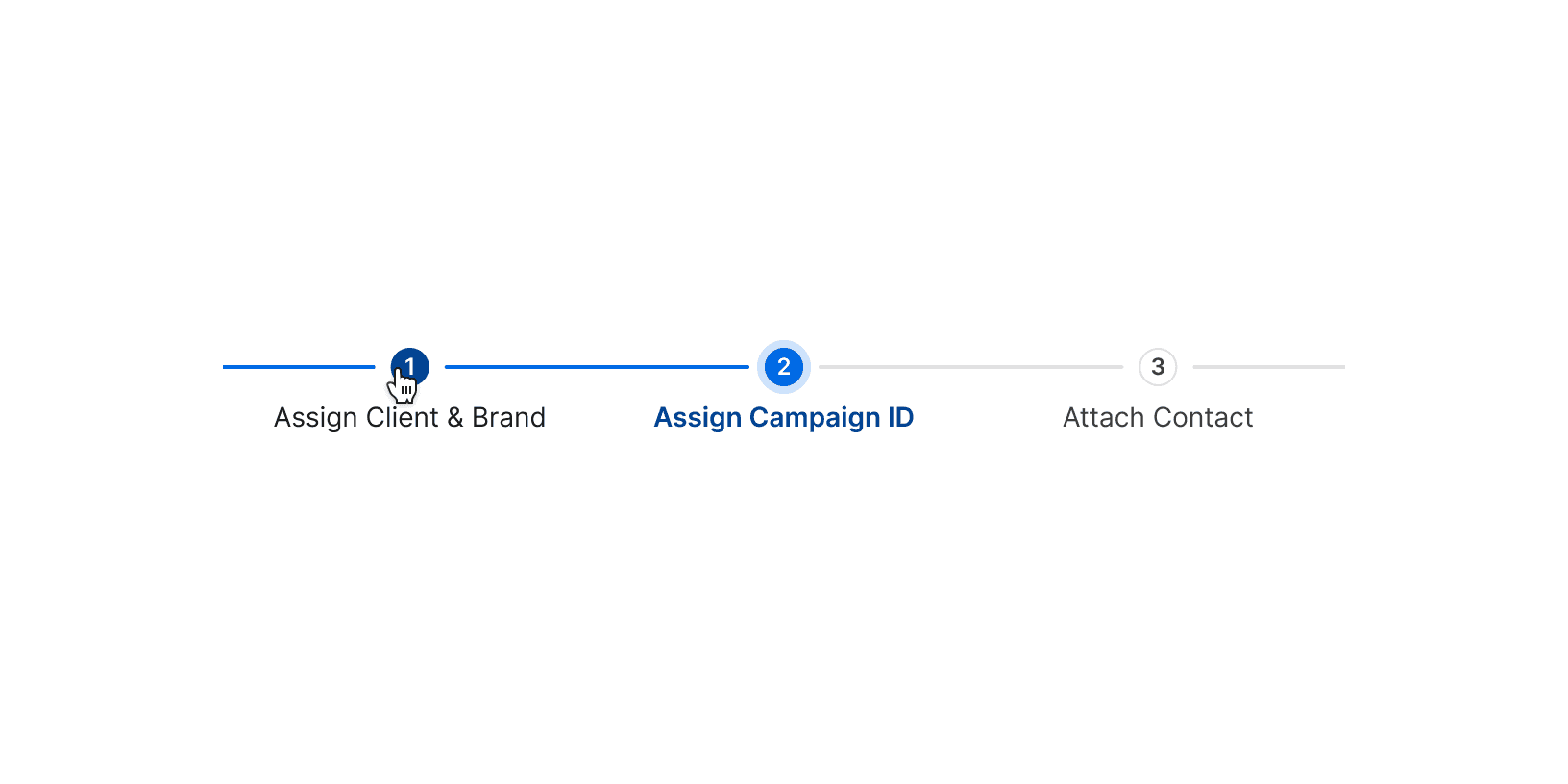
Use descriptive labels that clearly indicate what actions or options the user can expect at each step of the process. Keep labels short--two or three words maximum in most cases. Use title cases without periods, commas, or other unnecessary punctuation.

Do

Don't
2
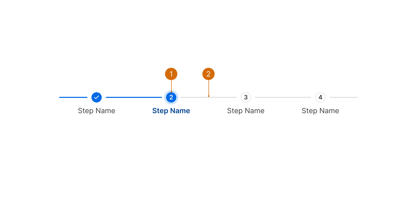
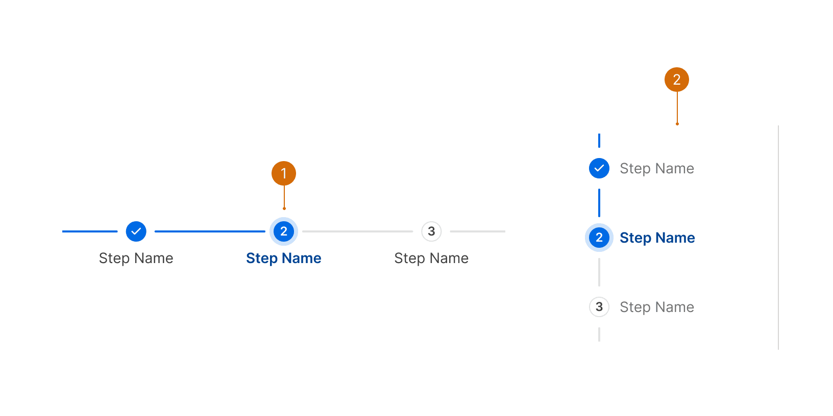
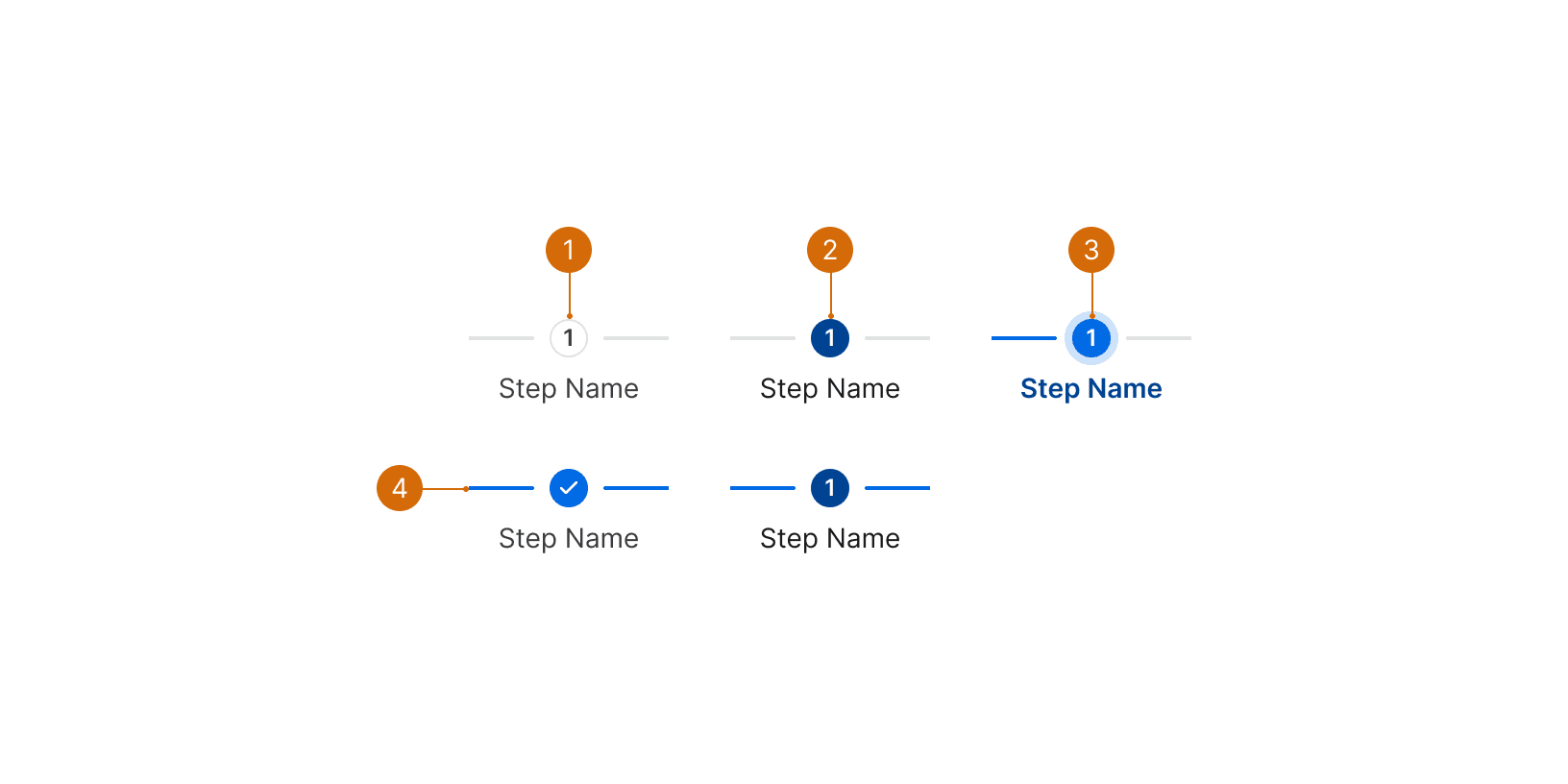
Order
Display steps in a logical order from left to right (or up to down).

Do

Don't
