


Content
Information modals
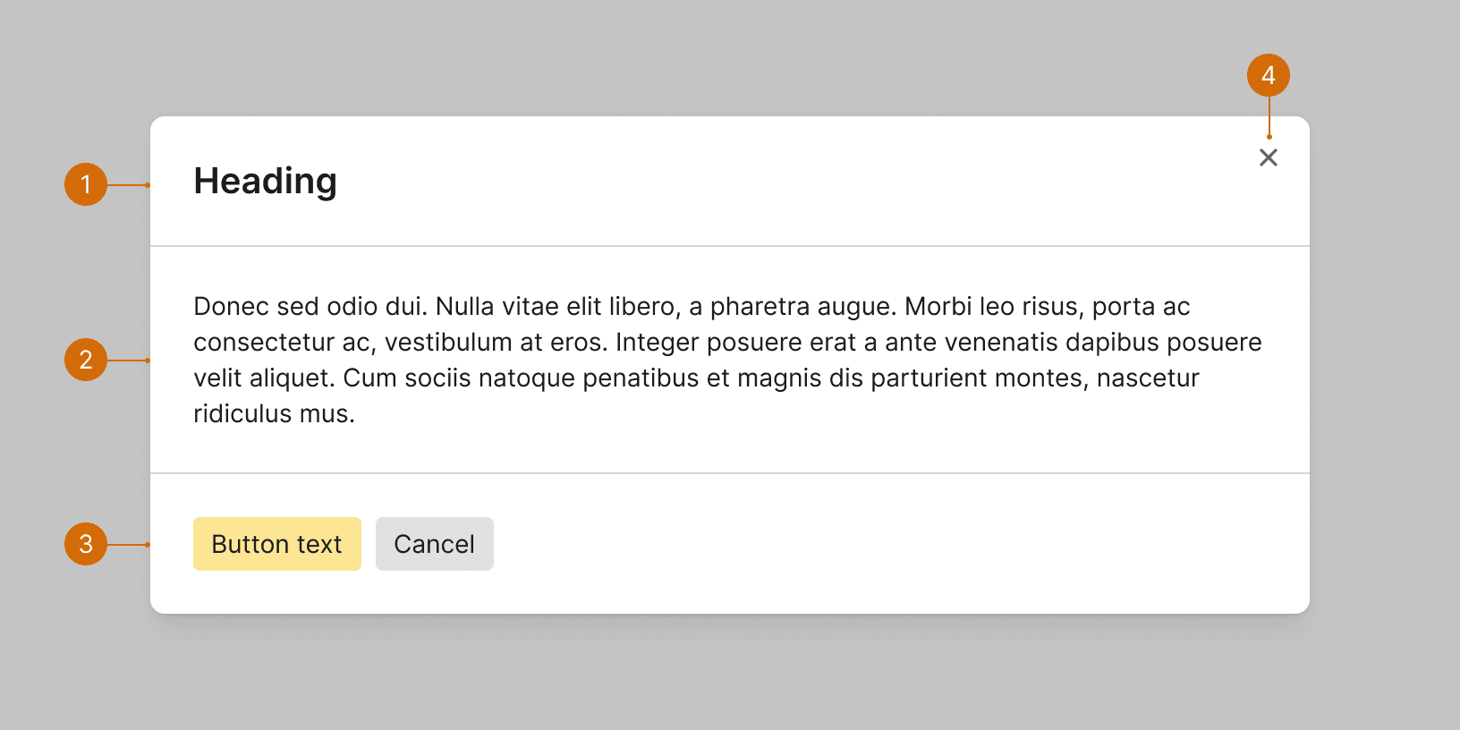
Information modals contain a lot of information or very complex information. Examples of information modals would be lists of reports, a user’s contact information, or deal details. These modals don’t require user action, though there can be buttons that allow the user to do something, such as Edit. They can also include a button that allows the user to exit, which should be labelled Close.
Information modal headers
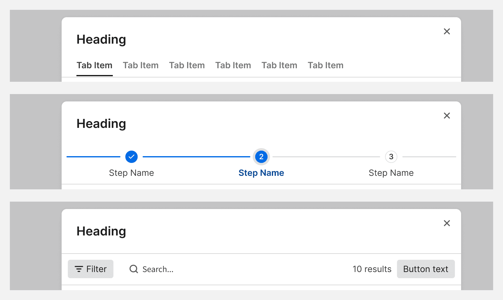
Information modals can include super headers. The super header indicates the type or category of the item that the user is looking at. For example, Property, Vendor, or Contact. The main heading for these types of modals should be the name of the selected item itself, so the super header provides a general description of the modal.

Do
Task modals
Task modals should be used for complex tasks with multiple inputs. The heading conveys the purpose of the modal and the action that users can expect to take. It should align with the button, but it doesn't have to be identical. Keep the heading as short as possible while clearly describing the modal. In general, these types of modals do not require super headers.
For confirmation modals, the heading should take the form of a question. See Confirmation Messages.
The button should allow the user to complete the action, confirm their choices, or acknowledge their understanding of the modal’s content. The button label should align with the action described in the modal header.


