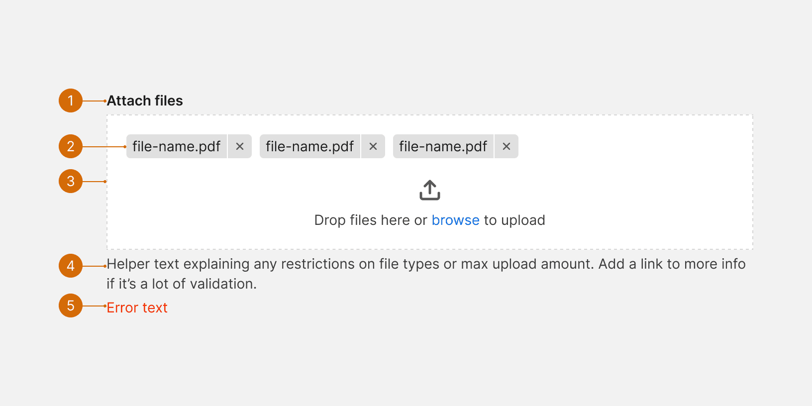
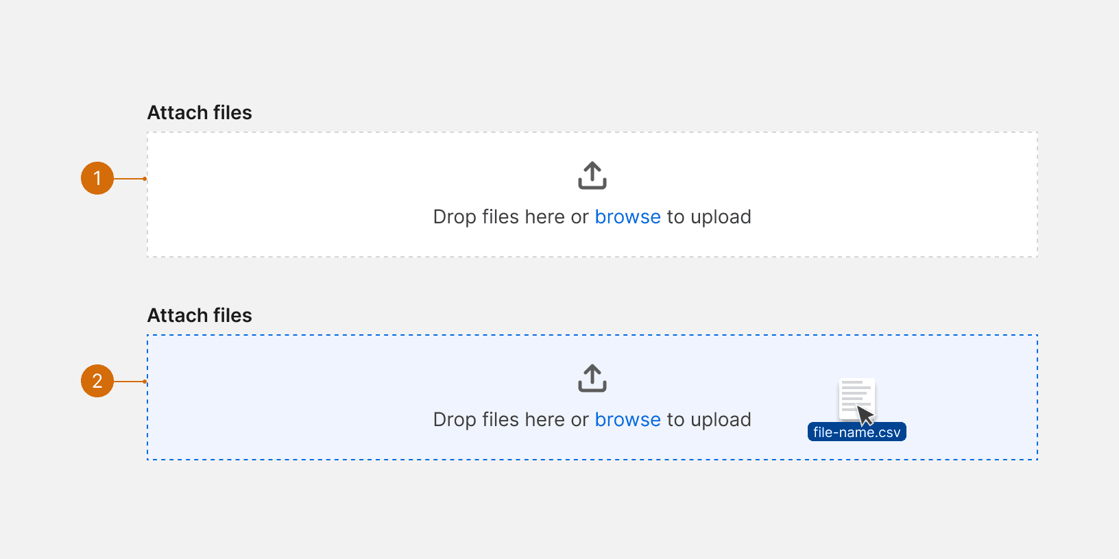
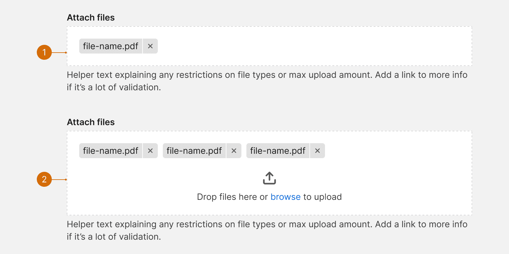
Label
File Drop Inout
Help Text
Error Text
Attachments

Default
Input Hover

Single File: If the file drop is configured to allow a single file, the file will be displayed in the input and the icon and text will become hidden.
Multiple Files: If the file drop is configure to allow multiple files, the files will be displayed at the top of the inputs and the icon and text will remain below.
1. Context
Provide context for user. Typically this is through a form label or instructional text to let the user know why they may want or need to upload / import a file into the application.

2. Options
Give users options when uploading or attaching files. Allow users to either drag and drop or browse their computer for the file. This give the user flexibility on how to attach files, as well as help with accessibility.

3. Help Text
Indicate file types and max file size allowed. Then a user will know what files can or cannot be uploaded before receiving an error message.¹

4. Errors
If the file fails to pass the defined validation, and error message should be displayed. This message should specify which file failed to upload and why it did not pass the validation.

Related Components
Additional Reading
Scacca, Suzzane. "Designing an Attractive and Usable Data Importer for Your App" Smashing Magazine, Dec 2, 2020
"How 'Drag-AndDrop' Movements Affect Web Accessibility" Bureau of Internet Accessibility, Sept 10, 2021
Laubheimer, Paul. "Drag-and-Drop: How to Design for Ease of Use" Nielson Norman Group, February 23, 2020
Maxey, Ty. "Drag & Drop" Medium, Jan 14, 2020