
Label
Input
Help Text
Error Text

Default
Text Area
Read Only
Inline

Default
Hover
Focus
Disabled
Locked
Error and Warning

Error: Helps users identify and fix critical issues.
Warning: Alerts users to potential issues that don't block the workflow
Tooltip: Use when space is limited and text cannot be displayed below the input
Tooltip Focus: Displayed error or warning message
Text Overflow

Default: Single line form inputs will overflow additional text horizontally within the field. The user can use the keyboard or scroll horizontally to view the hidden text.
Text Area: Text areas allow multiple lines of text by wrapping the text. If the text exceeds the max-height of the field, then the user may use the keyboard or scroll vertically to view the hidden text.
1. Label
Form inputs should always include a label. ²

2. Errors
If there is a validation error, text explaining the error should be displayed. ³

3. Placeholder Text
Placeholder text can be used to provide helpful hints or to demonstrate the format to use. It should not include critical information and should not be used as a replacement for a label. ²

4. Sizing
The Input size should support expected user input. ¹ Using equally size form inputs may look clean but this can constrain the input area and make it harder to fill out.³

5. Error with Tooltip
For situations where limited space prevents displaying a clear error message, use the tooltip error state. However, remember that tooltips are less accessible than visible text, so use them sparingly.

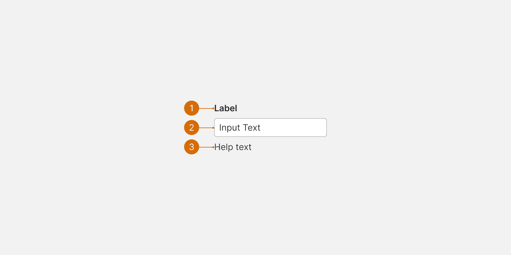
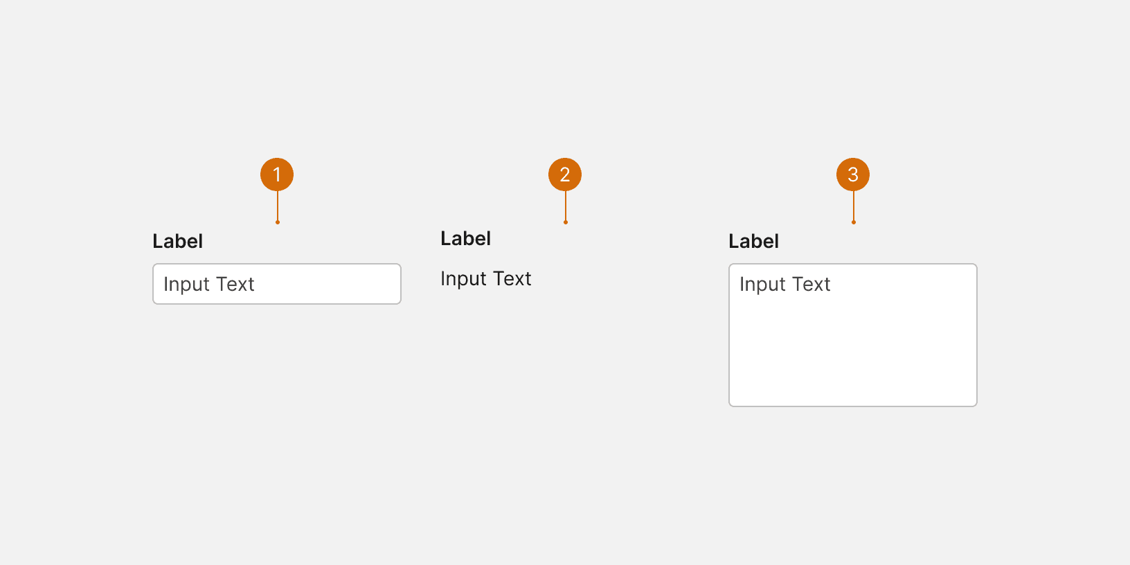
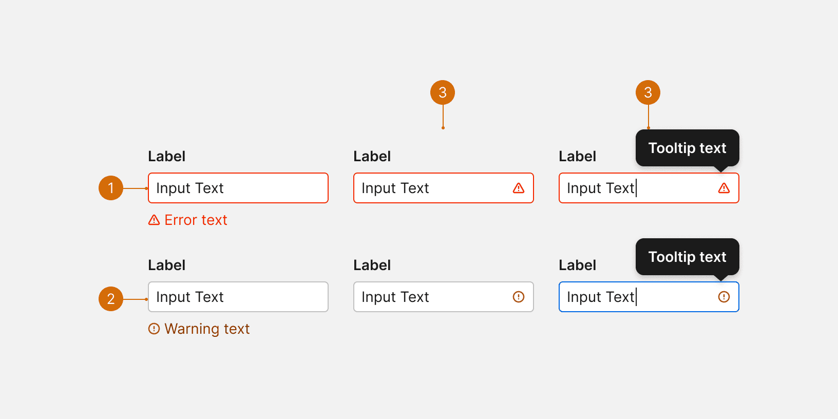
Labels describe what sort of content the user should provide in the input field. Labels should be short and concise--2 or 3 words max in most cases. Do not truncate or allow labels to spill into multiple lines. Every input should include a label. Labels should not be truncated and they should use title case.¹

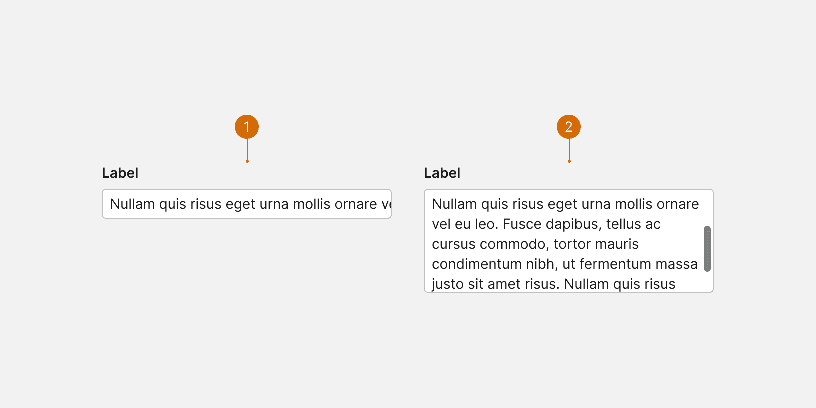
Placeholder input text can provide instructions, examples, or additional information about what sort of content they can enter in the field. For example, the expected or accepted format, or what sort of keywords can be searched for.
Don’t include essential information like formatting requirements in the placeholder. These details should go in the help text below the input or in the label so that it’s always on screen and available for the user. It is often better to include instructions, examples, or additional information as help text rather than as placeholders.
![]() | ![]() |
---|---|
Label: Address Help text: Full address including postal code | Label: Address Help text: Enter the address |
Related Components
Related Patterns
Additional Reading
https://uxplanet.org/the-anatomy-of-input-field-c3ef863e01d7
https://uxplanet.org/designing-more-efficient-forms-structure-inputs-labels-and-actions-e3a47007114f
https://uxdesign.cc/text-fields-forms-design-ui-components-series-2b32b2beebd0
https://blog.prototypr.io/the-ultimate-guide-for-text-fields-in-ux-part-i-b6e5eb58b0e4