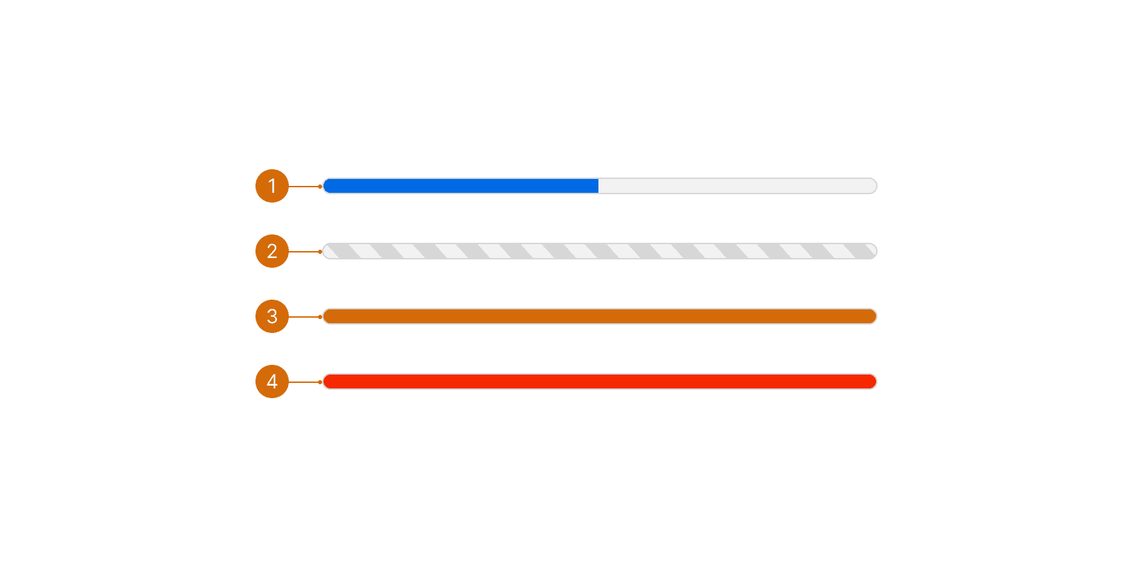
Ready

Progress Bar

Progress bars communicate the working status of a user-initiated action. Progress bars support values between 0% and 100%.

Ready

Progress Bar

Progress bars communicate the working status of a user-initiated action. Progress bars support values between 0% and 100%.

States

  1. Default: Action is in progress

  2. Indeterminate: The system is currently unable to display action progress

  3. Warning: Total progress is complete but certain actions were not able to be completed

  4. Error: An error has occurred and no actions were completed

Best Practices

1

User Initiated

The progress bar is used for user-initiated actions that take longer than 1 second.¹ ² The progress bar should not be used for content loading. See Loader.

Do

Don't

2

Multiple Actions

The progress bar should not be used to communicate the working status of multiple actions at once.

Don't

Content

1

Label

The label should be short and concise. It should describe the action being performed. Use descriptive verbs ending in -ing, and include an ellipses if the task is is progress.

When the task is complete, the label should change to reflect the new status. Use specific language that mirrors the verb used while the task was underway. For example, if the action was “Saving groups…” then the complete status could say “Save complete” or “Groups saved”.

Use sentence case--capitalize the first word. Don’t include a period.

Do

Don't

2

Helper text

Helper text underneath the progress bar can provide additional information, details, warnings, and so on.

Do

3

Dynamic helper text

Helper text can change as the process progresses. This is useful if the amount of time it takes to complete an action can vary greatly.

Do

  1. 0-10 seconds

  2. 10+ seconds

© 2026 Basis Technologies