

Content
Pill text labels should clearly represent the user input that generated them. If the input contains text, that text should be used in the pill.
1
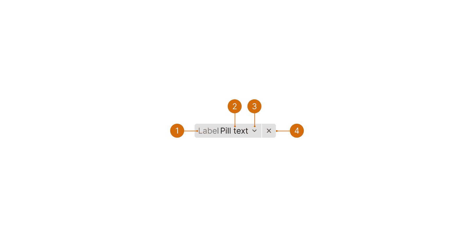
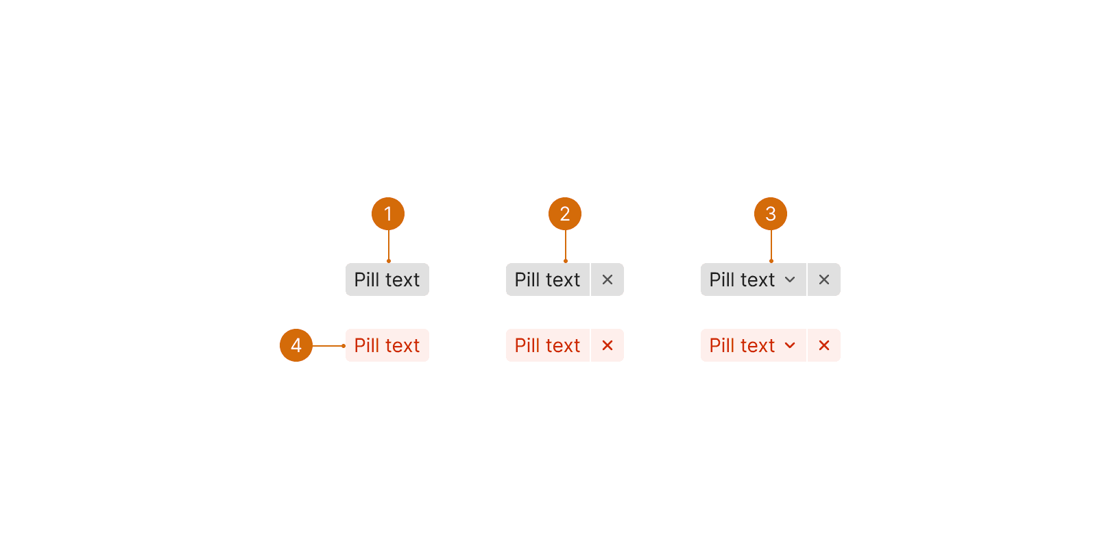
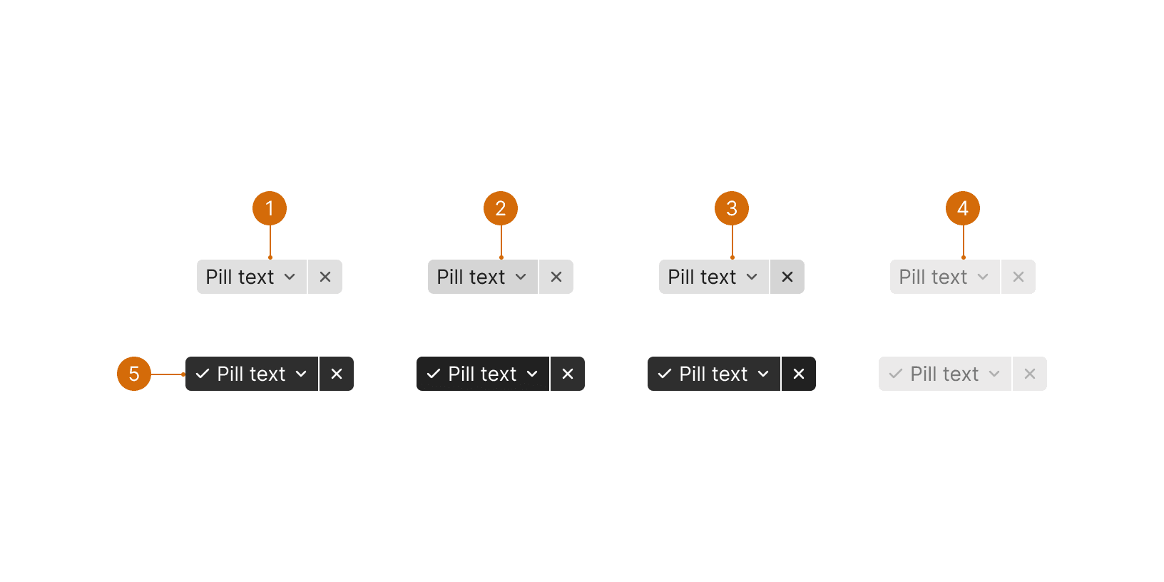
Pill text
Cursus Lorem Tellus Consectetur Sem

Do

Don't
2
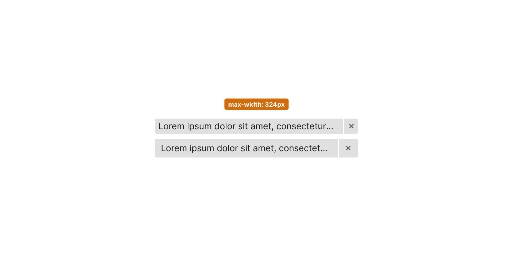
Short
Keep pill text short and easy to scan.

Do

Don't


