Anatomy
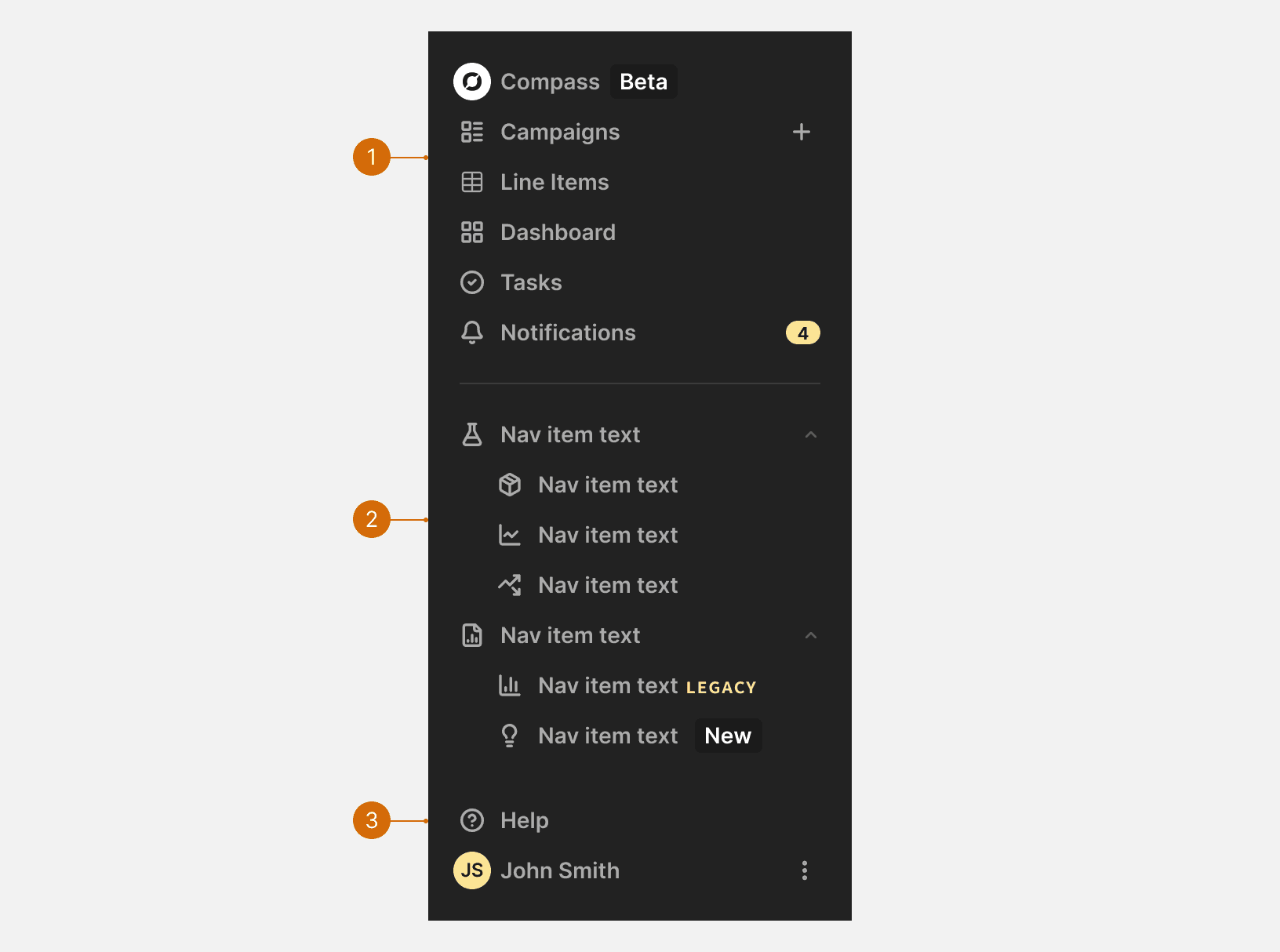
Primary List
Secondary List
Settings List
States
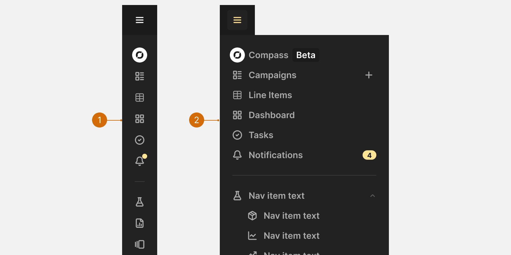
Collapsed
Expanded
Behaviors
Breakpoint Behavior
X-large
When expanded, app drawer will push page content to the right and can remain open when user is working.³
Large and below
When expanded, the app drawer will display over top of the page content and will collapse when the user interacts with the page content. ³
Best Practices
Keep It Visible and Predictable
Persistent vertical navigation helps orientation and reduces cognitive load for users ¹.
Navigation Item Grouping
Navigation items in the app drawer should be grouped with similar items. These groupings should include a heading that describes the group. This helps users scan and understand structure faster. ²

Do

Don't
Use Clear, Concise Labels
Navigation labels should be short, descriptive, and reflect the user’s mental model—not internal jargon ².
Indicate the Current Location
Highlighting the current page improves wayfinding and prevents users from getting lost. ¹ ²

Do
Keep Primary Actions at the Top
Place high-priority or frequently accessed items at the top of the list where they're easiest to find ².
New or Beta features
New or beta versions should use a “New” or “Beta” badge for a determined period of time. Do not label old versions of nav items with “Legacy”.

Do

Don't
More
Related Pages


Additional Reading
Top vs side navigation: Which one is better for your product? https://uxdesign.cc/top-navigation-vs-side-navigation-wich-one-is-better-24aa5d835643
Best UX Practices for Designing a Sidebar https://uxplanet.org/best-ux-practices-for-designing-a-sidebar-9174ee0ecaa2
Left-Side Vertical Navigation on Desktop https://www.nngroup.com/articles/vertical-nav/