Anatomy
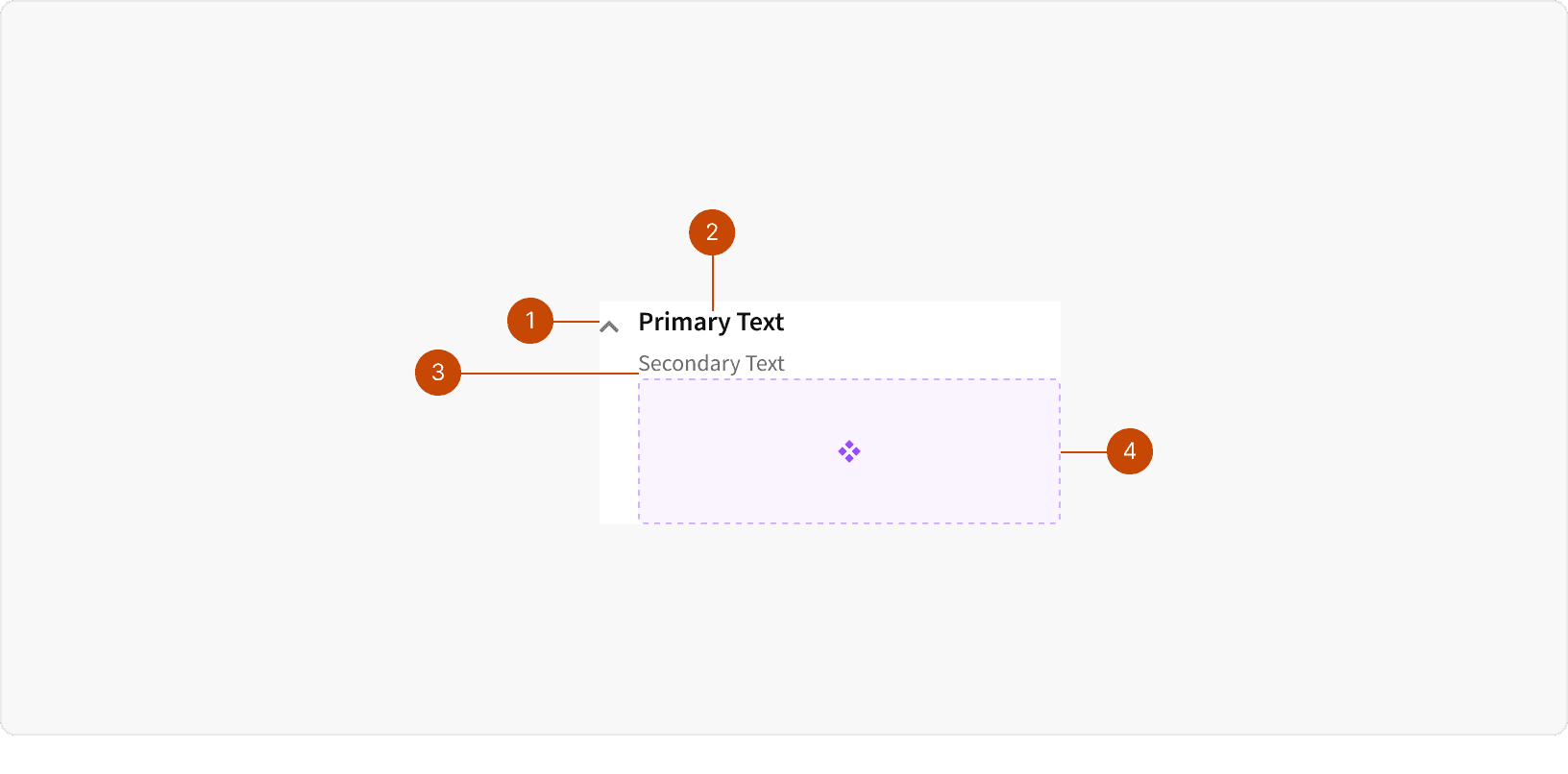
Accordion icon
Primary text
Secondary text
Accordion content
Best Practices
1. Secondary Text
Use secondary text when there is information that you want the user to be able to see at all times.
2. Consistent Interactions
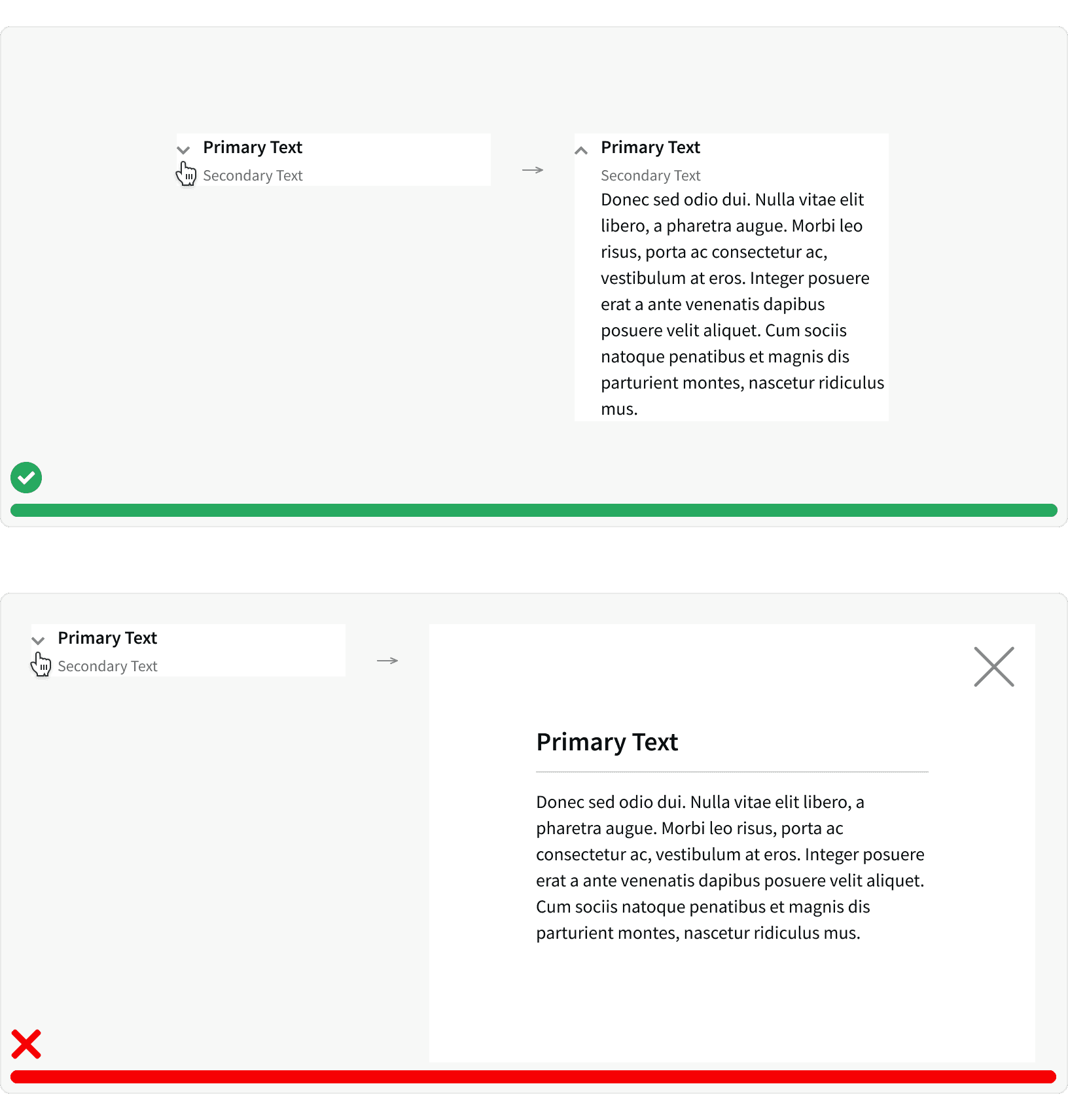
Ensure the interaction is the same wherever the accordion component is used. Make sure the same behavior happens when the user clicks on the accordion header / text and icon to reveal hidden content. Avoid mixing interactions like opening a modal.
3. Reduce Clutter
Use accordions to present the user with less visual clutter on a page. Hidden content is generally less crucial information or content that only applies in certain scenarios. It is best to not hide critical information in an accordion. If all the information is important, then it may be best to have a long scrolling page to ensure the user is aware of all the content.²
4. Layout
Accordions typically push the page content down when in an open state. This helps keep the users eye in the same place without jumping the content on the screen. However, there are some instances that may necessitate content being pushed up or to the side depending on location of the accordion or device screen size.
5. Persist States
It is best practice to have the state of the accordion remembered the next time that user visits the page. This allows for more continuity for the user, as well as make the experience more intuitive to the user's needs.
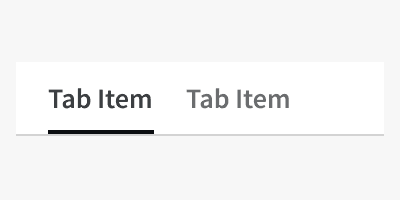
6. Accordions vs Tabs
Both accordions and tabs are used to organize similar information to make easier to consume for the user. However, when to use either pattern depends on the content and use case. Accordions are useful when needing to compare information on the same page, whereas tabs alleviate long scrolling pages by piecing out related in content.
Additionally, tabs may be better option if there is a lot of information for each content section. The amount of content options to toggle through will also help determine whether to use accordions or tabs. If there are many, then tabs might be a better option. However, remember that if there is a lot of content for each, then accordions lose their benefit of seeing two sections of content at the same time.³
Another thing to note, accordions are a great pattern for responsive design and smaller screens.⁴ They are better suited for the vertical scrolling nature of content on mobile devices.
More
Related Pages

Accessibility
It is necessary to ensure the accordion content is accessible for keyboard and screen reader users. Arrow keys and tabbing do not open accordions to reveal the hidden content if the accordion is collapsed. The user must hit the space bar to open the accordion and read the hidden content. Aria attributes are crucial in ensuring users recognize when there is hidden content.
The accordion header will need to include the aria-expanded attribute to alert the users that there may be hidden content. If there is not a relationship built-in for the accordion header and the panel content, it is also best practice to include aria-controls to identify the controlling element.
Read more on best practices for aria attributes on W3C.
Jump to the accordion section to aid with the accessibility of show/hide functionality.
Additional Reading
Laubheimer, Page and Budiu, Raluca. "Accordion Icons: Which Signifiers Work Best?" Nielson Norman Group, August 23, 2020 https://www.nngroup.com/articles/accordion-icons/
Loranger, Hoa. "Accordions Are Not Always the Answer for Complex Content on Desktops" Nielson Norman Group, May 18, 2014 https://www.nngroup.com/articles/accordions-complex-content/
Kapoor, Mehek. "Little Details in UX Design: Tabs vs Accordions" UX Collective, March 28, 2019 https://uxdesign.cc/little-things-in-ux-design-part-1-tabs-v-s-accordions-47390e4910c3
Nigam, Arnav. "When To Use What— Module Tabs vs Accordion vs Single Page" UX Planet, Dec 8, 2020 https://uxdesign.cc/little-things-in-ux-design-part-1-tabs-v-s-accordions-47390e4910c3
Friedman, Vitaly. "Designing the Perfect Accordion" Smashing Magazine, June 21, 2017 https://www.smashingmagazine.com/2017/06/designing-perfect-accordion-checklist/