Variants
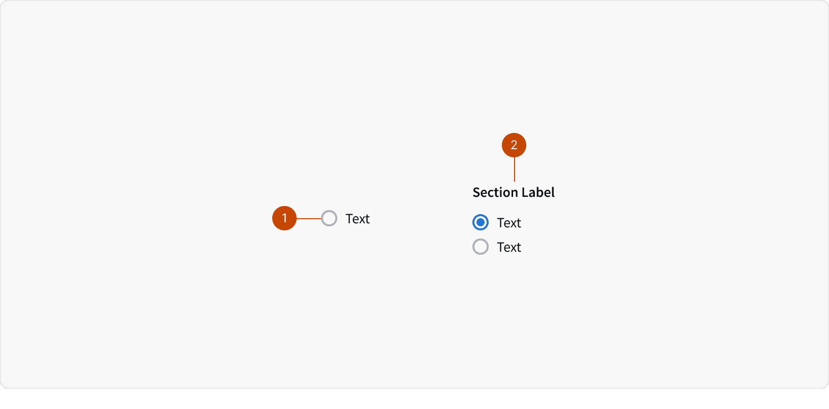
Radio
Radio Group
Behaviors
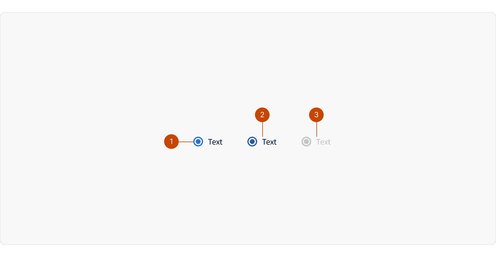
Mutually Exclusive
The user can only select one radio at a time.
Best Practices
1. Labels
Radio must include a clear, contextual label to help the user make their selection.
2. Usage
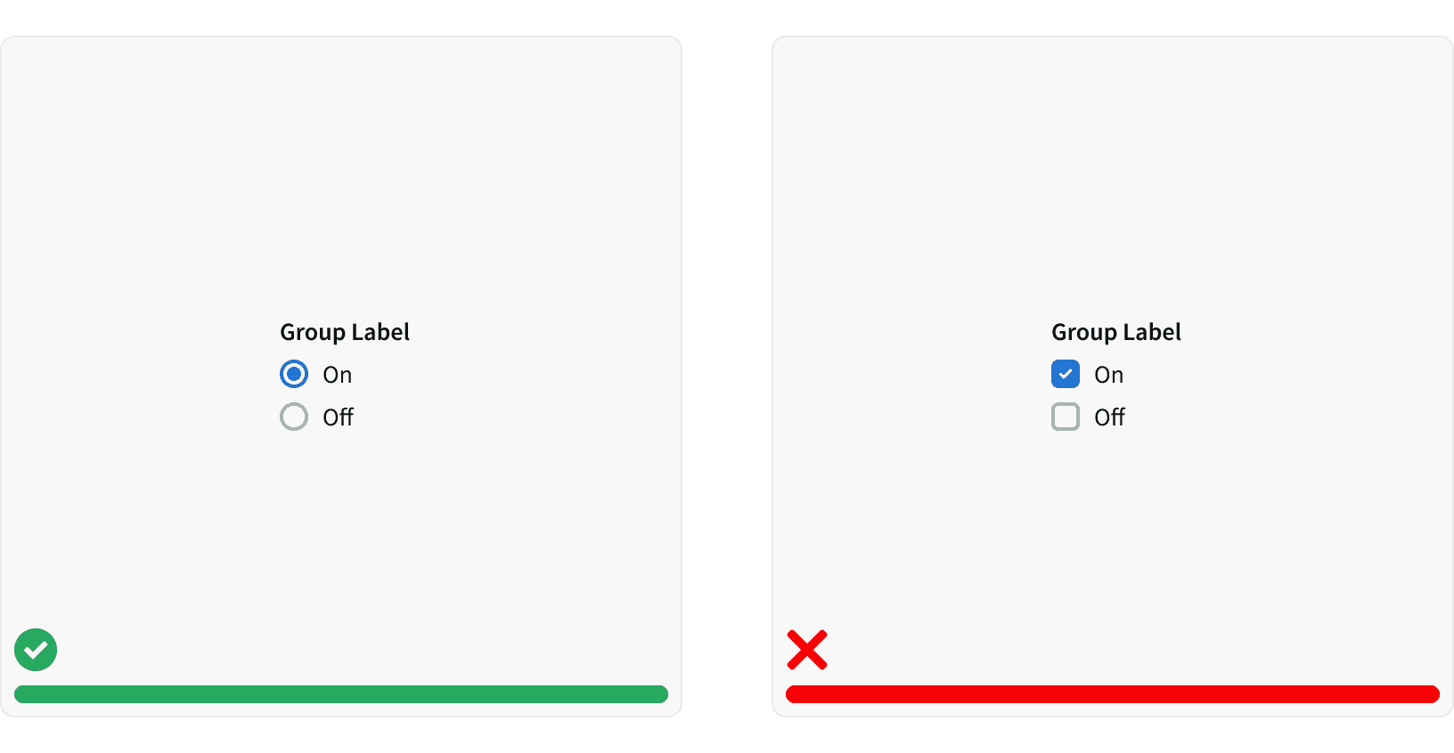
Radio Buttons are used when the user must select exactly one choice. If the user needs to select any number of choices (zero, one or several) use Checkboxes instead.¹
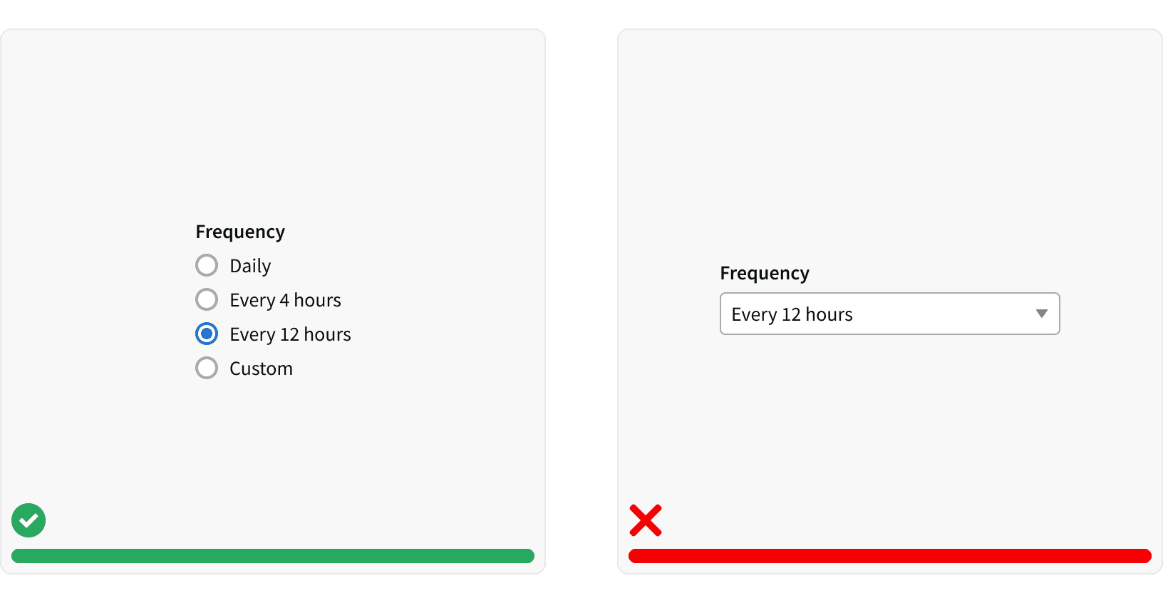
3. Radio Button vs Dropdown Select From Input
Use Radio Buttons over Dropdown Selects where space permits. This allows all options to be visible to the user, who can easily compare them.¹
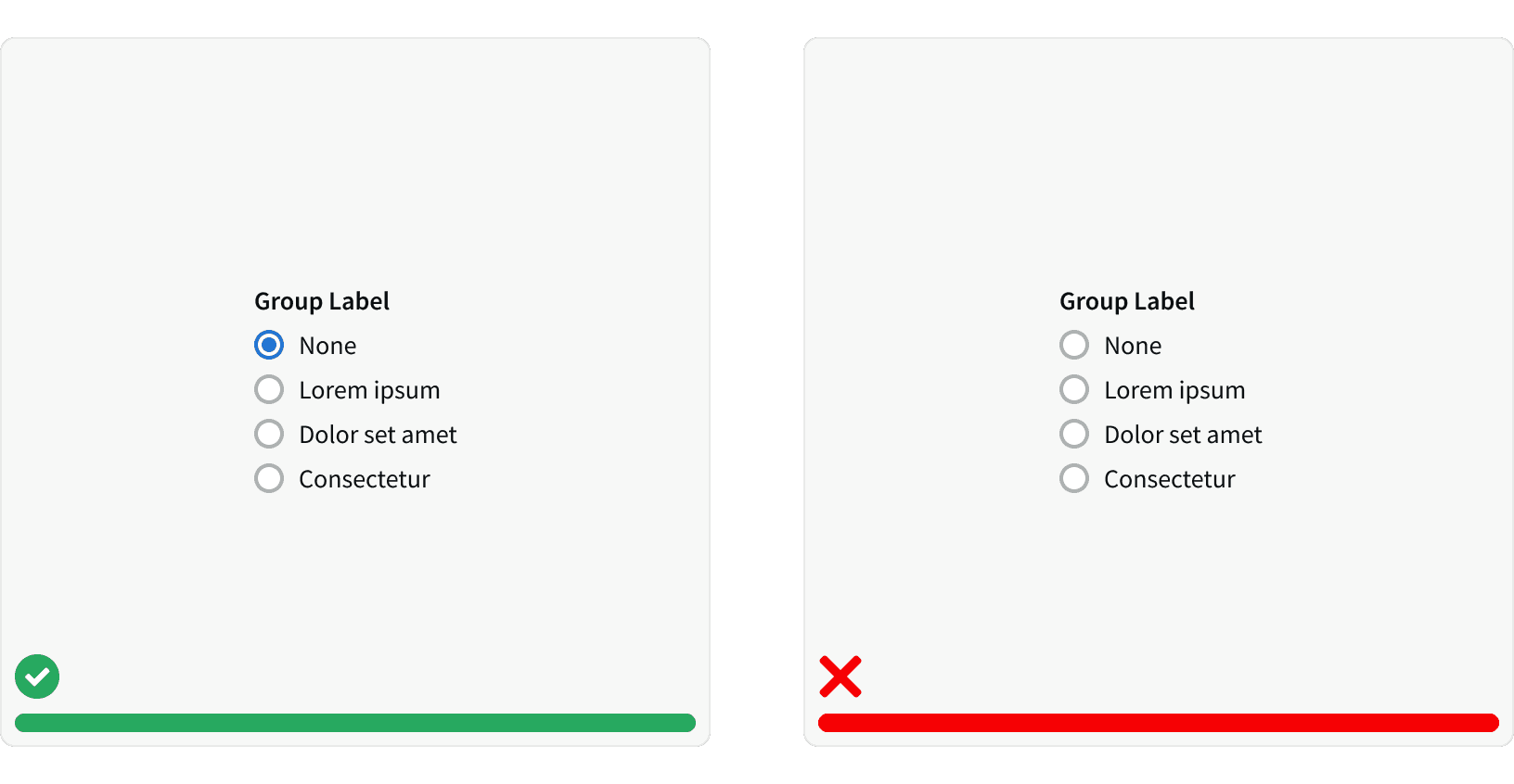
4. Default Selection
Have a default Radio Button option selected whenever possible. A default choice is a strong suggestion to the user that helps them make their decision and increases their confidence in the app. When the frequently selected choice is set to be the default, it helps users expedite their tasks. If users need to refrain from making a selection, you should provide a radio button labeled “None.” Use analytics to help determine what our users commonly select.²
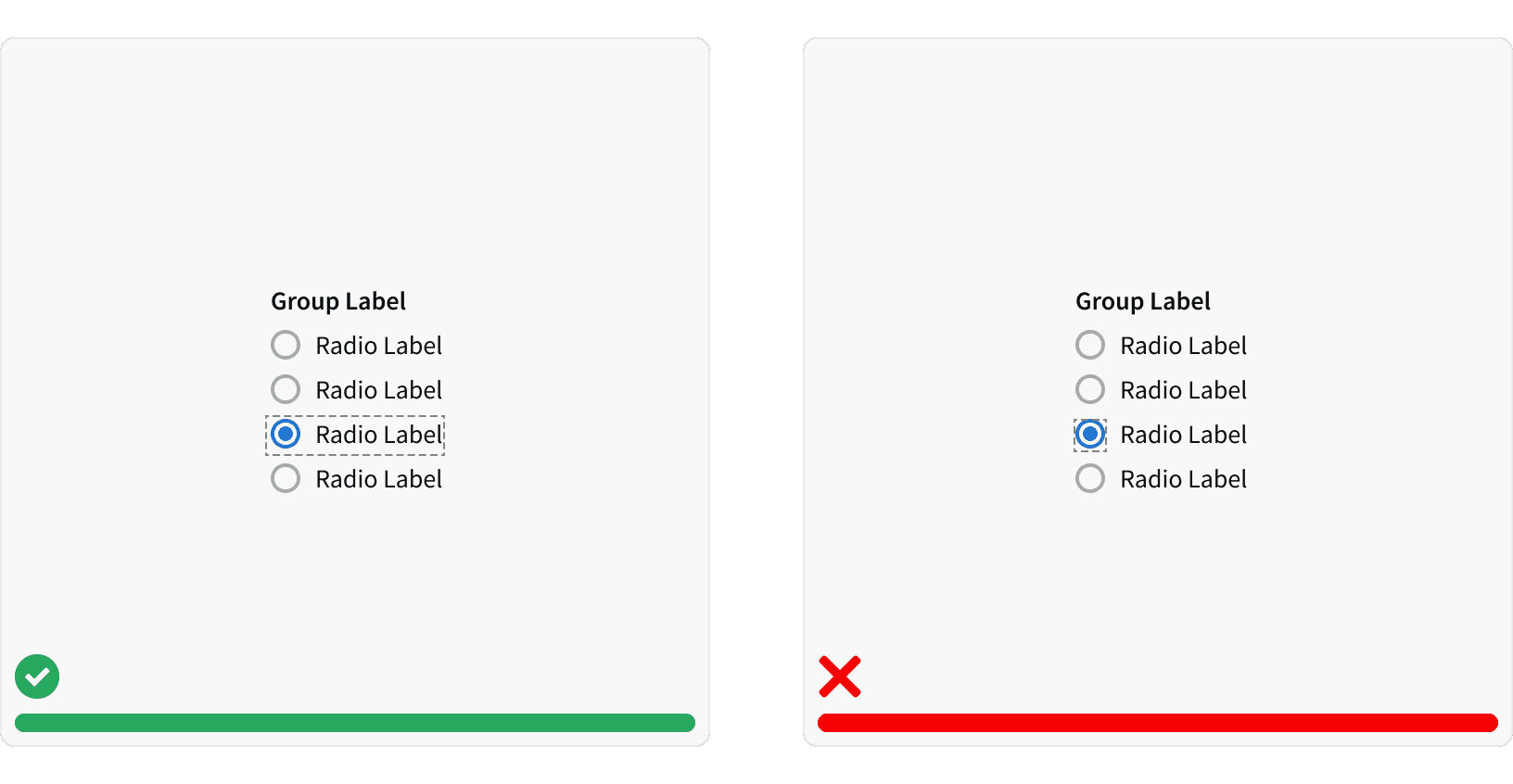
5. Click Area
Users should be able to select an option by clicking on the radio or the label associated with it. A larger target area helps prevent user error and allows them to quickly execute their tasks.¹
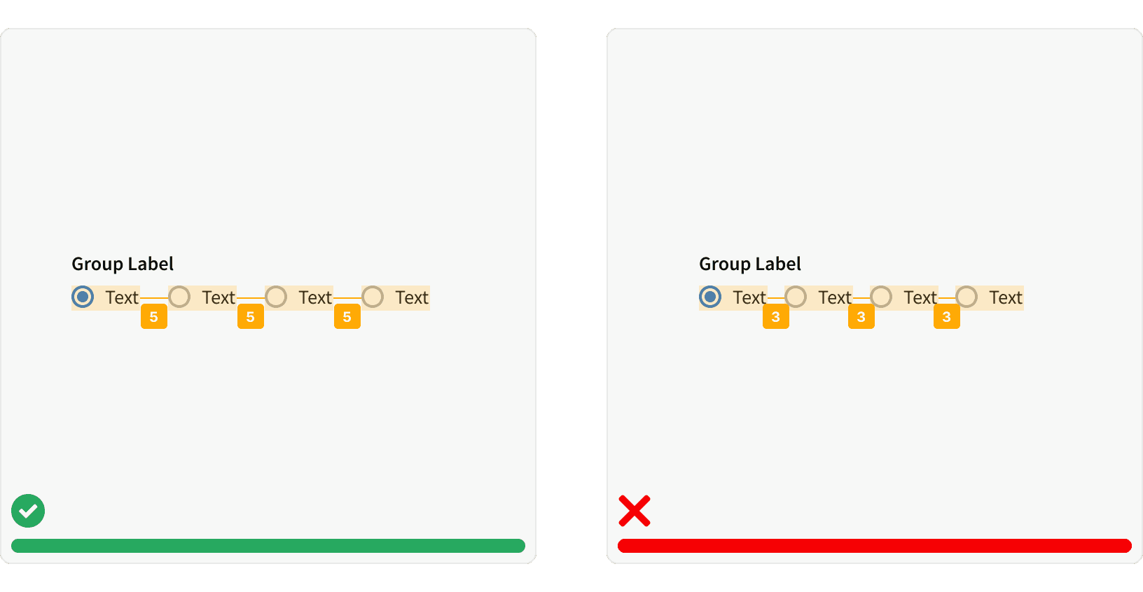
6. Spacing
Where space permits, lay out your Radio Button lists vertically, with one choice per line. You can use a horizontal layout but only with ample space between options so it’s abundantly clear to the user which choice goes with which label. Refer to our spacing system to learn more about "core" units.¹
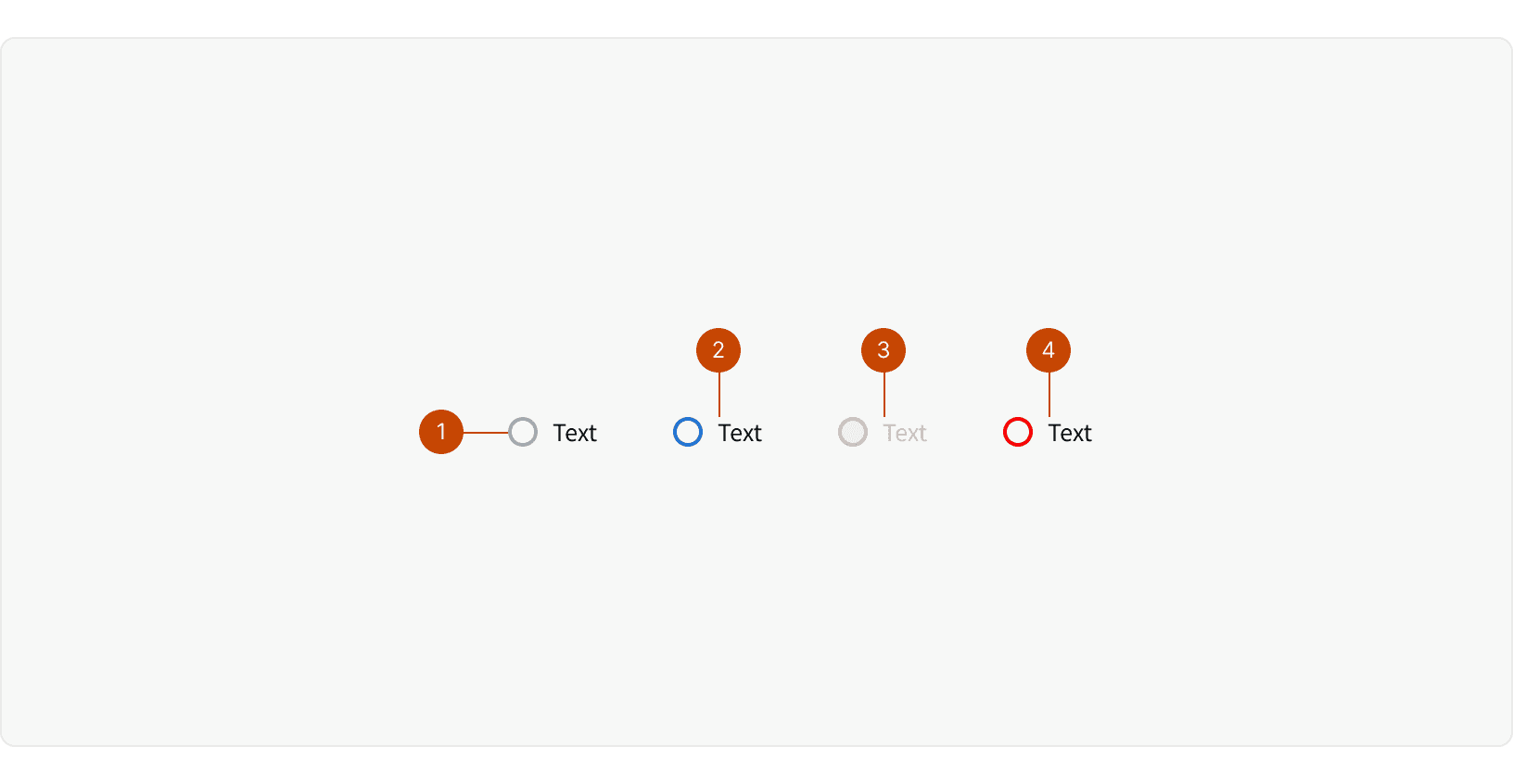
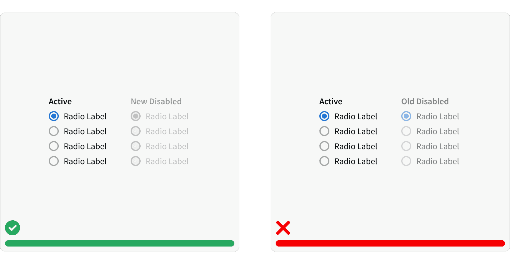
7. Disabled States
Use our new disabled styling on Radio Buttons and don’t change the opacity to indicate a disabled state. ³
More
Related Pages
Accessibility
Color contrast ratio for our Radio Buttons meets AA standards, based on Web Content Accessibility Guidelines (WCAG) guidelines.
Benefits: People with low vision often have difficulty reading text that does not contrast with its background. This can be exacerbated if the person has a color vision deficiency that lowers the contrast even further. Providing a minimum luminance contrast ratio between the text and its background can make the text more readable even if the person does not see the full range of colors.³
Developer Guidelines
States and attributes
Convey the state of the radio button automatically.⁴
Use the
disabledprop to apply the HTMLdisabledattribute to the radio button<input>. This prevents users from being able to interact with the radio button, and conveys its inactive state to assistive technologies.⁴
Labeling
The required
labelelement conveys the purpose of the radio button to all users⁴The label must have a
forattribute with a value that matches the uniqueidattribute of its associated radio<input>.⁴
Keyboard support
Move focus to the radio button group using the tab key (or shift + tab when tabbing backwards).⁴
Use the up and down arrow keys to change which radio button is selected.⁴
Additional Reading
World Leaders in Research-Based User Experience. “Checkboxes vs. Radio Buttons.” Nielsen Norman Group, www.nngroup.com/articles/checkboxes-vs-radio-buttons/.
World Leaders in Research-Based User Experience. “Radio Buttons: Always Select One?” Nielsen Norman Group, www.nngroup.com/articles/radio-buttons-default-selection/.
“Web Content Accessibility Guidelines (WCAG) 2.0.” W3C, www.w3.org/TR/WCAG20/.
“Radio Button.” Shopify Polaris, polaris.shopify.com/components/forms/radio-button.
World Leaders in Research-Based User Experience. “Toggle-Switch Guidelines.” Nielsen Norman Group, www.nngroup.com/articles/toggle-switch-guidelines/.