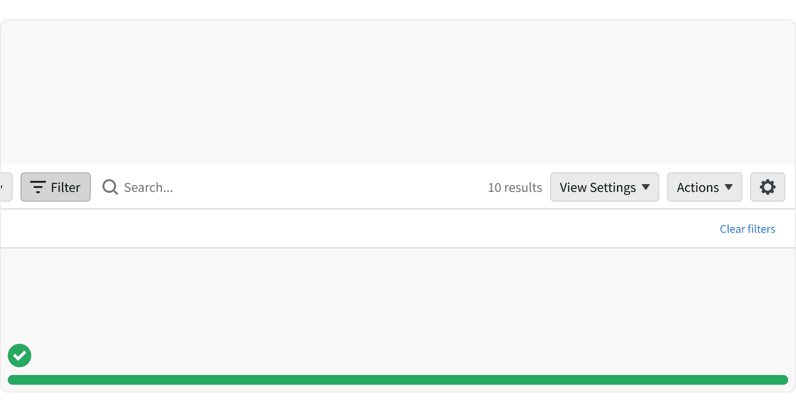
Anatomy
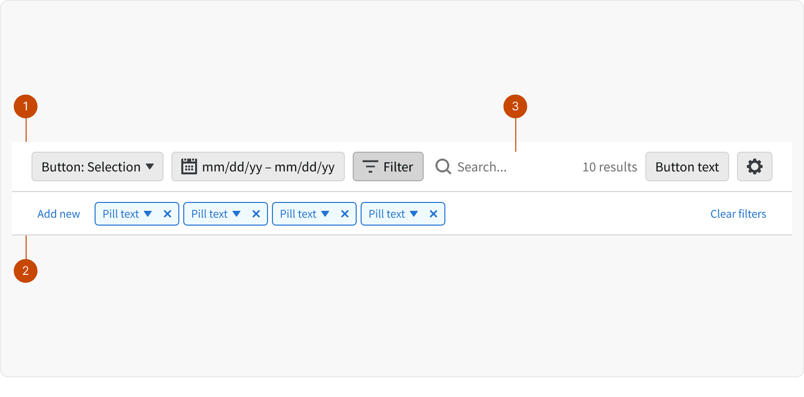
Control Bar Row
Filter Bar
Search Input
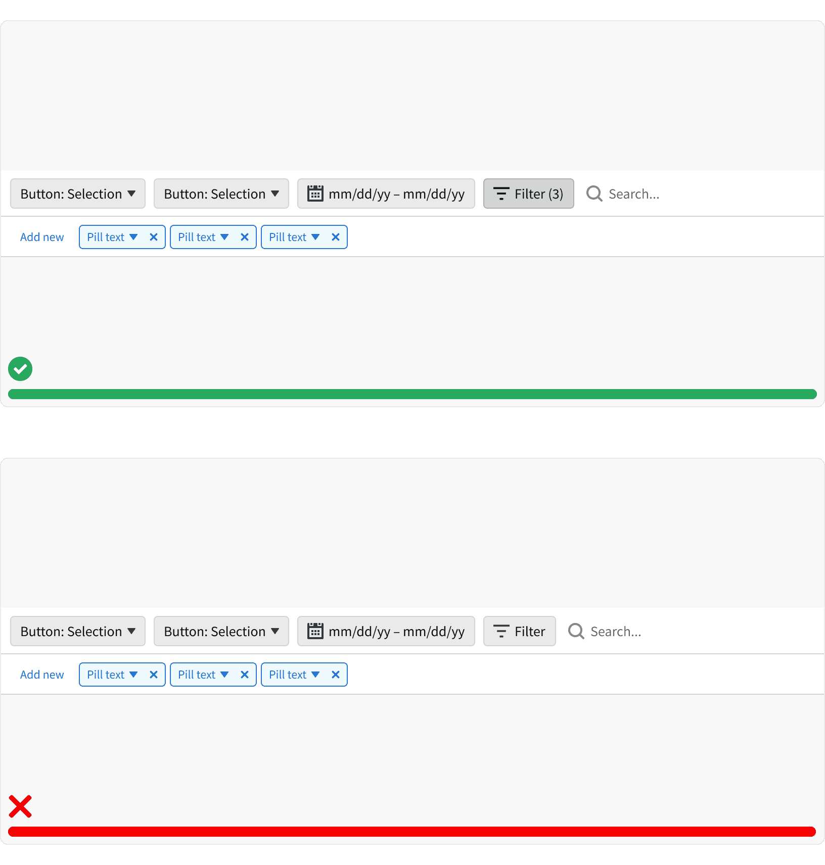
States
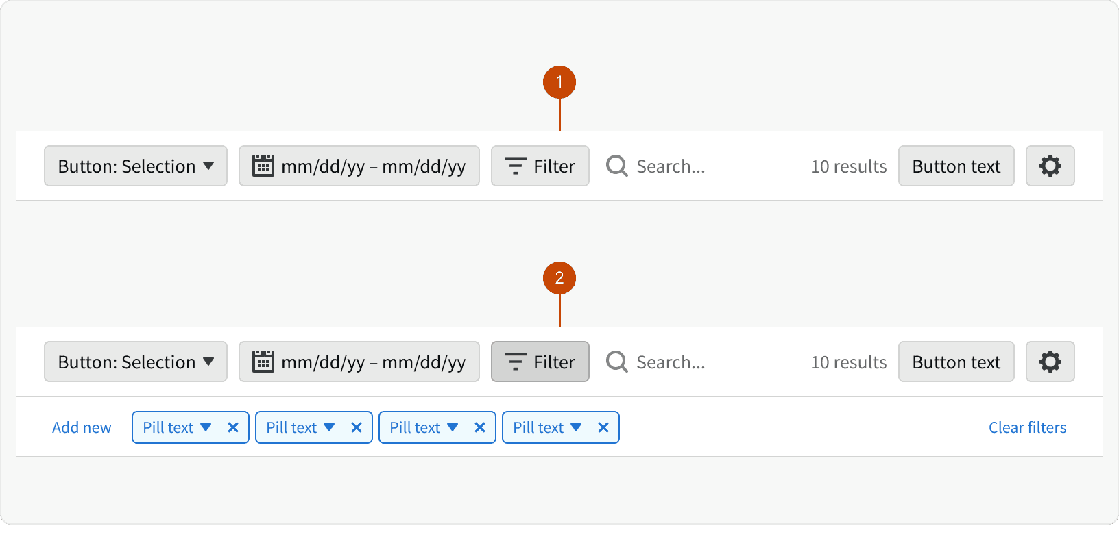
Filter Bar Collapsed
Filter Bar Expanded
Behaviors
Responsive Behaviors
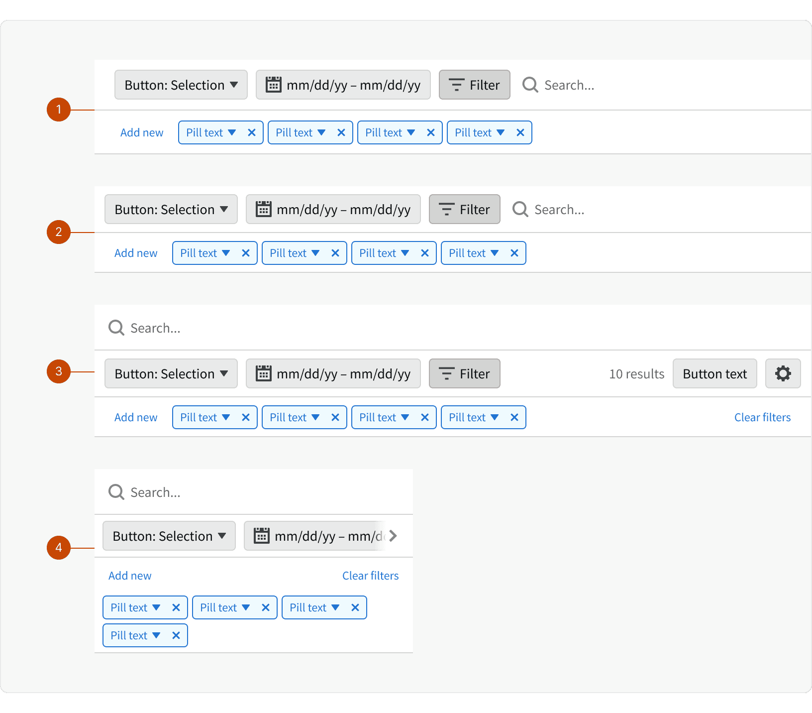
Xlarge: Increased padding around row elements
Large: Reduced padding around row elements
Medium: Search input moves to a row above over elements
Small: Filter bar pills move to the next line and wrap if necessary
Best Practices
1. Left Side Buttons
Buttons that manipulate the page date should appear in the left side of the Control Bar. Organize these buttons in a logical order.
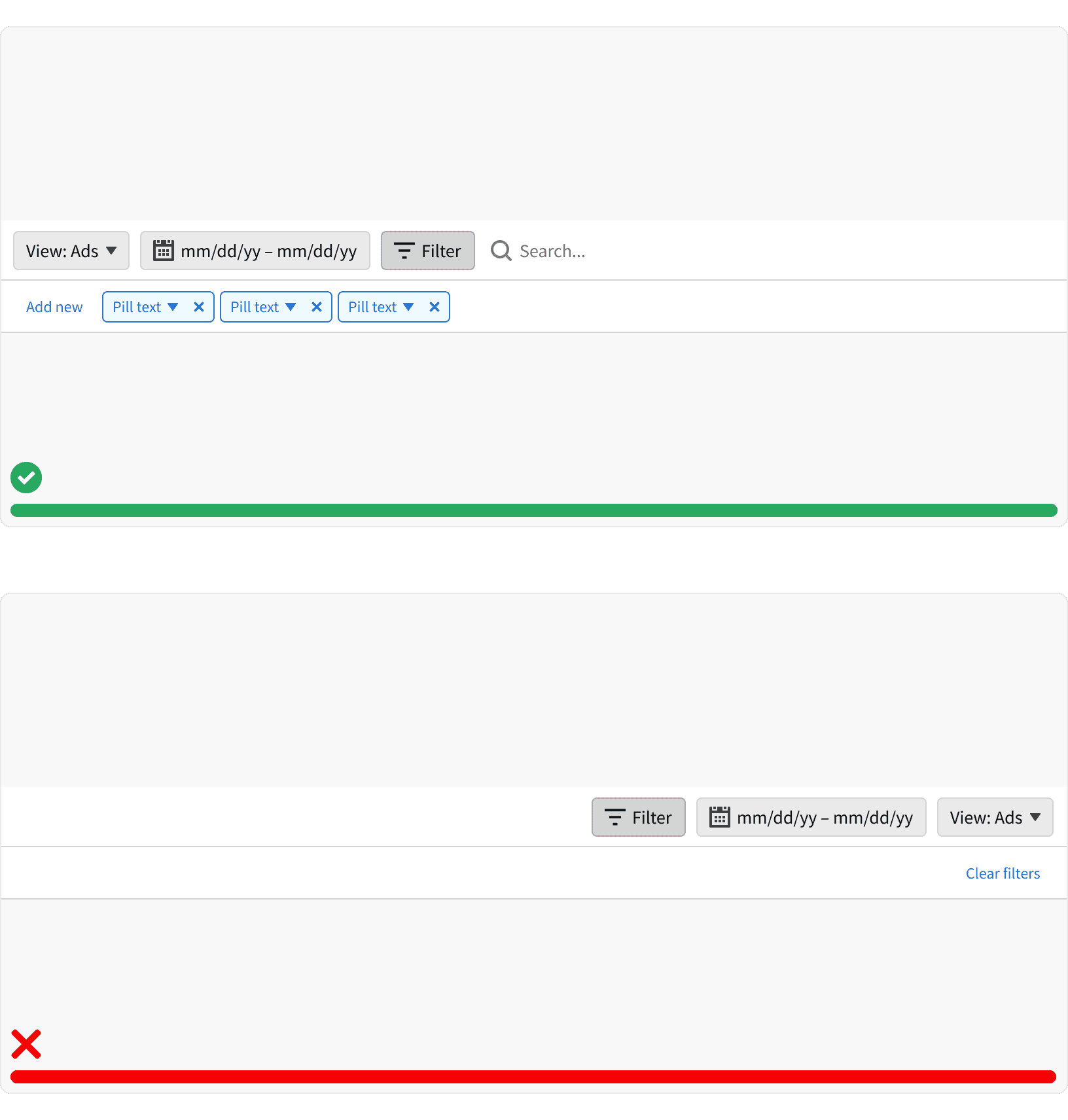
2. Right Side Buttons
Actions a user can take that do not interact with the data or information in view should appear on the right side of the Control Bar. Exporting, creating, or downloading are examples of actions a user can take that would not change their view of data or information on a page.
3. Filter Bar
When the filter bar is expanded, the filter button should remain in a pressed state. The filter button should also include a counter of the number of applied filters.
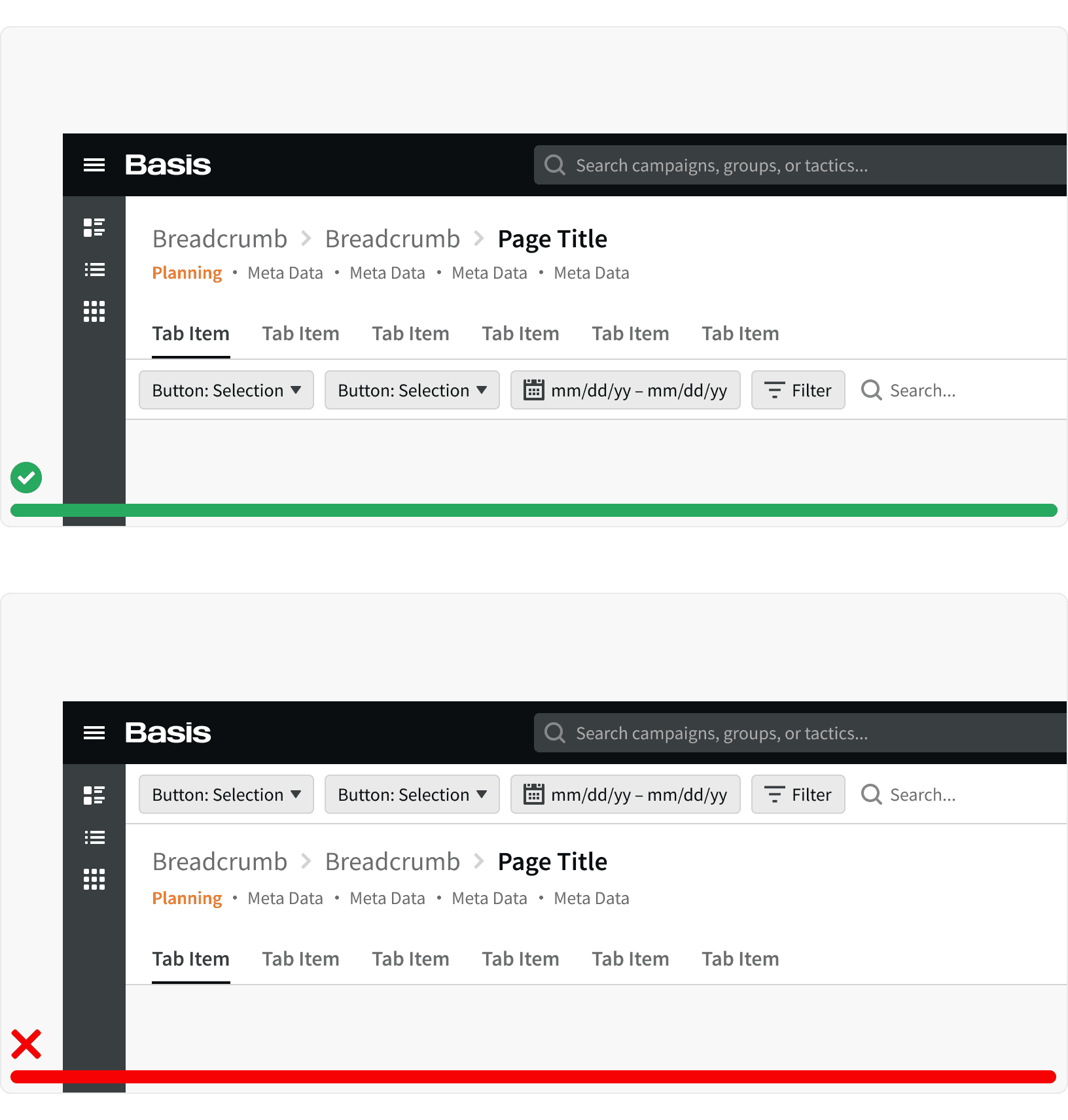
4. Placement
The Control Bar should always appear below all other Page Header components. When scrolling, the Control Bar should be sticky to the top. As referenced in the Anatomy section above, the Control Bar features should appear in the same order regardless of which page a user is on. This consistency will increase familiarity, efficiency, and predictability of contents and features. (1)
More
Related Pages


Accessibility
Control Bar content colors should follow contrast ratio AA standards, based on Web Content Accessibility Guidelines (WCAG) guidelines.