States
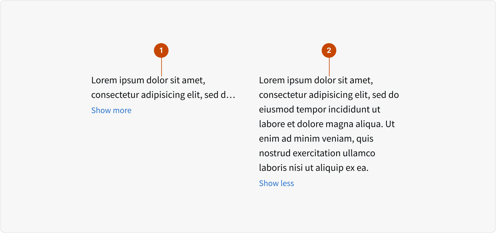
Collapsed
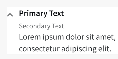
Expanded
Behaviors
Expanding
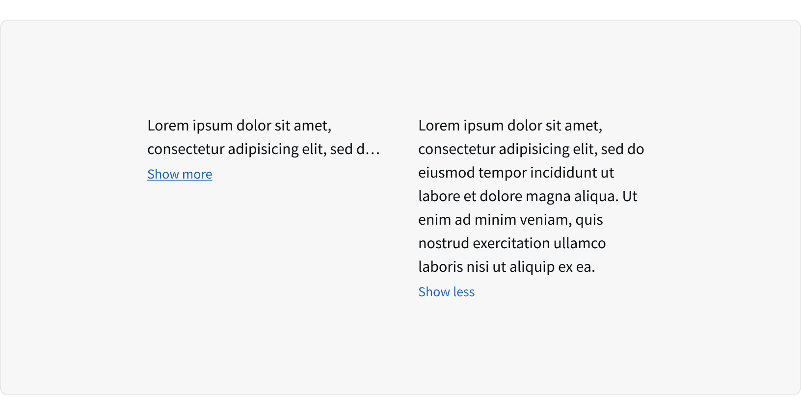
When the "Show more" text is clicked, the component expands vertically to show all hidden text.
Number of lines
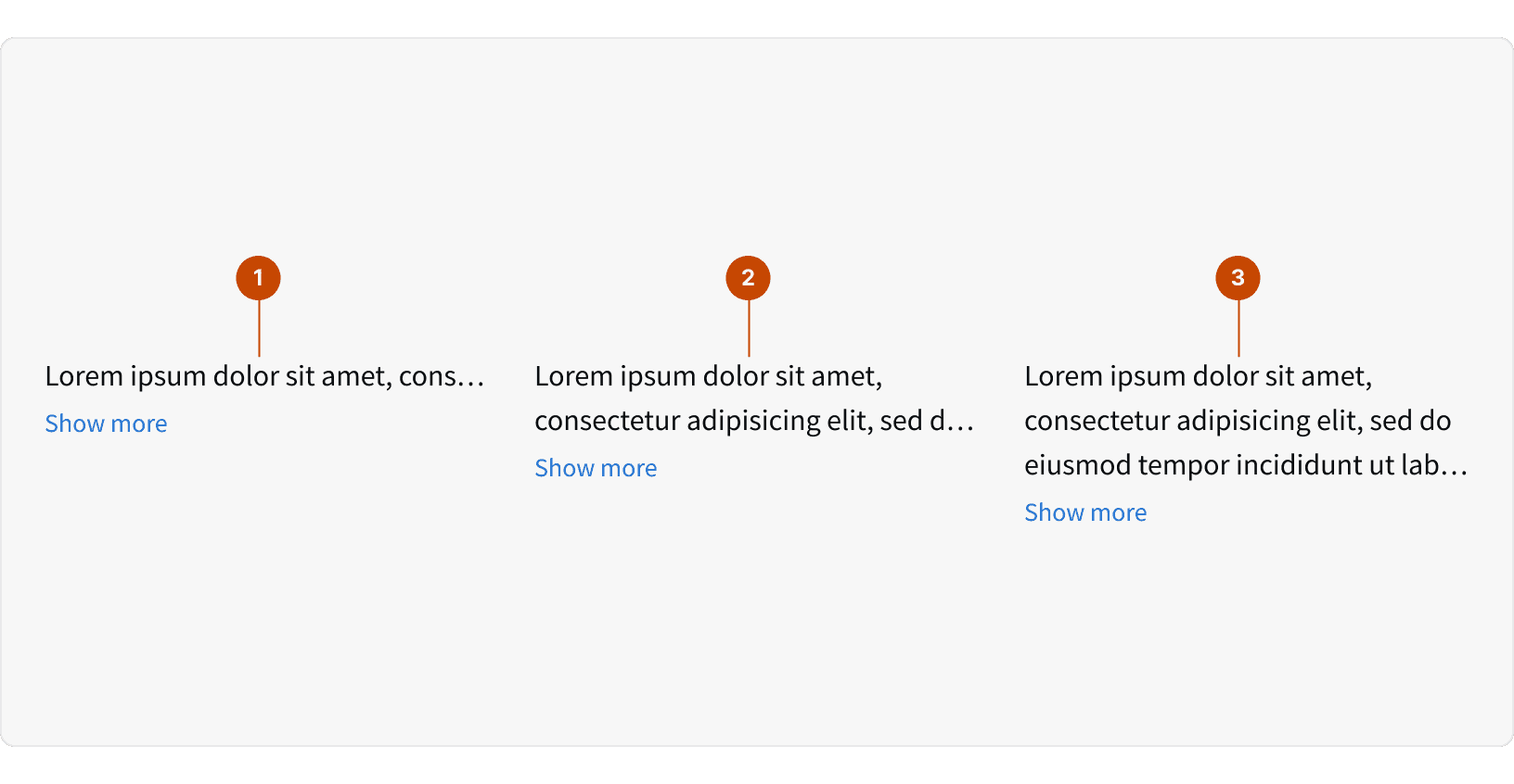
The component can be configured to show one, two or three lines of text when in the collapsed state.
Best Practices
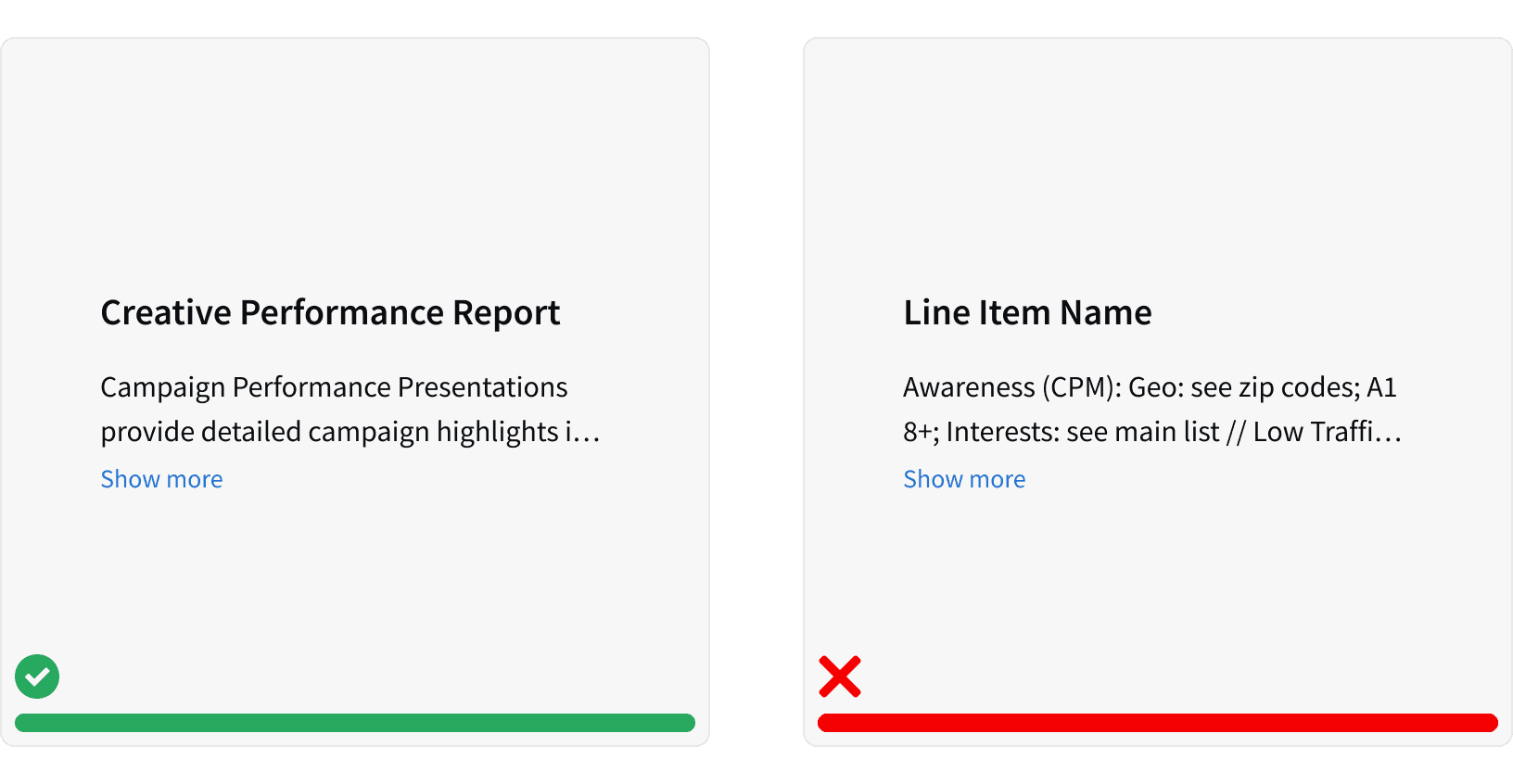
1. When to use
Use this component to save vertical space when designing a content heavy page. Do not use this component when there is sufficient space to display the entire content block. ¹
2. Secondary Information
Only use this component to truncate secondary information such as descriptions or additional contextual information. Do not use this component to truncate primary information that is critical to decision making. ¹
More
Related Pages

Accessibility
All Text Truncation content should follow contrast ratio AA standards, based on Web Content Accessibility Guidelines (WCAG) guidelines.
Benefits: People with low vision often have difficulty reading text that does not contrast with its background. This can be exacerbated if the person has a color vision deficiency that lowers the contrast even further. Providing a minimum luminance contrast ratio between the text and its background can make the text more readable even if the person does not see the full range of colors. It also works for the rare individuals who see no color.¹
Additional Reading
Wrapping and Truncating Text https://experience.sap.com/fiori-design-web/wrapping-and-truncating-text/