Anatomy
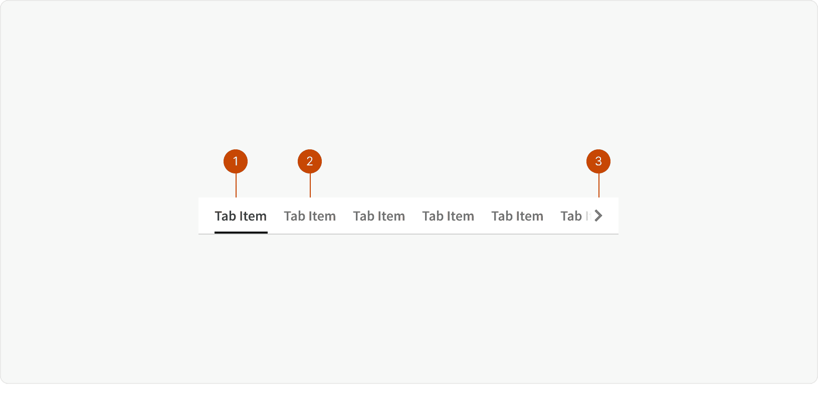
Active Tab
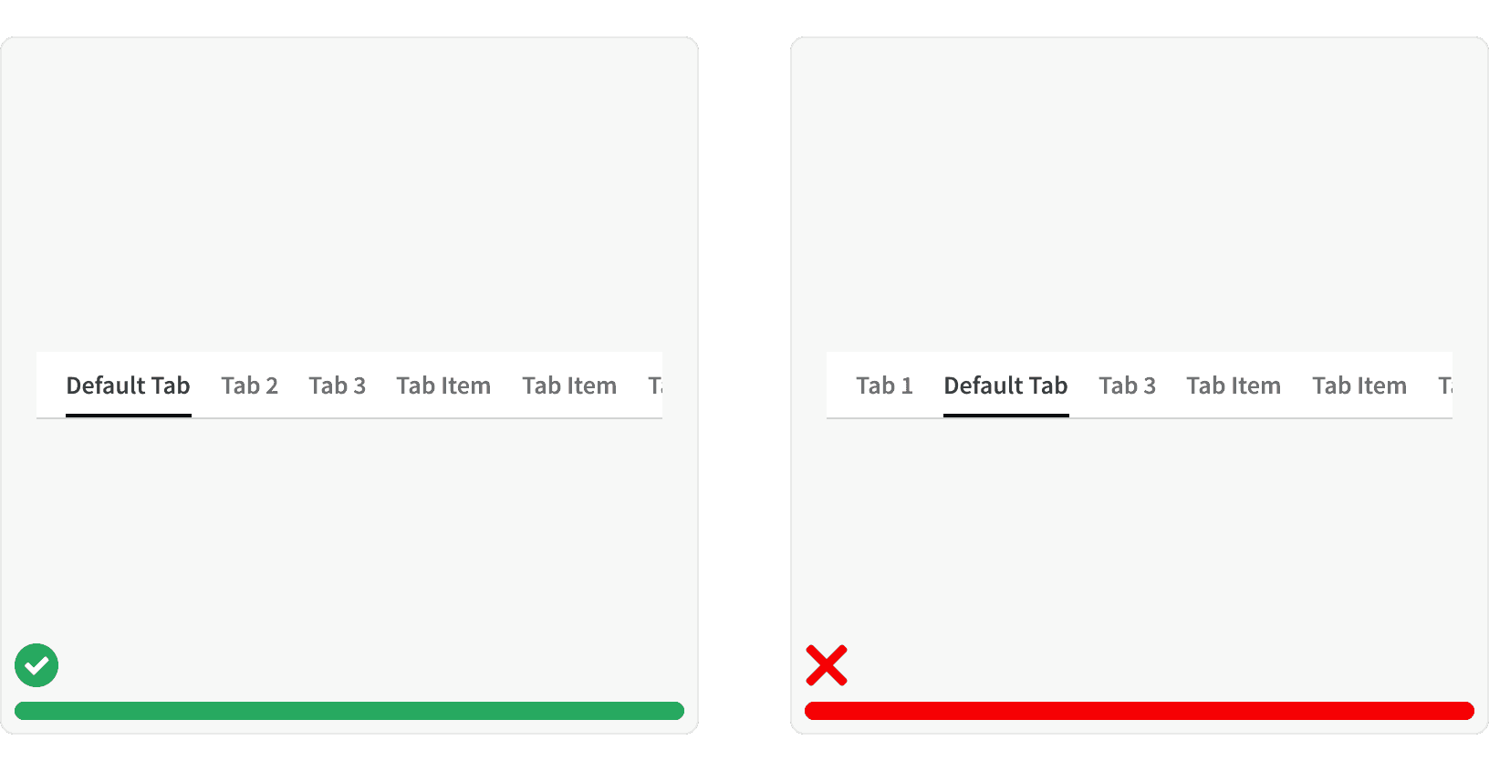
Default Tab
Overflow
Variants
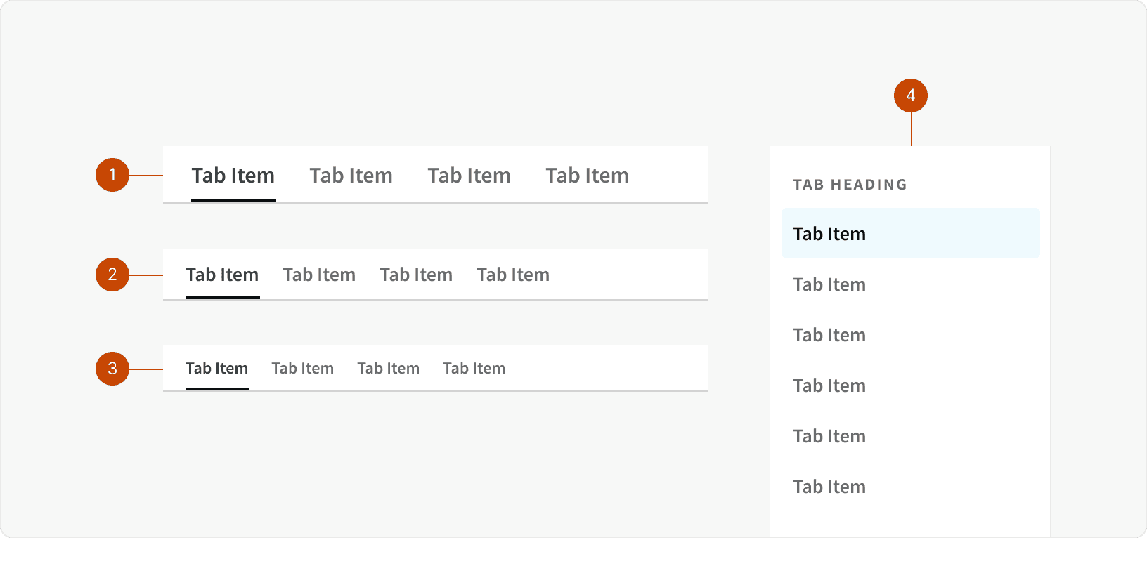
Large: Use the Large Tabs when separating the content of an entire page. These tabs should be positioned directly below the Title Bar.
Default: Use the Default Tabs when separating content within a section of a page or within an element on the page.
Small: Use the Small Tabs to separating content only when space is very limited. These should be used sparingly.
Tabs Stacked: Use the Stacked Tabs when displaying a large number of tabs that would not fit into a horizontal layout, or as sub navigation within a horizontal tab view. Use sections within the Stacked Tabs to groups related items.
Behaviors
Overflow
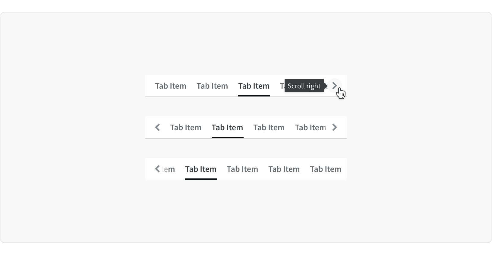
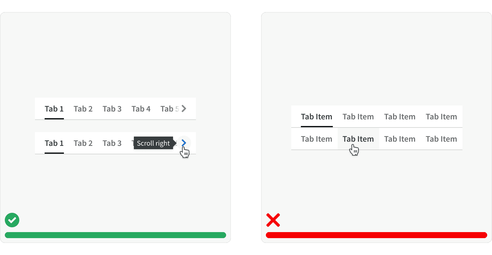
When Tabs container is too narrow to display all tabs, a horizontal scroll indicator should be show and horizontal scrolling should be available. The scroll indicators container an icon button that allows users to move the items left or right without scrolling.
Responsive
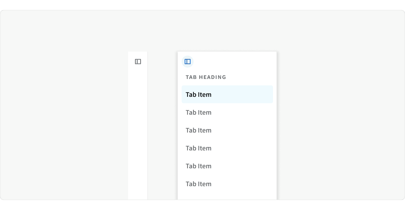
For the Medium and Small breakpoints, the stacked tabs will collapse into a side bar. An icon button will allow user to open the tabs as an overlay.
Best Practices
1. When to use
Only use tabs when users don’t need to see content from multiple tabs simultaneously.
2. Ordering
Tabs should be arranged in a logical order that makes sense to the user. The default tab should be first and contain the most important/frequently-read information. The following tabs should be arranged in order of importance or logic.¹ Tabs also remain in a consistent order regardless of which tab is selected.² If tabs are not organized in a logical way it increases the users cognitive load.³
3. Labels
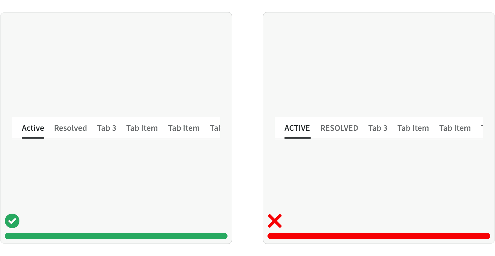
Write short, clear labels and use plain language in your tabs. Tab labels should be one or two words max, and written in Title Case. Never use ALL CAPS in tab labels because it’s harder for the user to read.² If tabs are not clearly written in a logical way it increases the users cognitive load.³
4. Overflow
Tabs should only contain one row. If more tabs are needed than the space allows, a icon button will be show to allow the user to side scroll and see the hidden tabs.
5. Sizing
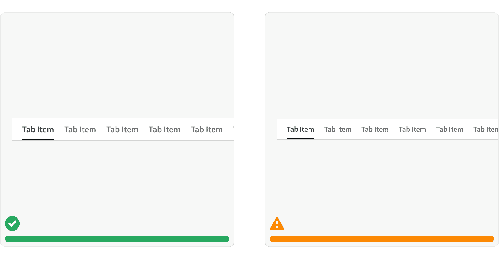
Tabs typically use our "default" size. Smaller tab sizes should be used sparingly.
More
Related Pages
Accessibility
Color contrast ratio for our Tab components meets AA standards, based on Web Content Accessibility Guidelines (WCAG) guidelines.
Benefits: People with low vision often have difficulty reading text that does not contrast with its background. This can be exacerbated if the person has a color vision deficiency that lowers the contrast even further. Providing a minimum luminance contrast ratio between the text and its background can make the text more readable even if the person does not see the full range of colors. It also works for the rare individuals who see no color.
Additional Reading
“8 Tips to Get Tabs Right in Web Design.” Justinmind, www.justinmind.com/blog/8-tips-to-get-tabs-right-in-web-design/.
World Leaders in Research-Based User Experience. “Tabs, Used Right.” Nielsen Norman Group, www.nngroup.com/articles/tabs-used-right/.
World Leaders in Research-Based User Experience. “Minimize Cognitive Load to Maximize Usability.” Nielsen Norman Group, www.nngroup.com/articles/minimize-cognitive-load/.