Anatomy
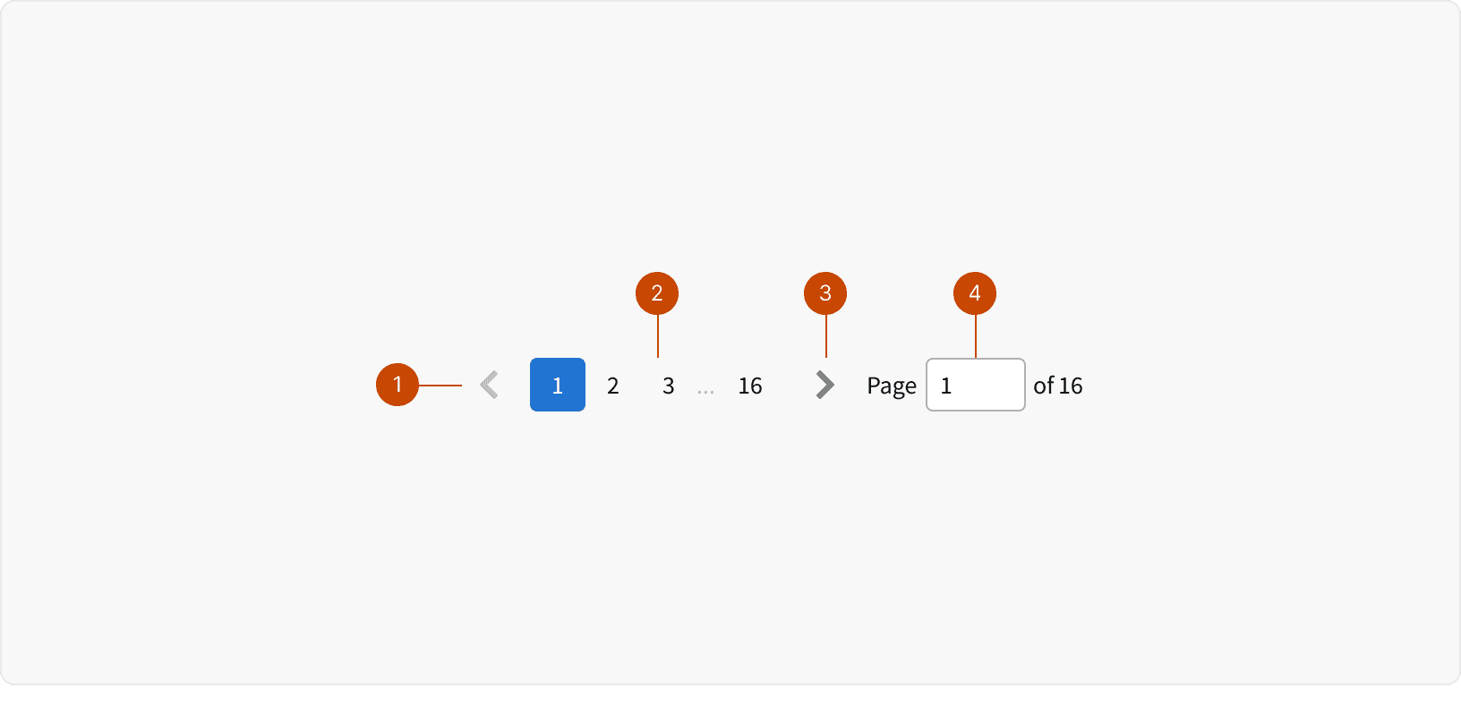
Icon Button
Page Buttons
Icon Button
Page Input
Behaviors
Page Buttons
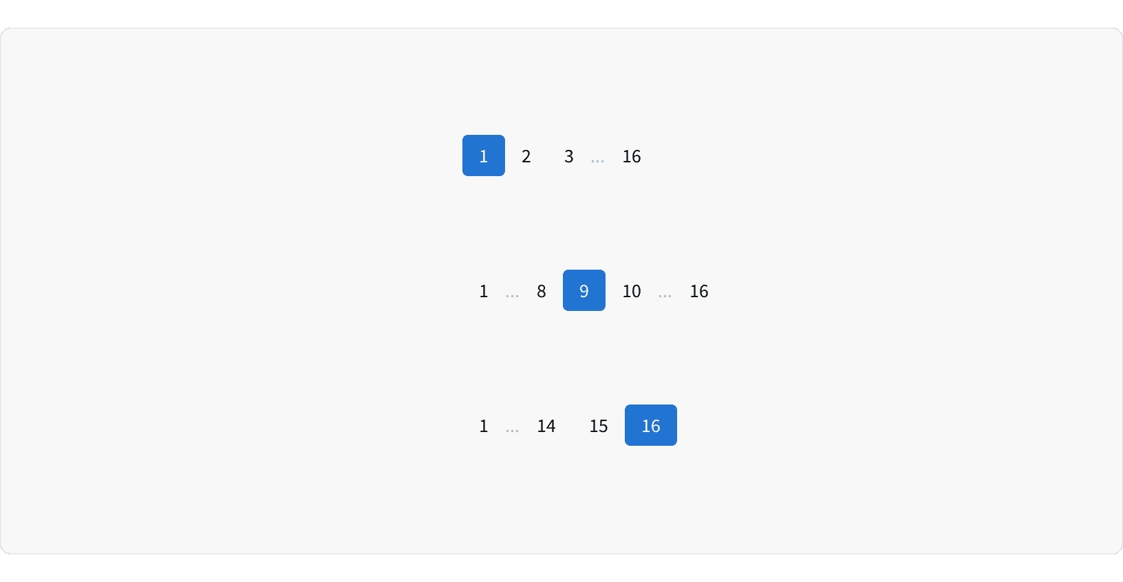
If there are more than 6 pages, an ellipsis will be shown to truncate the list. The first and last page button will always be visible. The page before and after the active page will also always be visible.
Page Input
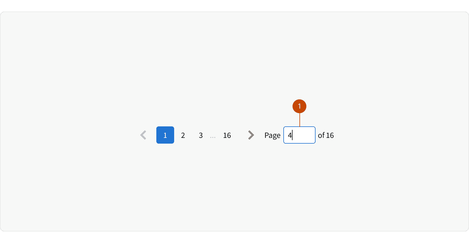
The page input allows users to quickly jump to a specific page. The user must type in a number and hit ⏎ enter. If the number is larger than the number of pages, the last page will be selected. The text to the right of the input displays the number of items you are currently viewing and the total number of items.
Responsive
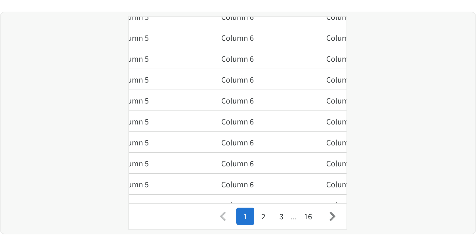
At the small breakpoint the Page Input becomes hidden.
Best Practices
1. When to Use
Pagination should be used when there is a large amount of content that can't be shown in one view and needs to be broken down into multiple pages.
2. Loading State
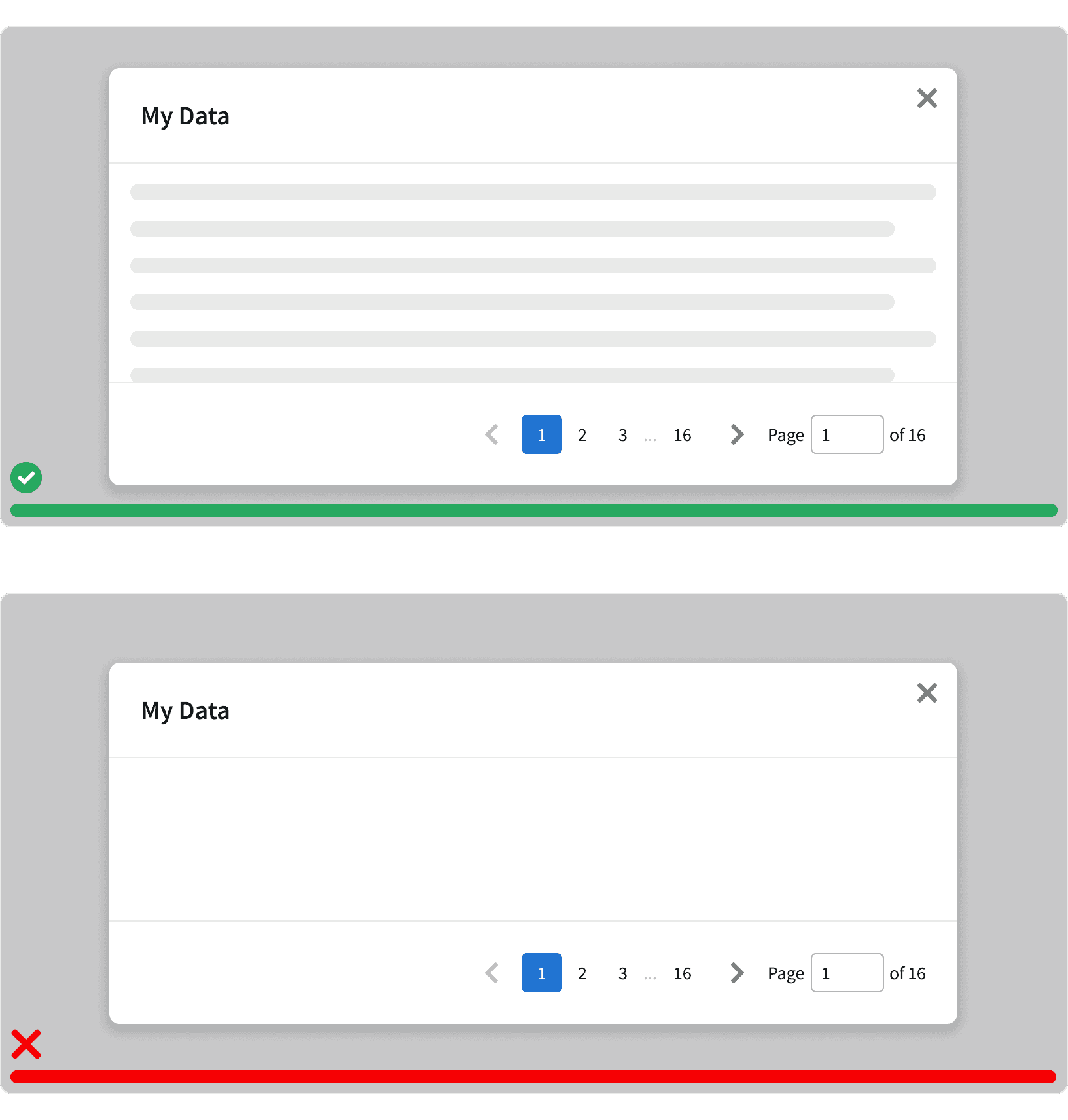
If the content takes longer than 2 seconds to load, then a Loader should be displayed.
3. Visibility
Make sure that the pagination is visible and easy to find in relation to the content. No other elements should separate the pagination from the content.
4. Scrolling
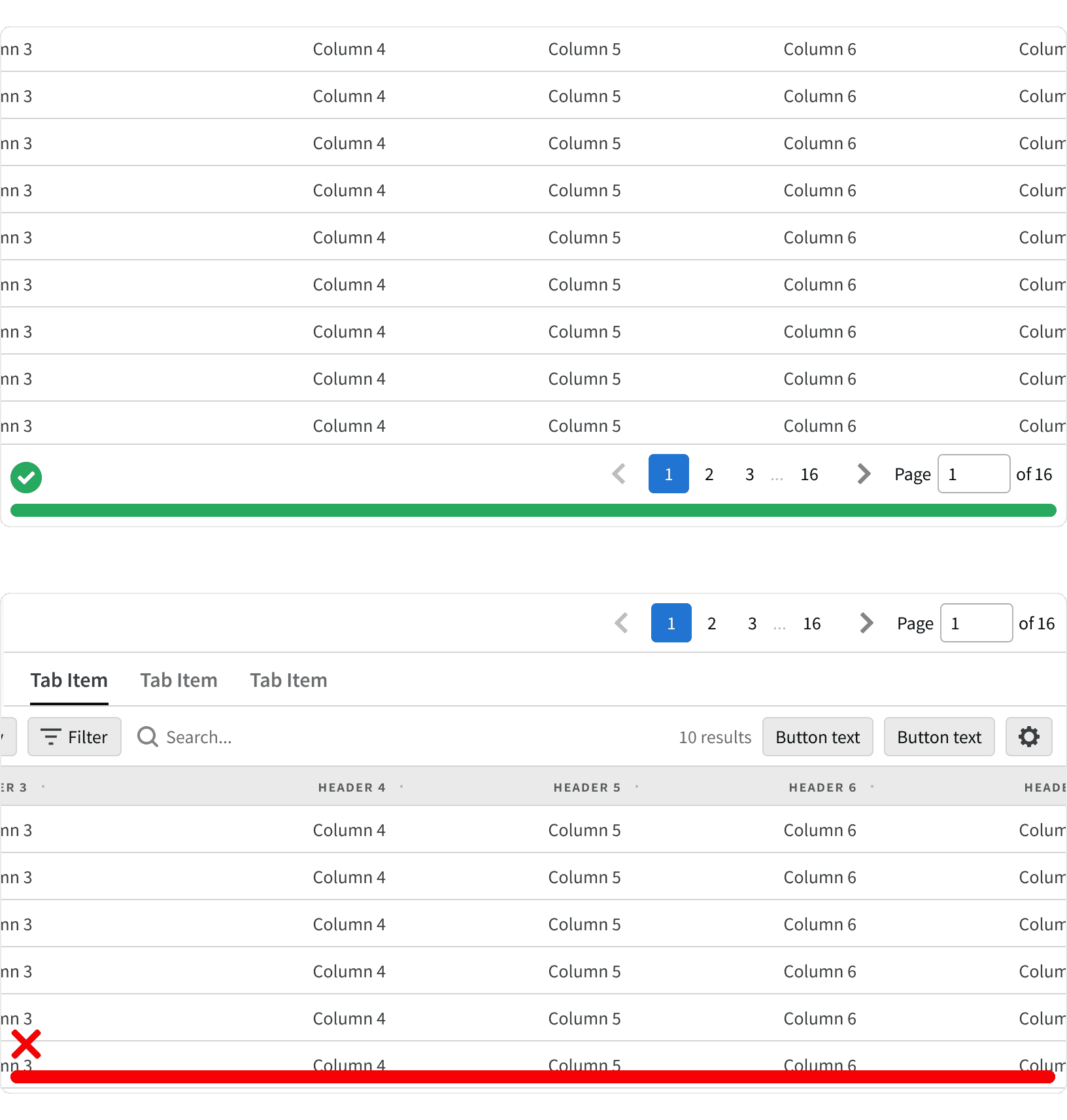
If there is scrollable content, the pagination should be displayed in a container that is fixed and always visible below the content. Avoid hiding the pagination at the bottom of scrollable content. The container should have a top border. When used within a modal, the pagination should be displayed in the modal footer.
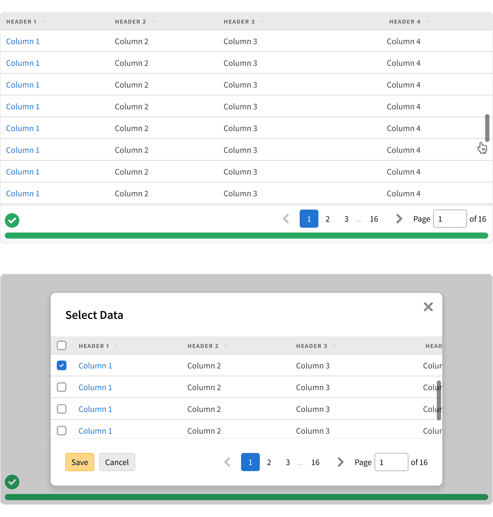
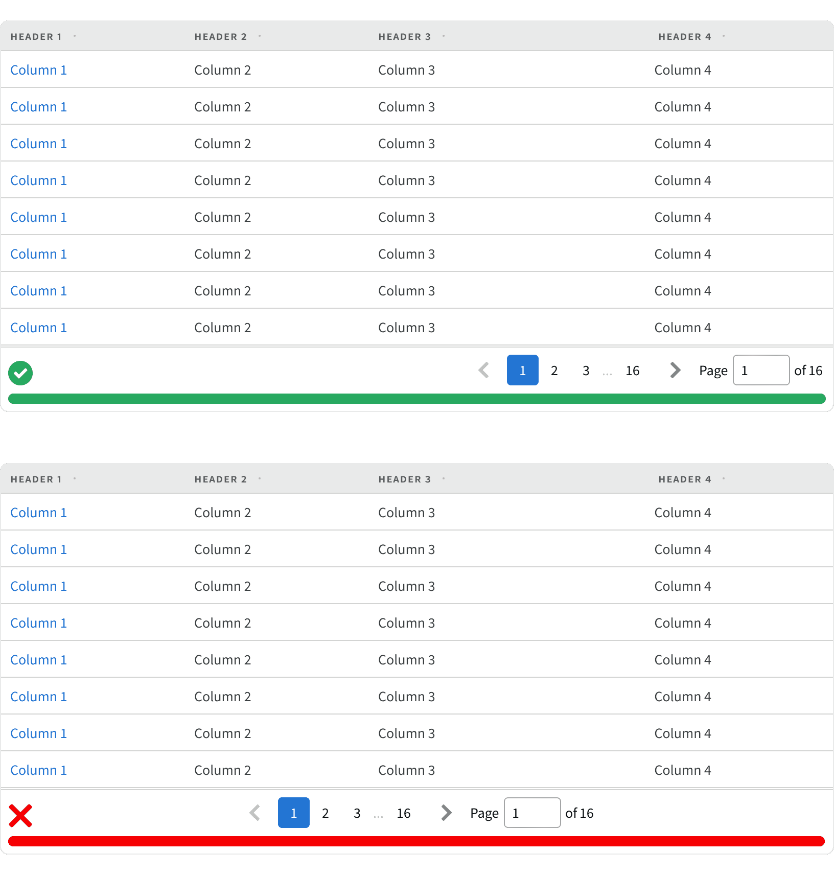
5. Alignment
The pagination should be aligned to the right side of it's container below the page content.
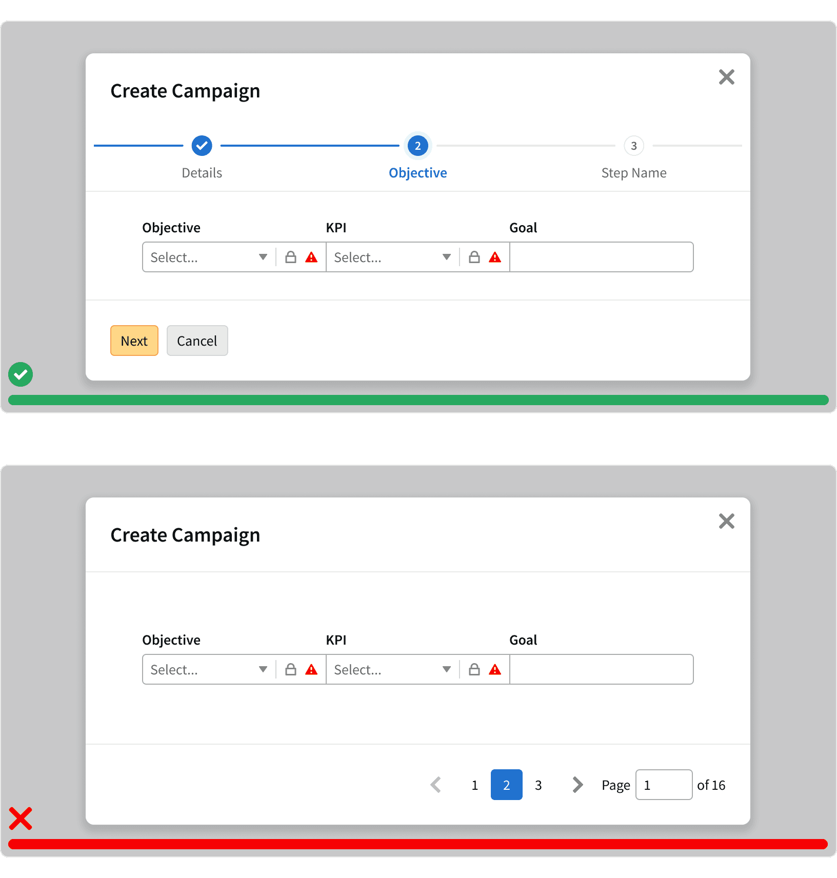
6. Pagination vs Step Progress
Pagination shouldn't be used to break up user work flows. Use a Step Progress Bar instead.
7. Pagination vs Infinite scroll
Pagination should be used when the user is looking for something specific such as a campaign or line item. Infinite scrolling should be used for content discovery such as browsing report templates.
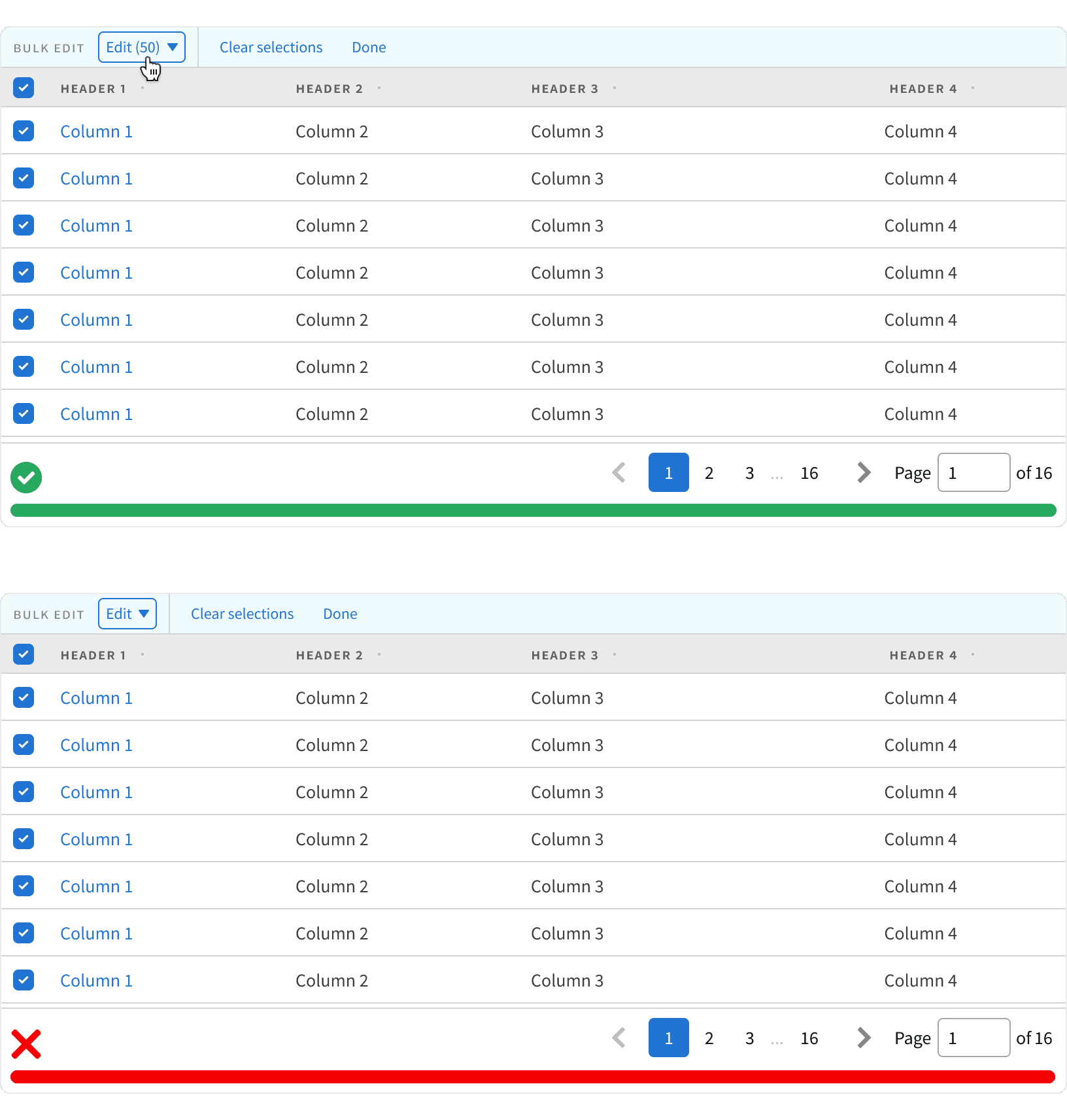
8. Bulk edit
If paginated content can be bulk edited, only the visible items will be edited. Provide a count in the UI that tells the user that they are editing only the visible items. If the user navigates to a new page using the pagination, the selections from the previous page will be lost, and the count will reset to none.
More
Related Pages
Accessibility
Color contrast ratio for our Pagination meets AA standards, based on Web Content Accessibility Guidelines (WCAG) guidelines.
Benefits: People with low vision often have difficulty reading text that does not contrast with its background. This can be exacerbated if the person has a color vision deficiency that lowers the contrast even further. Providing a minimum luminescence contrast ratio between the text and its background can make the text more readable even if the person does not see the full range of colors. It also works for the rare individuals who see no color.
Additional Reading
Best practices for designing Pagination in web https://uxdesign.cc/ui-cheat-sheet-pagination-infinite-scroll-and-the-load-more-button-e5c452e279a8
UX: Infinite Scrolling vs. Pagination https://uxplanet.org/ux-infinite-scrolling-vs-pagination-1030d29376f1
UI cheat sheet: pagination, infinite scroll and the load more button https://medium.com/uxness/best-practices-for-designing-pagination-in-web-1c33140f31b
