Variants
Checkbox
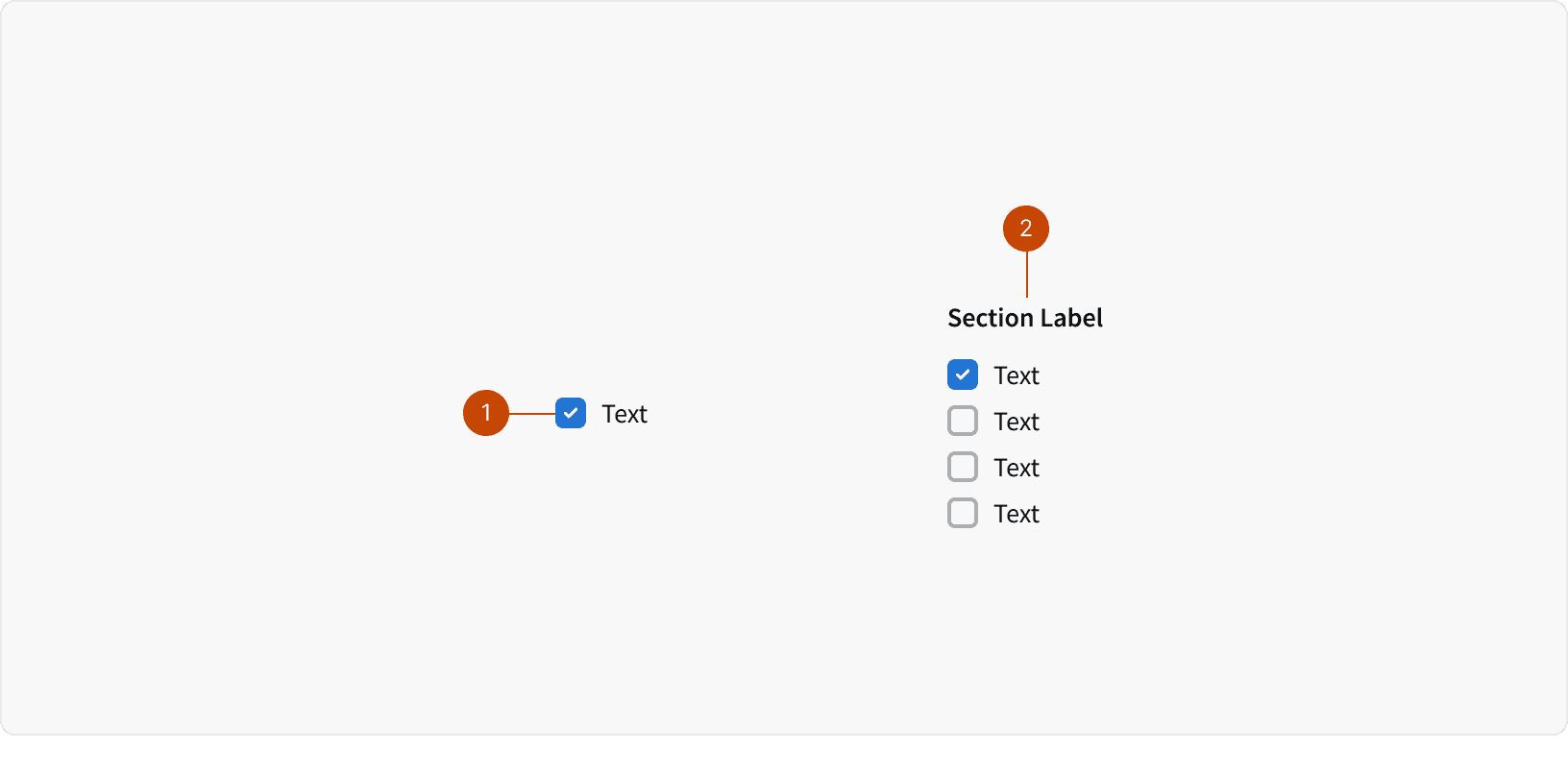
Checkbox Group
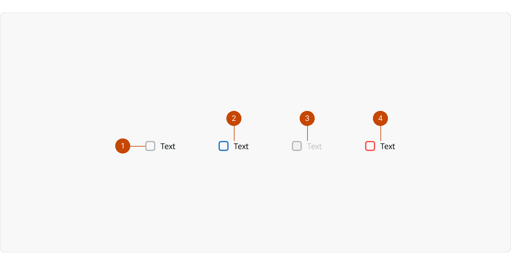
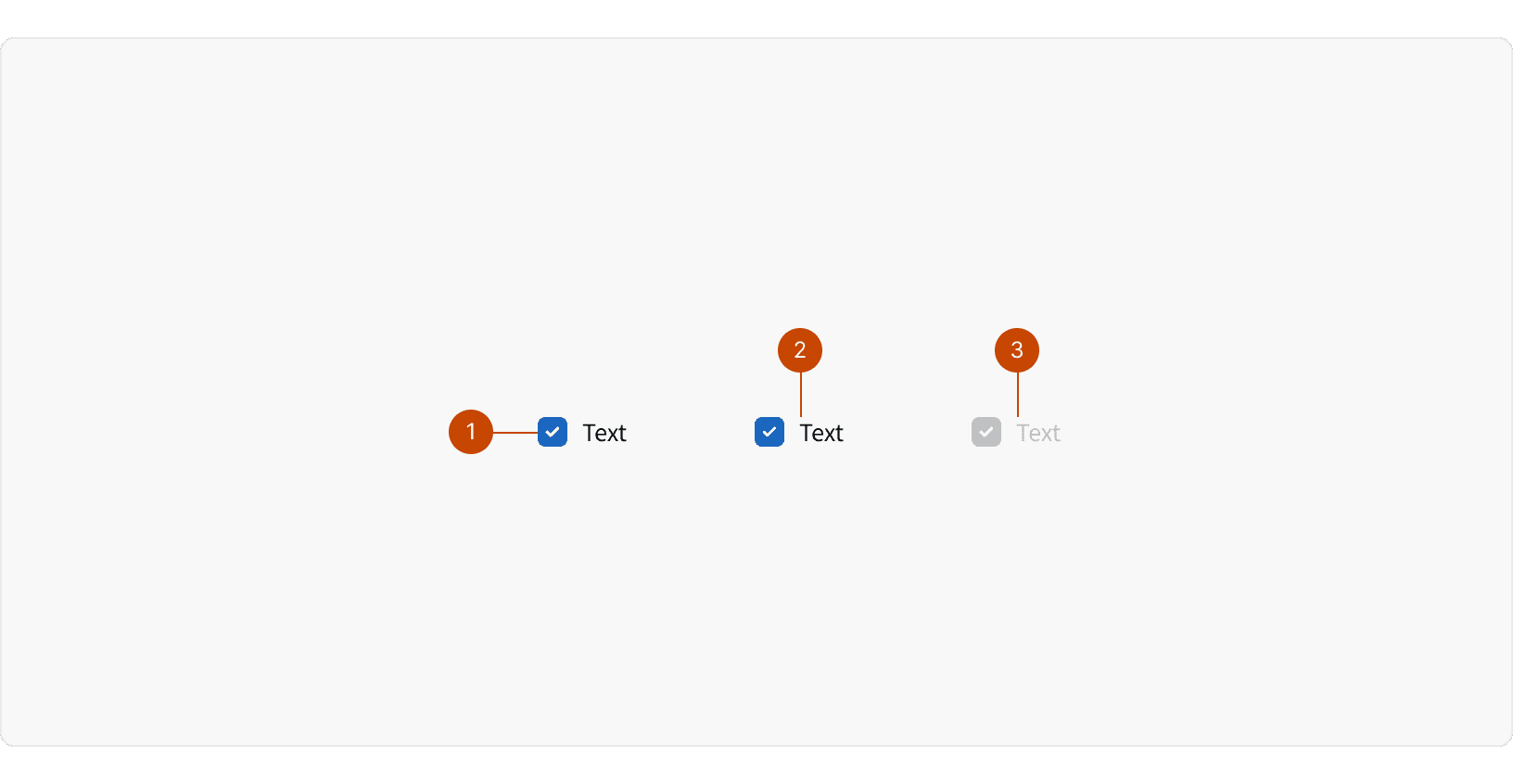
States
Best Practices
1. States
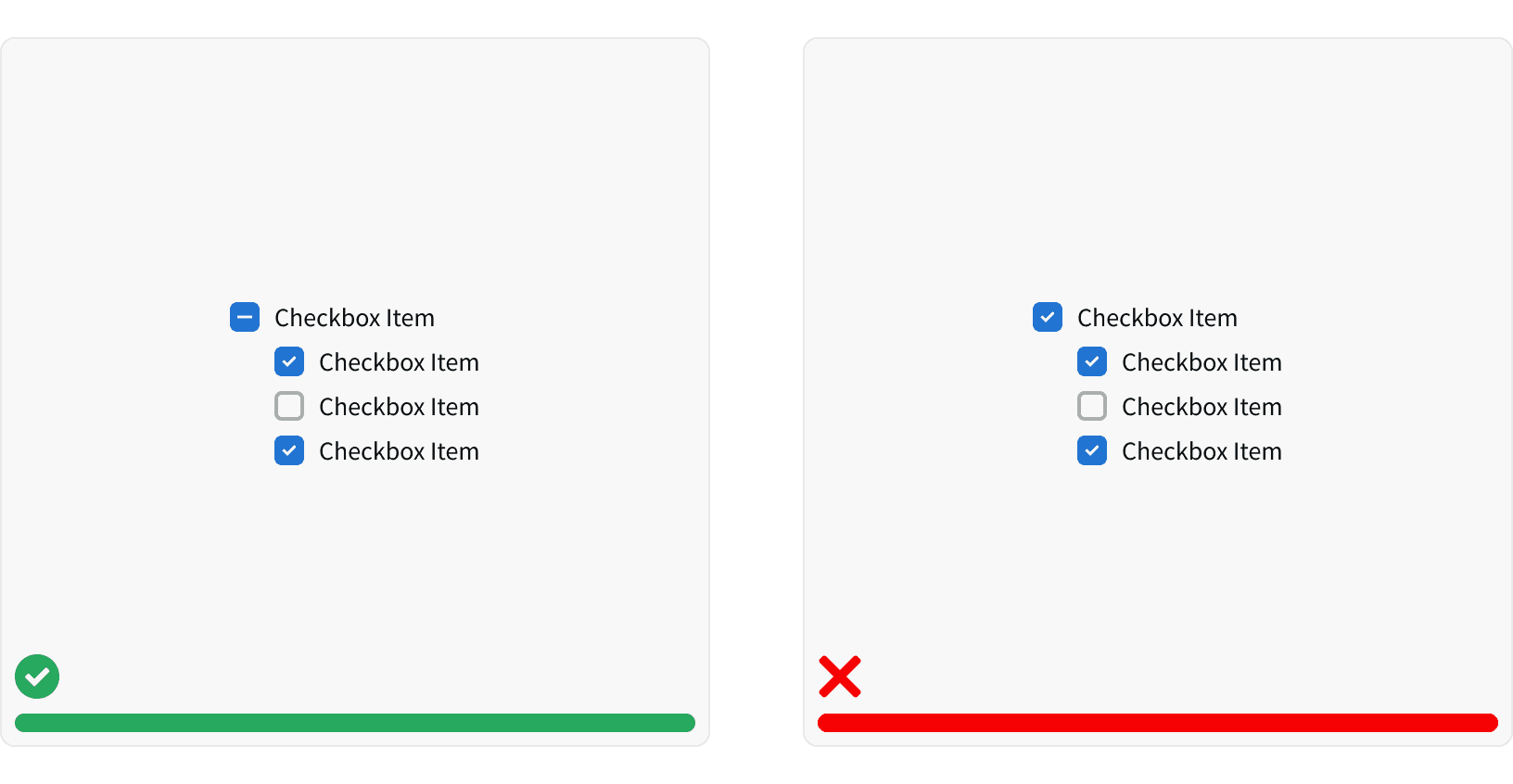
Checkboxes are either unselected or selected. The checkbox can have an additional, "indeterminate" state if they they use a hierarchical structure. Clicking on a checkbox in an indeterminate state sets the state of that checkbox, and all other controls affected by it, to the "selected" state.
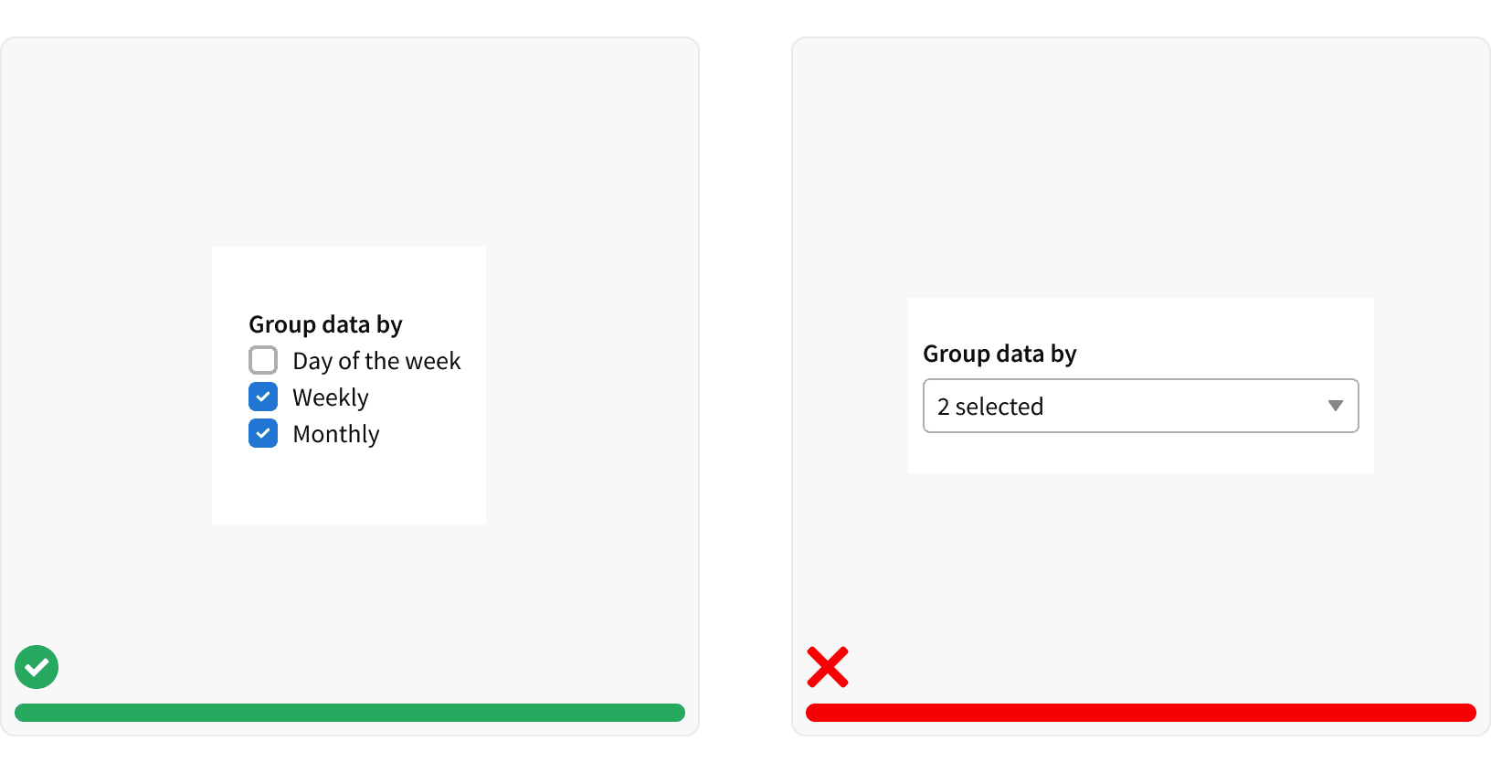
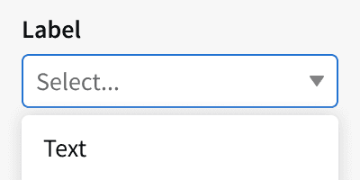
2. Checkboxes vs Dropdowns
Use Checkboxes over Multi-select Dropdowns where space permits. This allows all options to be visible to the user, who can easily compare them.¹
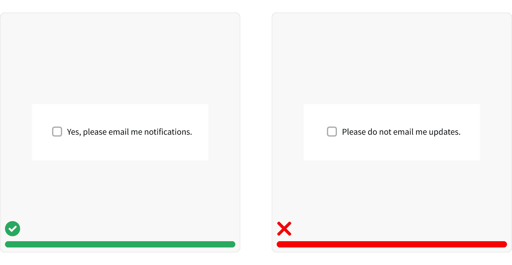
3. Positive and Active
Use positive and active wording for checkbox labels, so that it's clear what will happen if the user turns on the checkbox. Avoid negations which would mean that the user would have to check the box in order for something not to happen. Opt-in scenarios should also be unchecked by default.¹
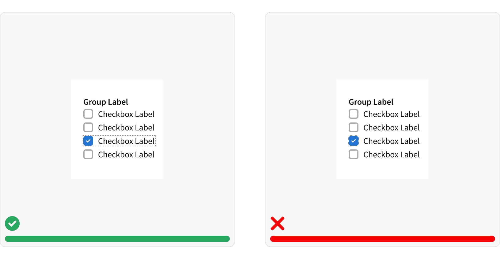
4. Click area
Users should be able to select an option by clicking on the Checkbox or the label associated with it. A larger target area helps prevent user error and allows them to quickly execute their tasks.¹
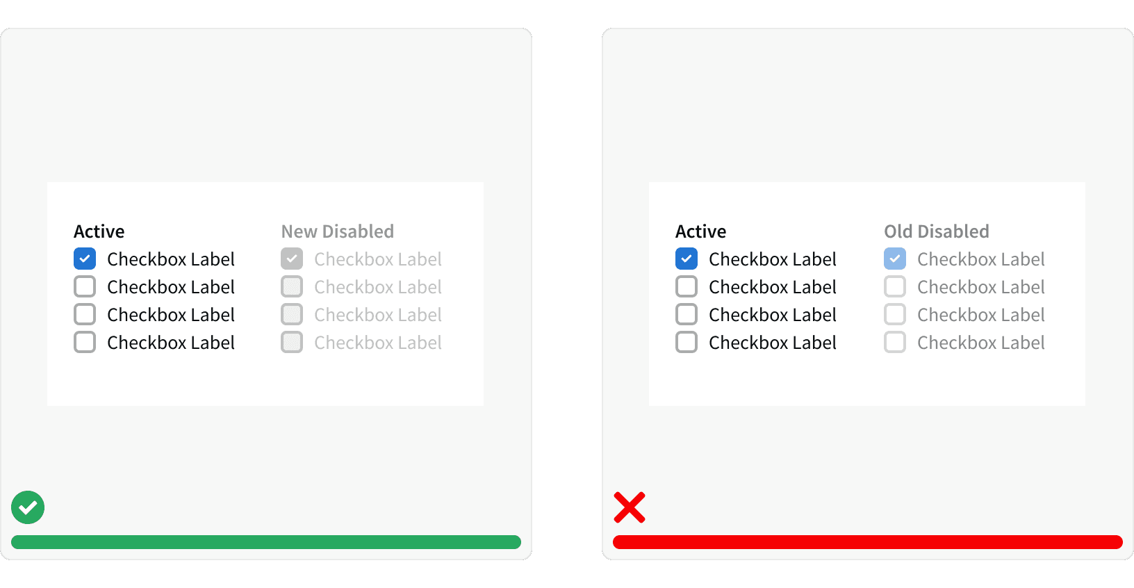
5. Disabled States
Use our new disabled styling on Checkboxes and don’t change the opacity to indicate a disabled state. The old styling was not AA compliant and made it difficult for the user to tell that something was intentionally greyed out and disabled.²
More
Related Pages
Accessibility
Color contrast ratio for our Radio Buttons meets AA standards, based on Web Content Accessibility Guidelines (WCAG) guidelines.
Benefits: People with low vision often have difficulty reading text that does not contrast with its background. This can be exacerbated if the person has a color vision deficiency that lowers the contrast even further. Providing a minimum luminance contrast ratio between the text and its background can make the text more readable even if the person does not see the full range of colors. It also works for the rare individuals who see no color.²
Developer Guidelines
States and attributes
Convey the state of the checkbox automatically.³
Use the
disabledprop to apply the HTMLdisabledattribute to the checkbox<input>. This prevents users from being able to interact with the checkbox, and conveys its inactive state to assistive technologies.³Setting
value="indeterminate"conveys the state of the checkbox.³
Labeling
The required
labelelement conveys the purpose of the checkbox to all users.³The label must have a
forattribute with a value that matches the uniqueidattribute of its associated radio<input>.³
Keyboard support
Move focus to each checkbox using the tab key (or shift + tab when tabbing backwards).³
To interact with the checkbox when it has keyboard focus, press the space key.³
Additional Reading
World Leaders in Research-Based User Experience. “Checkboxes vs. Radio Buttons.” Nielsen Norman Group, www.nngroup.com/articles/checkboxes-vs-radio-buttons/.
“Web Content Accessibility Guidelines (WCAG) 2.0.” W3C, www.w3.org/TR/WCAG20/.
“Checkbox.” Shopify Polaris, polaris.shopify.com/components/forms/checkbox
World Leaders in Research-Based User Experience. “Toggle-Switch Guidelines.” Nielsen Norman Group, www.nngroup.com/articles/toggle-switch-guidelines/.