States
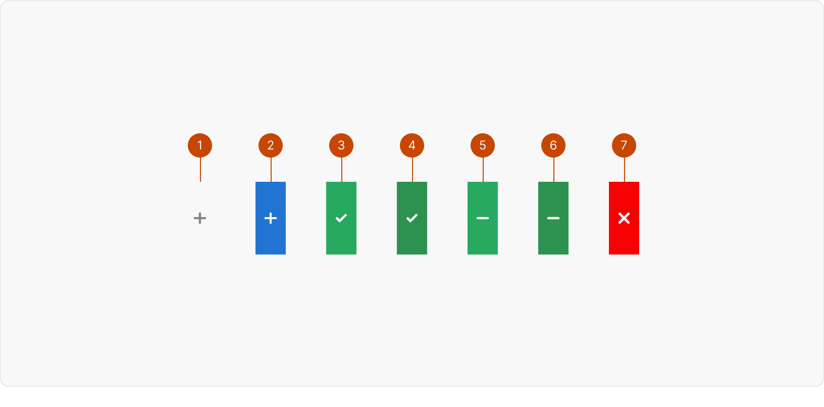
Default
Hover
Checked
Checked: Hover
Intermediate
Intermediate: Hover
Remove
Best Practices
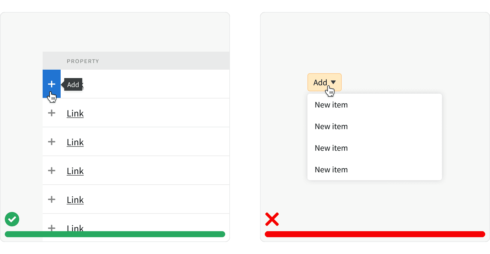
1. Row Selector vs Dropdown Button
The Row Selector should be used instead of the Dropdown Button when adding multiple items from a large list. If the list is short and the user is making a single selection, then a Dropdown Button may be used.
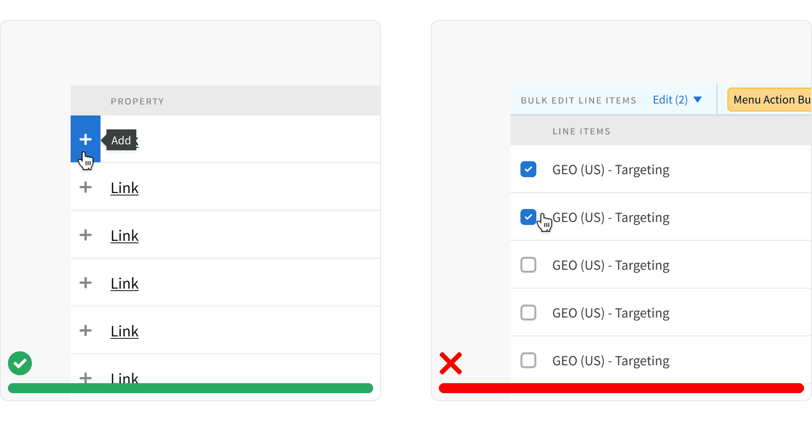
2. Row Selector vs Checkbox
The Row Selector should be used instead of the checkbox when selecting multiple items to add to a parent item. If the user is selecting multiple items in order to bulk edit those items, then a Checkbox may be used.
3. Tooltip
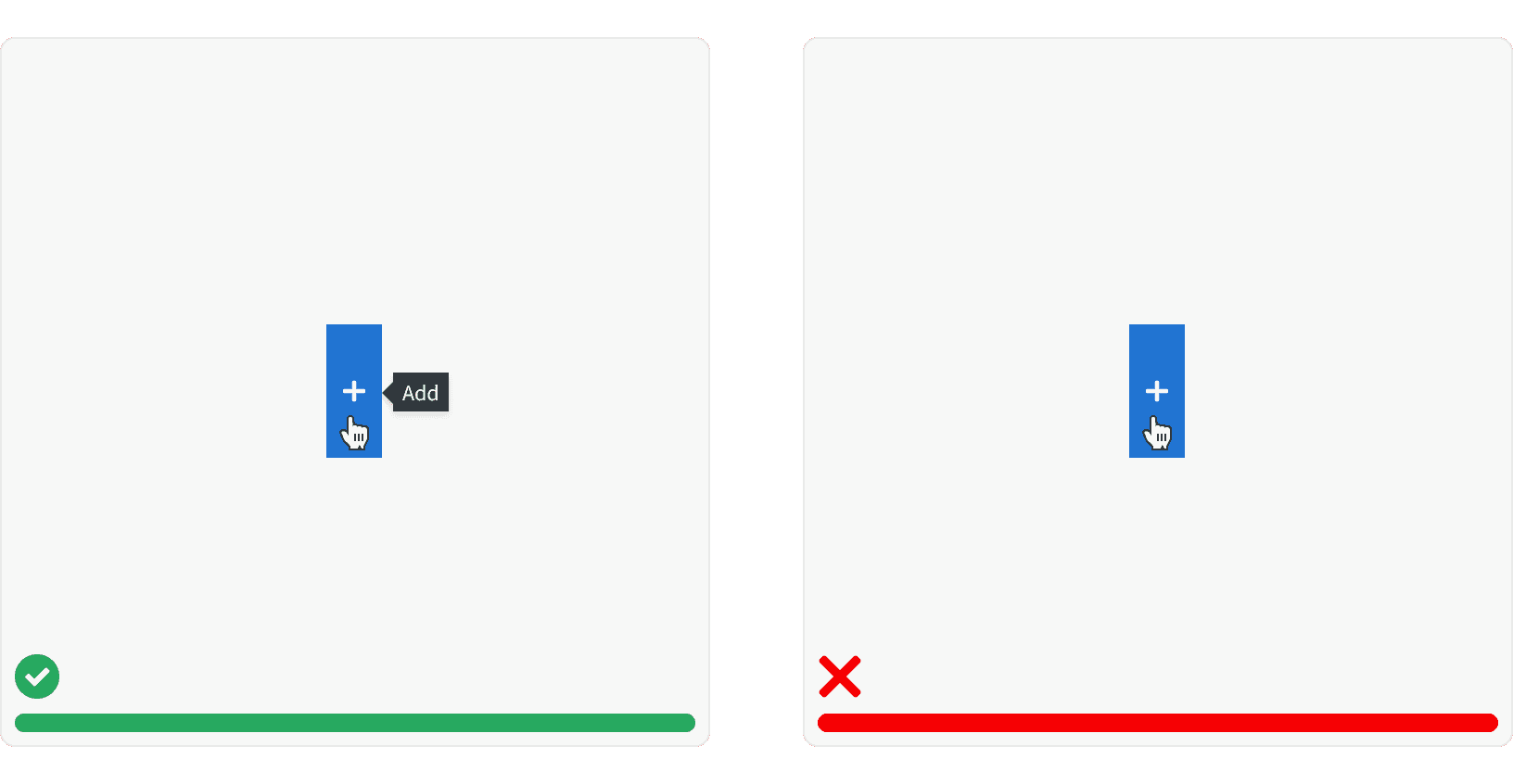
All Row Selectors are required to have a tooltip explaining the action to the user.
4. Single Action
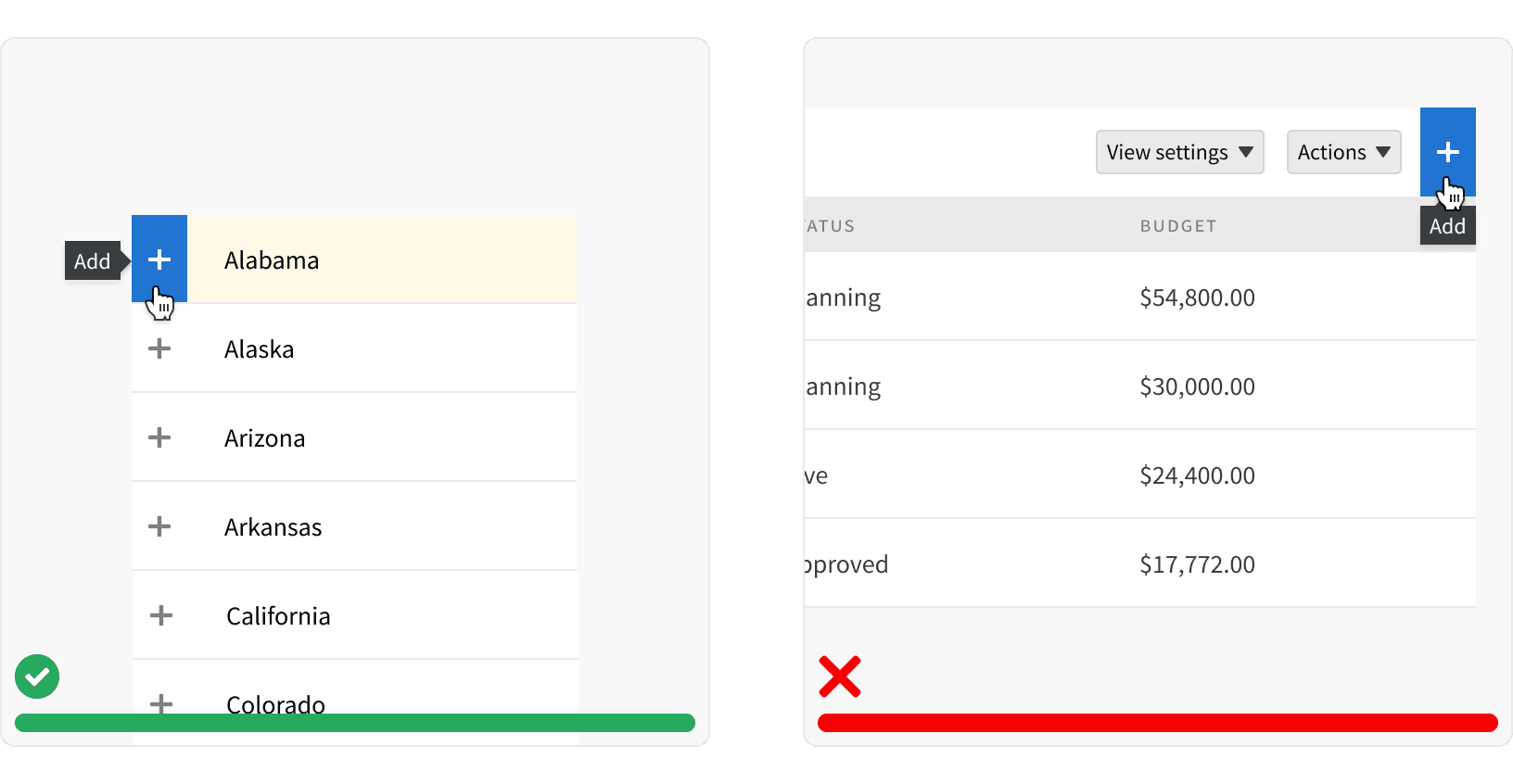
Row Selectors should only be used as single actions within list items. They should not be placed in bars or containers and should not be combined with other actions.
5. Multiple Instances
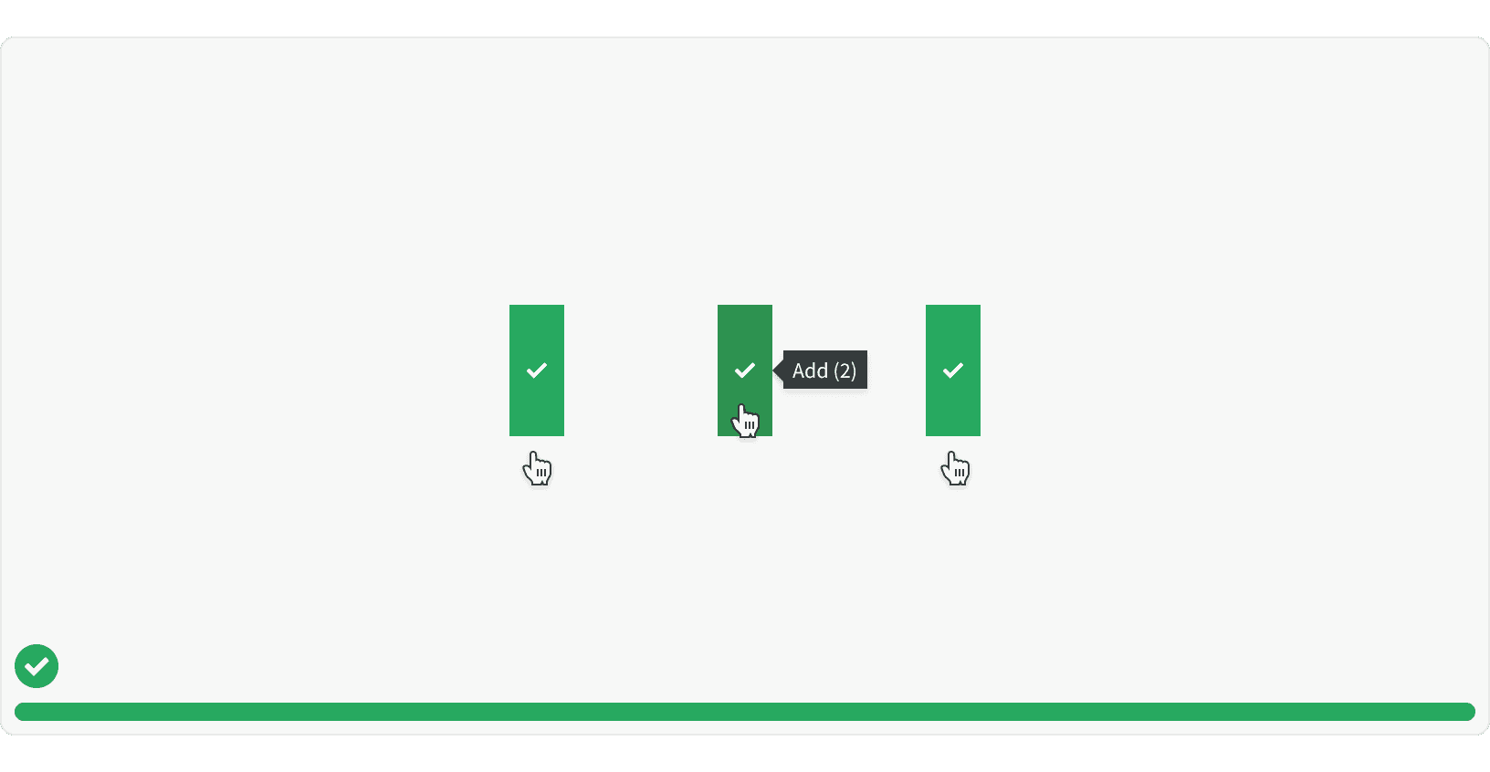
Row Selectors may be used to add multiple instances of the same item to the parent item. Once a single instance has been added, the user can hover again to show the plus icon and add a second instance.
More
Related Pages
Accessibility
Color contrast ratio for our Row Selector meets AA standards, based on Web Content Accessibility Guidelines (WCAG) guidelines.
Benefits: People with low vision often have difficulty reading text that does not contrast with its background. This can be exacerbated if the person has a color vision deficiency that lowers the contrast even further. Providing a minimum luminance contrast ratio between the text and its background can make the text more readable even if the person does not see the full range of colors. It also works for the rare individuals who see no color.¹
Additional Reading
Fitts's Law https://lawsofux.com/fittss-law.html
Fitts's Law: The Importance of Size and Distance in UI Design https://www.interaction-design.org/literature/article/fitts-s-law-the-importance-of-size-and-distance-in-ui-design search g_translate
