Anatomy
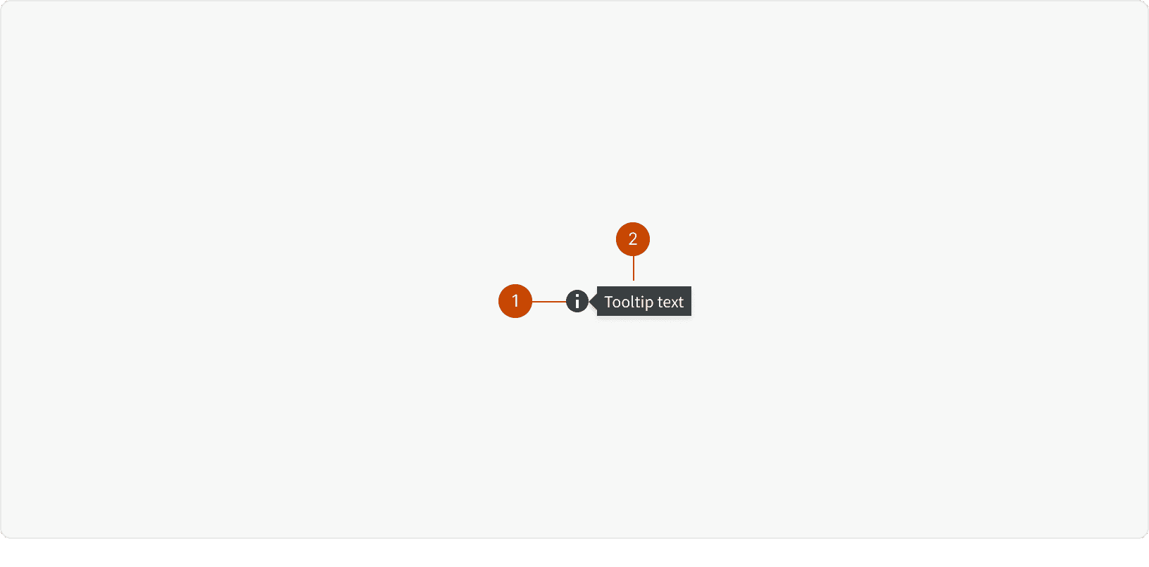
Icon
Tooltip
States
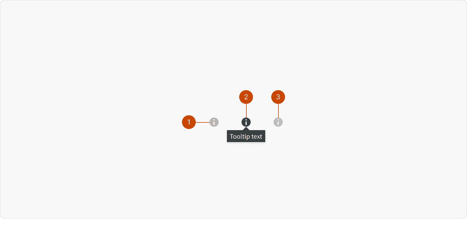
Default
Hover
Disabled
Best Practices
1. Usage
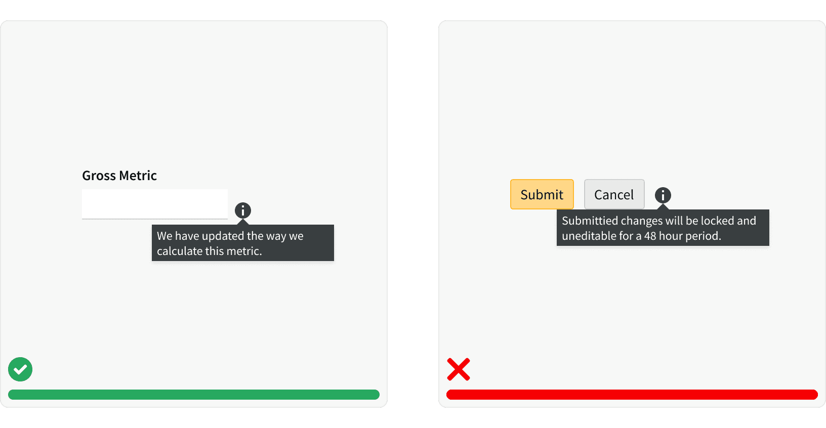
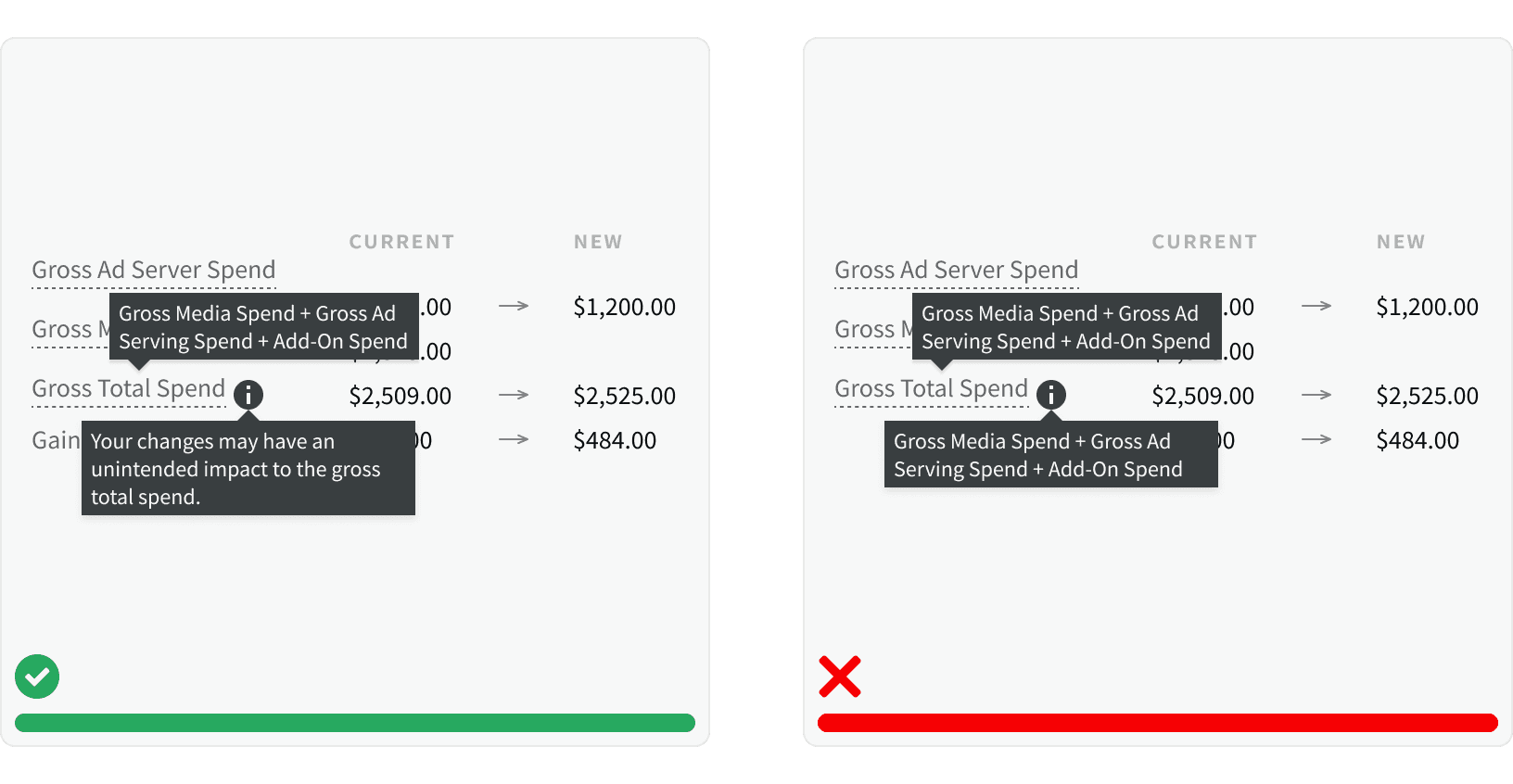
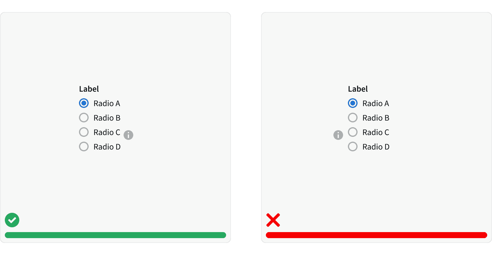
Don't use infotips to call out information that is vital to task completion. Infotips are best used when they provide additional, but non-critical information about a function or element on the screen. Since infotips display a tooltip, the same guidelines for using tooltips apply.
2. Short and Concise
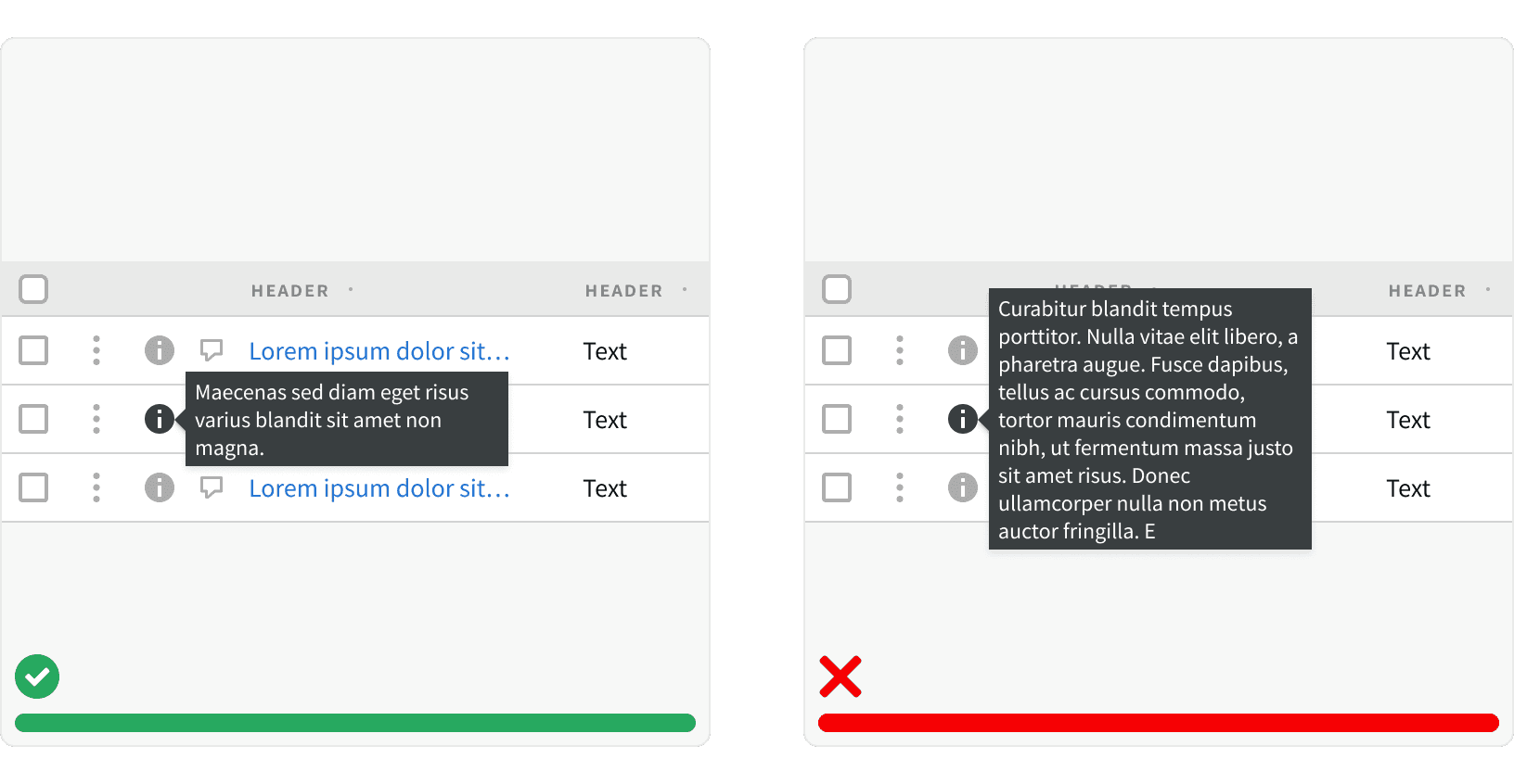
Keep the information short and concise. 2-3 lines is the recommended length. Long blocks of text can be difficult to read and can obscure related content.
3. Auxiliary Information
Don't use an infotip to provide redundant information. Infotips should only provide auxiliary information. Infotips can be used in conjunction with a dotted link tooltip if additional, supportive information is needed.
4. Placement
Position infotips to the right of the element they are supporting.
More
Related Pages

Accessibility
Infotips should trigger on both 'hover' and 'focus.' Do not have infotip tooltips appear on click. Tooltips that rely only on hover are inaccessible to users not using a mouse.¹
Color contrast ratio for our infotip meets AAA standards, based on Web Content Accessibility Guidelines (WCAG) guidelines.
Benefits: People with low vision often have difficulty reading text that does not contrast with its background. This can be exacerbated if the person has a color vision deficiency that lowers the contrast even further. Providing a minimum luminance contrast ratio between the text and its background can make the text more readable even if the person does not see the full range of colors. It also works for the rare individuals who see no color.²
Developer guidelines: When the user focuses on the infotip icon and triggers a tooltip, a hidden copy of the tooltip text should be included in the HTML for the triggering element, so that it is accessible to those using assistive technologies. Or, alternatively, the tooltip itself can be made tab-focusable, so that a mousedown/keydown on the triggering element forces tab focus to move onto the tooltip element.³
Additional Reading
World Leaders in Research-Based User Experience. “Indicators, Validations, and Notifications: Pick the Correct Communication Option.” Nielsen Norman Group, https://www.nngroup.com/articles/indicators-validations-notifications/.
“Web Content Accessibility Guidelines (WCAG) 2.0.” W3C, www.w3.org/TR/WCAG20/.
“Tooltip Widgets (or: Screen Tip, Balloon).” Accessibility Developer Guide, www.accessibility-developer-guide.com/examples/widgets/tooltips/.