Anatomy
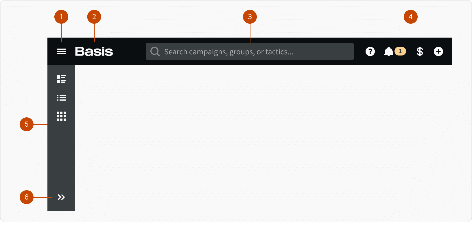
Menu
Logo
Universal Search
App Nav
App Drawer
Expand / Collapse
States
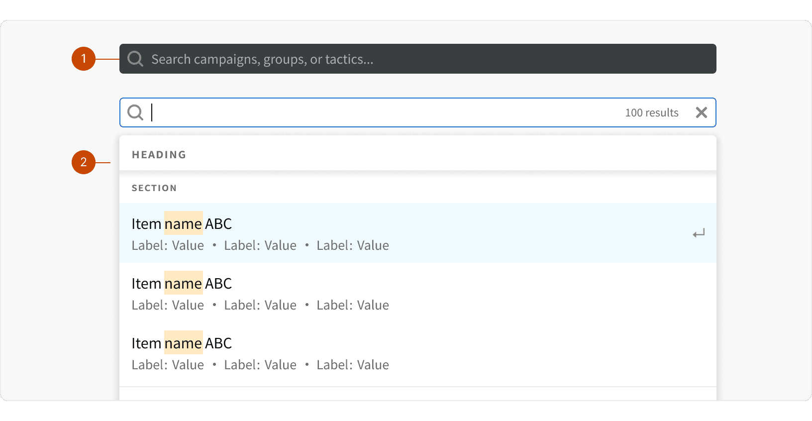
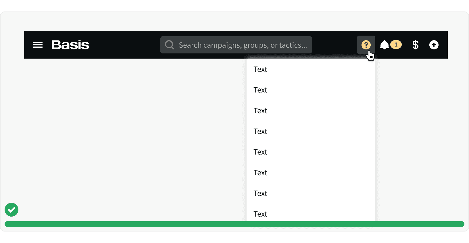
Universal Search
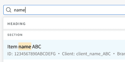
The app header Universal Search uses the Dynamic Search component to allow use to search across campaigns, groups and tactics.
Default
Active
App Drawer
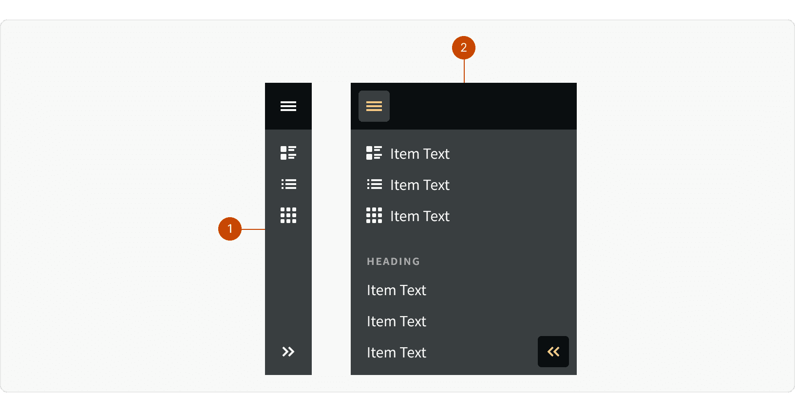
Collapsed
Expanded
Behaviors
Breakpoint Behavior
App Header
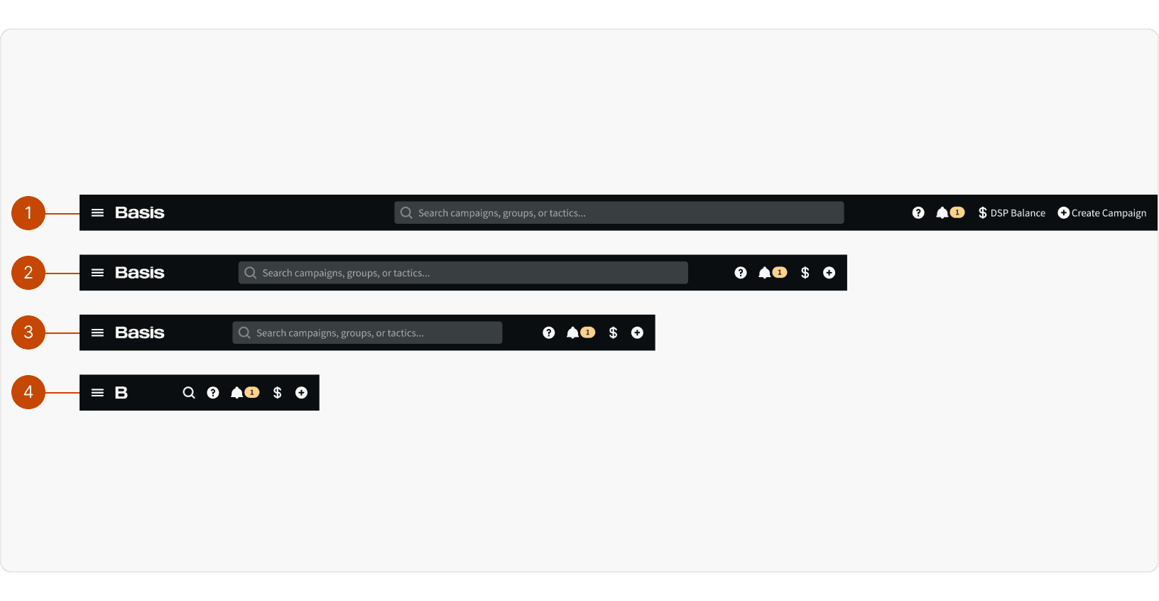
X-large: Right side navigation items display visible labels.
Large: Right side navigation items labels become hidden
Medium: Search input becomes more narrow
Small: App logo becomes smaller and search input becomes a button
App Drawer
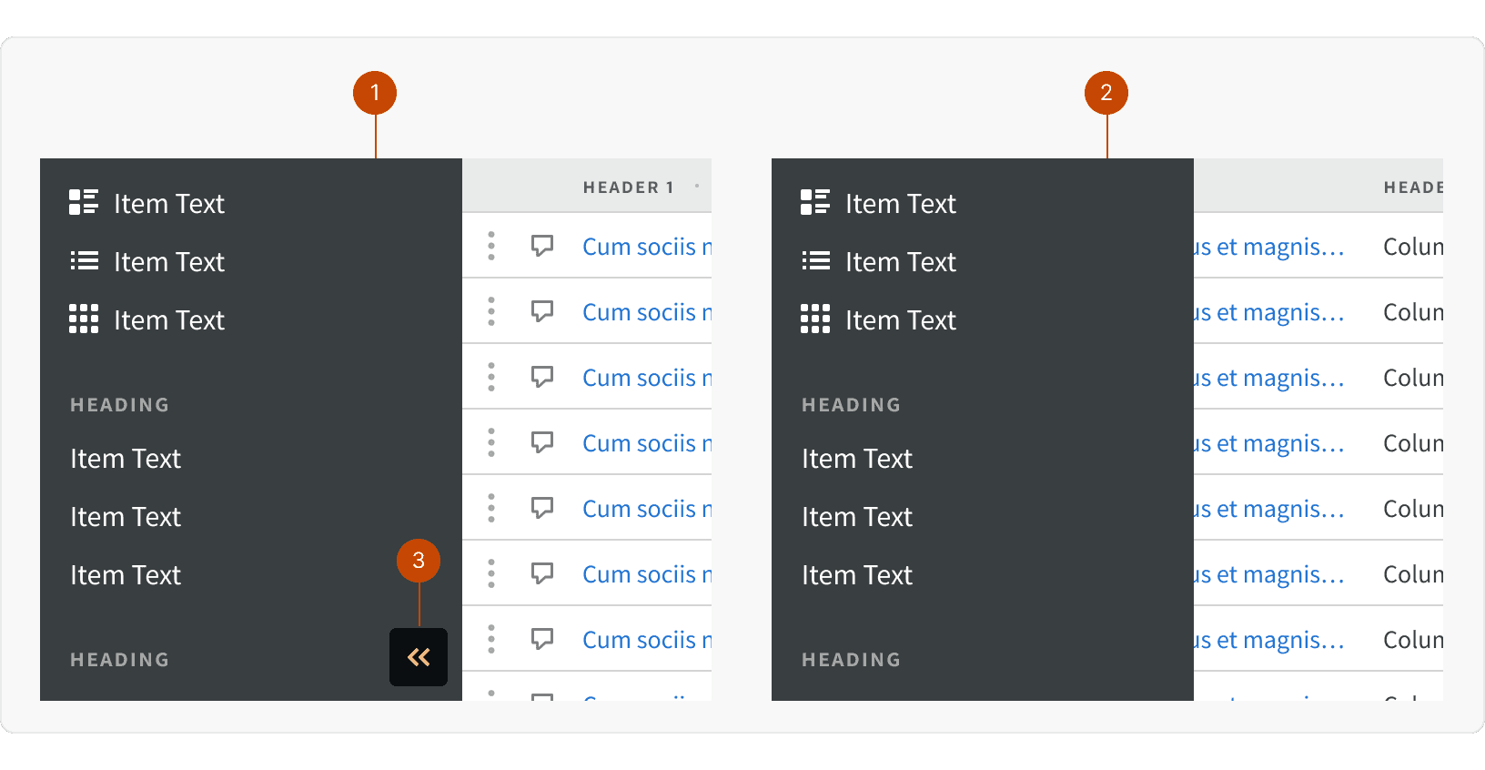
X-large: When expanded, app drawer will push page content to the right and can remain open when user is working. An addition expand/collapse button will be available at the bottom of the component
Large and below: When expanded, the app drawer will display over top of the page content and will collapse when the user interacts with the page content.
Best Practices
1. Global
The app header should be displayed globally across all pages. The app header provides a familiar and persistent way for user to navigate. The app header should be hidden is if a modal is open.
2. Consistent
The content of of the app header should remain consistent across all pages. For pages such as the login page, where the user is unauthenticated, a version of the app header with only the logo may be used.
3. Fixed
If the page has scrollable content, the app header should remain fixed and visible at the top of the screen.
4. Hover States
The nav items should display a visible hover state. If a nav item opens a menu or a tooltip, the nav item should remain in an active state.
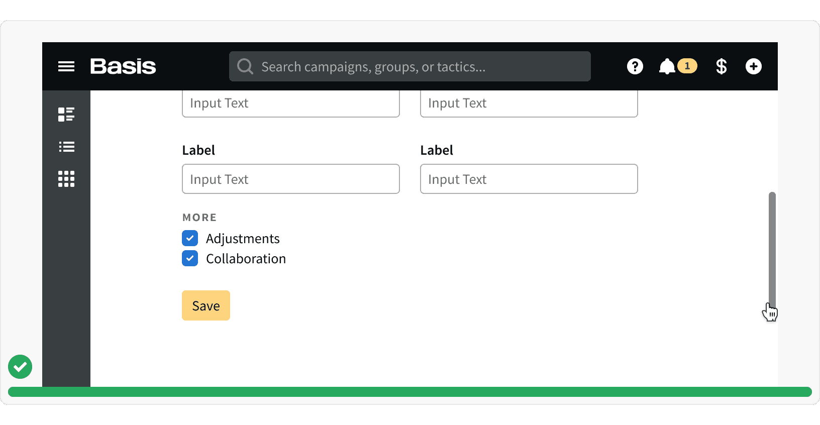
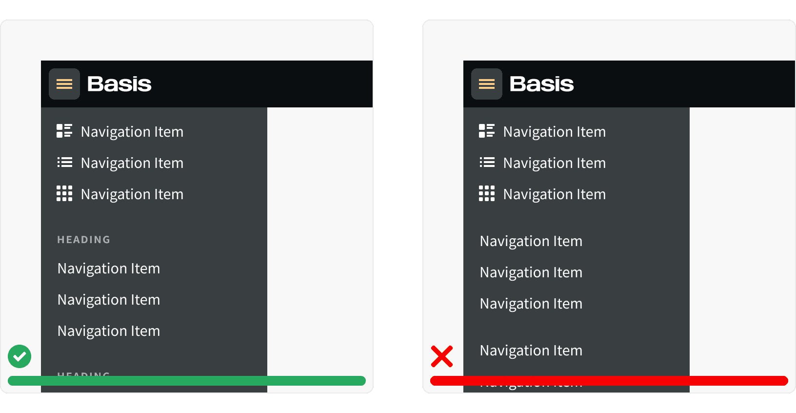
5. Navigation Item Grouping
Navigation items in the app drawer should be grouped with similar items. These groupings should include a heading that describes the group.
More
Related Pages
Accessibility
When hovering on the nav items icons, a title tag should be displayed to show the name of the item.
All app header content color should follow contrast ratio AA standards, based on Web Content Accessibility Guidelines (WCAG) guidelines.
Benefits: People with low vision often have difficulty reading text that does not contrast with its background. This can be exacerbated if the person has a color vision deficiency that lowers the contrast even further. Providing a minimum luminance contrast ratio between the text and its background can make the text more readable even if the person does not see the full range of colors. It also works for the rare individuals who see no color.¹
Additional Reading
The Fastest Navigation Layout for a Three-Level Menu https://uxmovement.com/navigation/the-fastest-navigation-layout-for-a-three-level-menu/
The Rules for Modern Navigation https://www.uxbooth.com/articles/the-rules-for-modern-navigation/