Anatomy
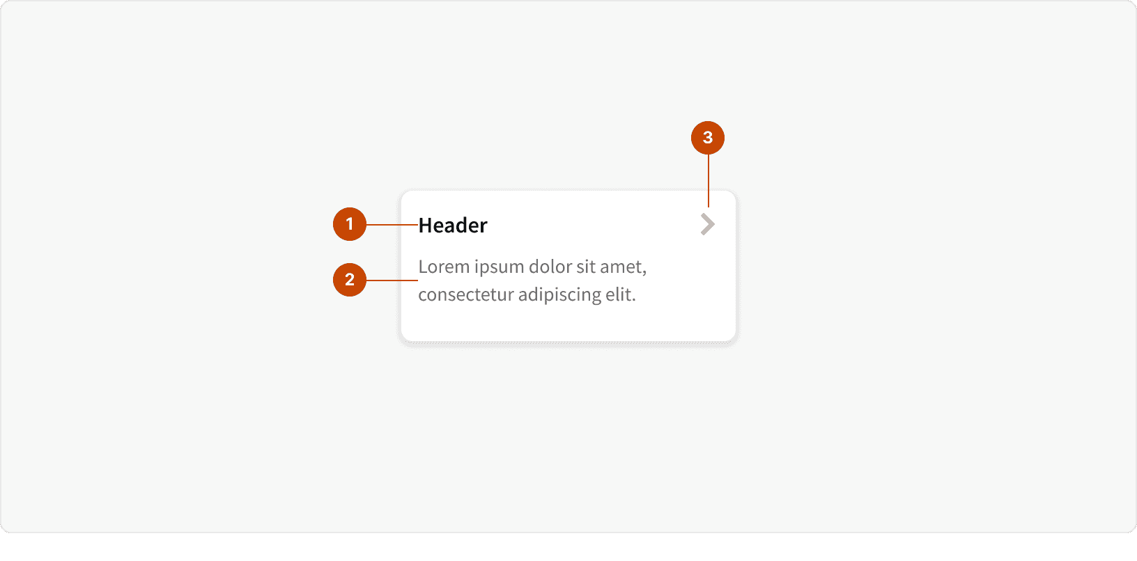
Header: The title of the card, providing a brief context or summary of the content.
Content: Contains the main content of the card, which could be text, numbers, or other elements.
Action: Indicates additional actions or navigational cues. This will change depending on the card variant.
Variants
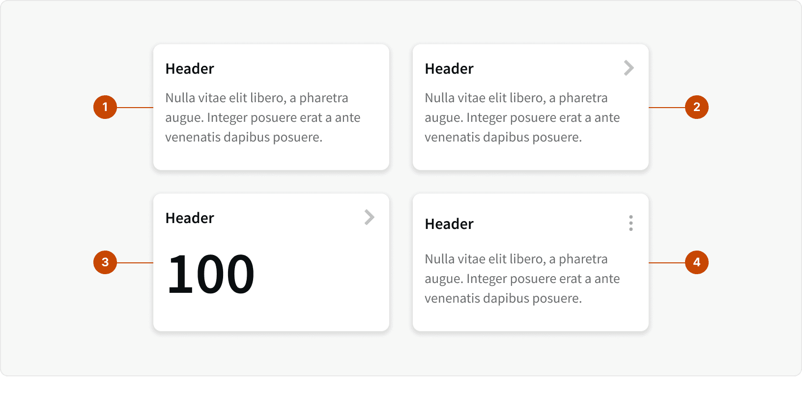
Select: This card is designed to allow users to select from multiple options. These can be used to allow single selection or multiple selections.
Navigate: This card includes a chevron icon, indicating that the card can be clicked or tapped to navigate to another page.
Metric: Designed to highlight numerical data prominently within the card body, making it suitable for dashboards and analytics.
Contextual Menu: This card variant includes a contextual menu, allowing users to access additional actions or settings related to the card content.
States
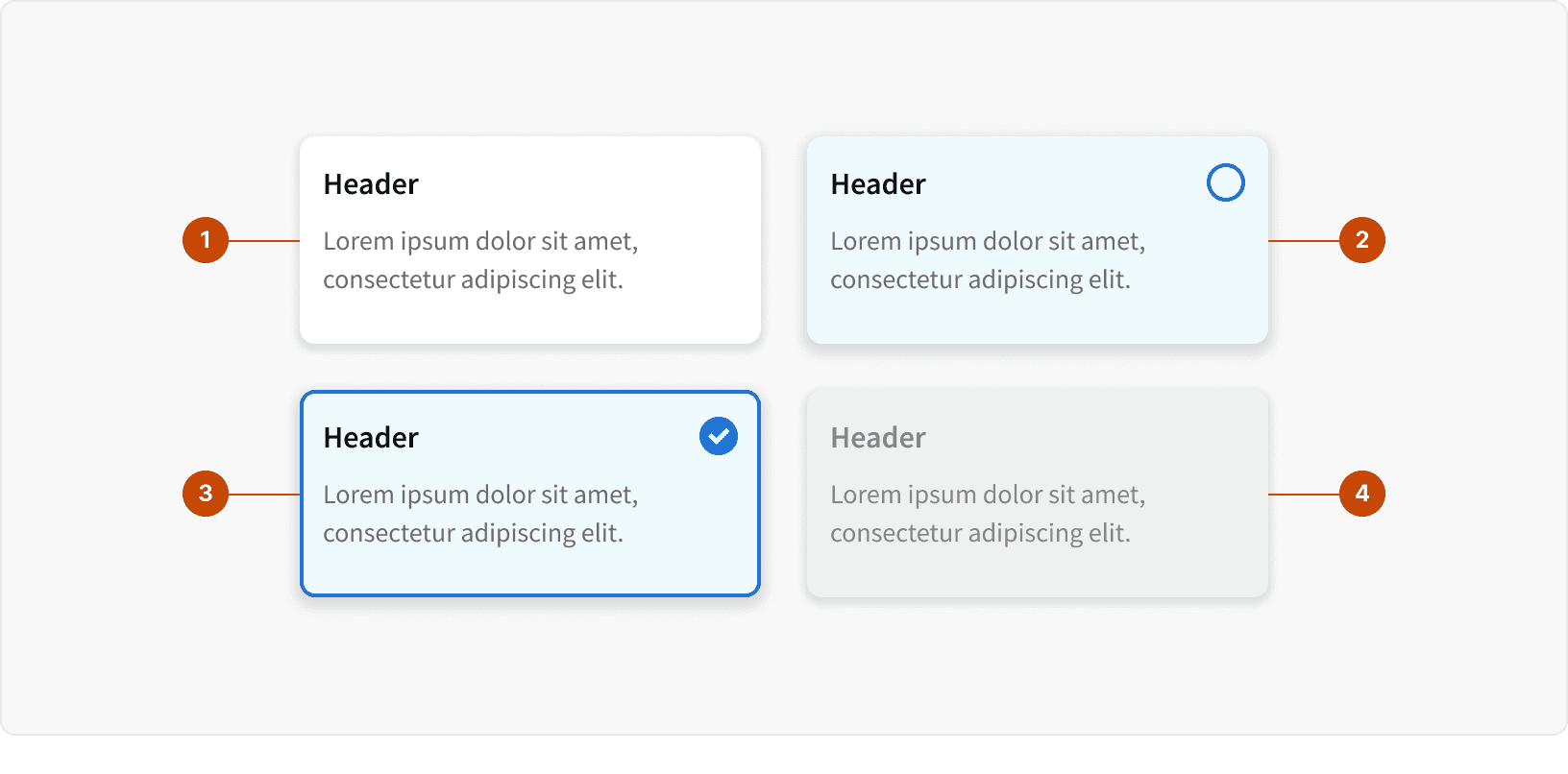
Default
Hover
Selected (Select variant)
Disabled
Behaviors

The content container of the interactive card can support any type of UI such as links or buttons.
Best Practices
1. When to use
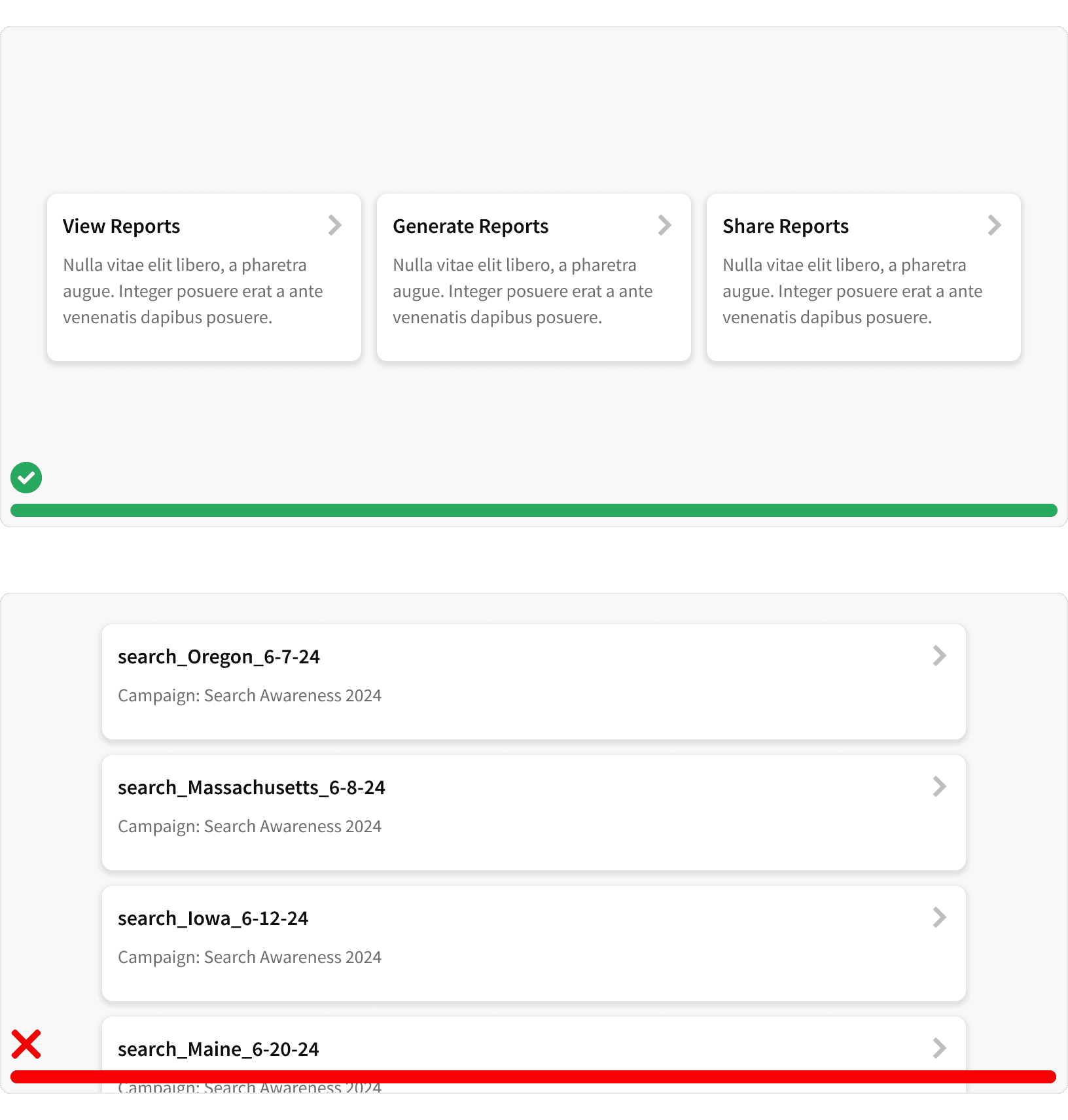
Use interactive cards to display a short list of distinct pieces of information or choices such as report types or app features. When presenting a long list of similar information such as campaigns or line items, consider using a data table. Tables are easier to scan because the positioning and structure is more predictable to the eye. ¹ ²
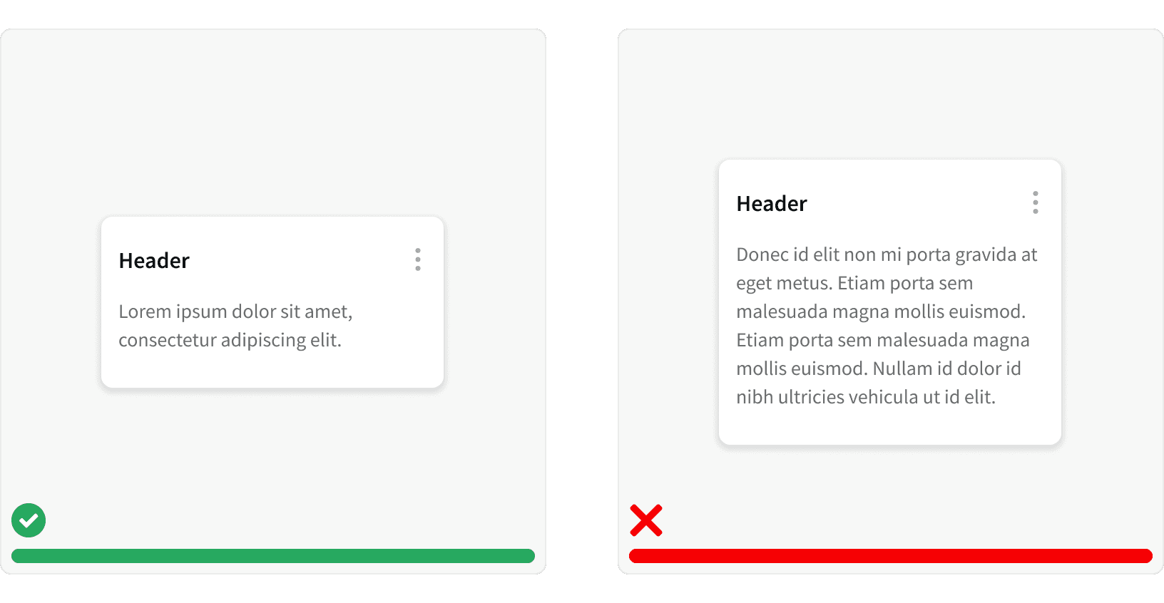
2. Concise content
The content on Interactive Cards should be clear and concise so as not to overwhelm users with information. Interactive Cards are meant to allow for quick decisions and as entry points to more information. ²
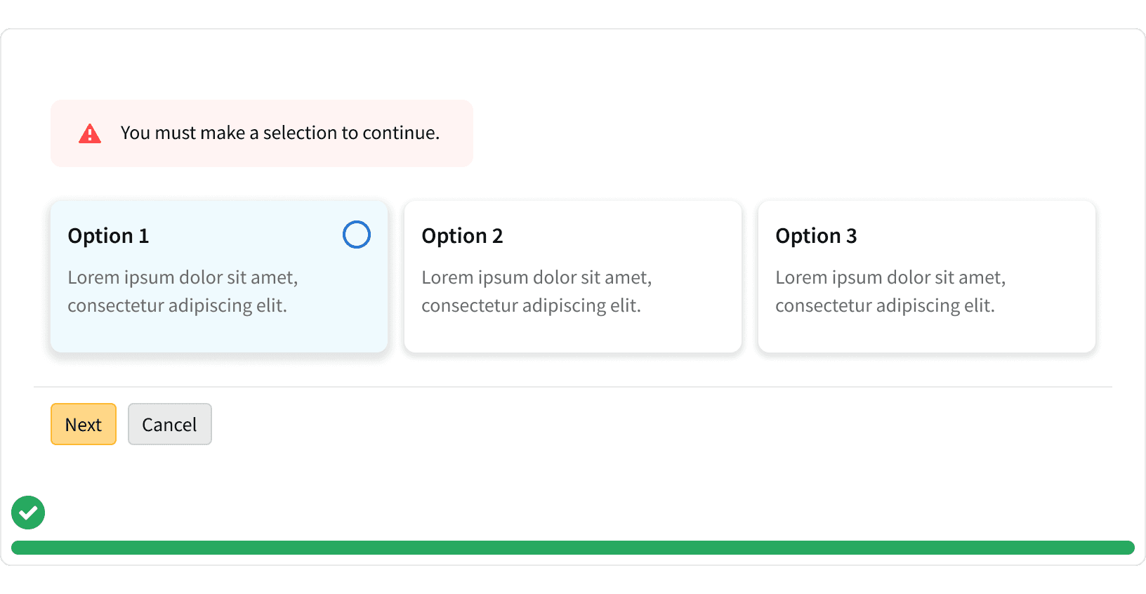
3. Error messaging
When using Interactive Cards to display a required selection, a message card should be used to indicate a missed selection.
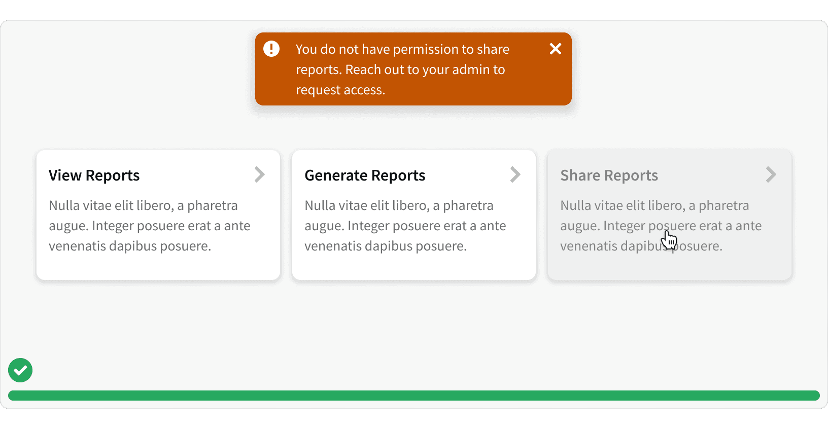
4. Permissions
When using interactive cards to display features and a user does not have permission to access a feature, use the disabled state so that the user can still see the feature. If the user clicks the card, display a Flash Message to provide a suggestion of how to gain access.
More
Related Pages


Accessibility
Color contrast ratio for our Interactive Card component meets AA standards, based on Web Content Accessibility Guidelines (WCAG) guidelines.
Additional Reading
Cards: UI-Component Definition https://www.nngroup.com/articles/cards-component/
Best Practices for Designing UI Cards https://app.uxcel.com/courses/ui-components-n-patterns/cards-best-practices-038
The Playful Power of Card Design UI https://www.uxpin.com/studio/blog/card-design-ui/