Anatomy
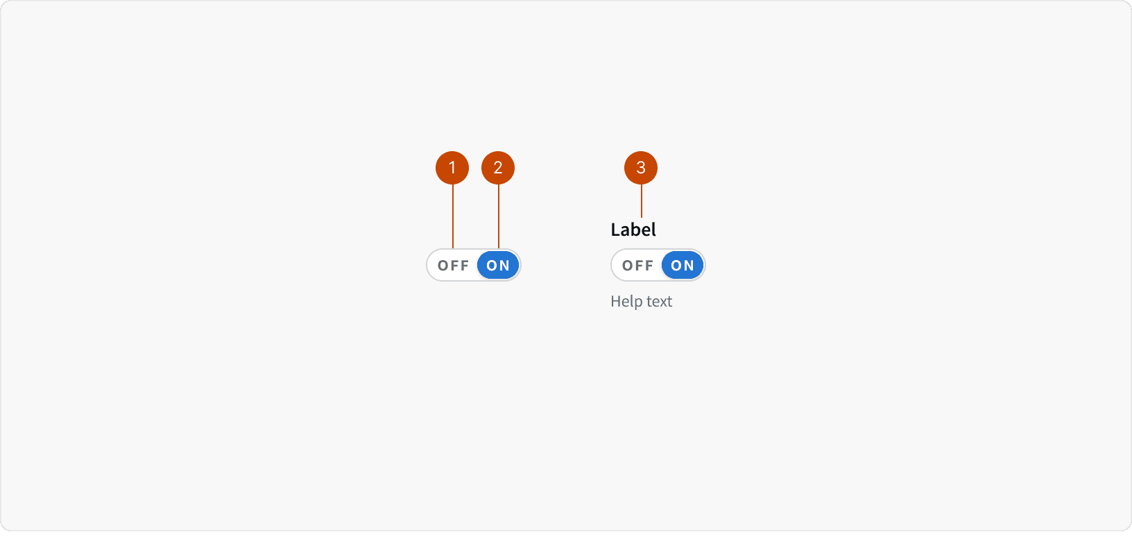
Default button
Selected button
Inside a form field with help text
States
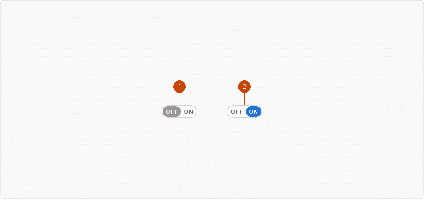
On
Off
Best Practices
1. When to use
The toggle switch should be used to change system or item settings.² They should not be used for changing surface-level settings on a single page, such as view settings.
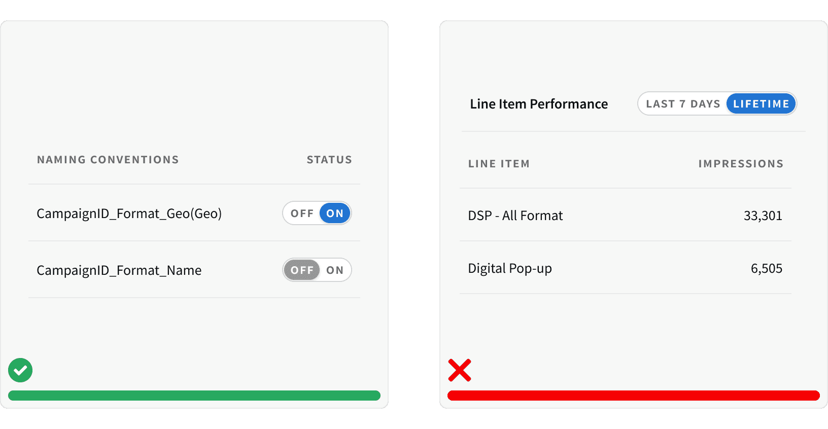
2. Mutually exclusive options
The toggle switch should be used to allow the user to switch between two mutually exclusive options, typically "on" and "off".³
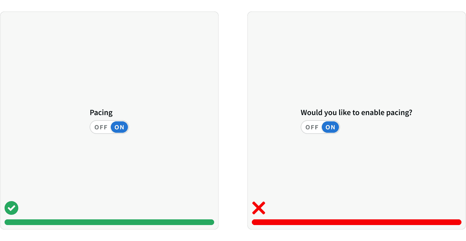
3. Clear Label
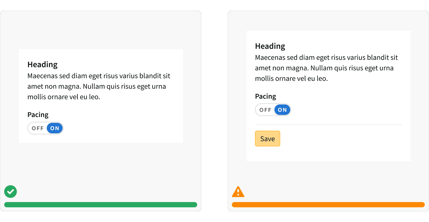
When using the toggle switch within a form field, the label should be clear and concise. ¹ The label should describe what the control will do when the toggle switch is ON. ²
4. Immediate effect
When possible, the effects of a toggle switch should take immediate effect.¹ This most closely matches user expectations because it matches the behavior of real-world switches. If this is not possible, ensure a "Save" button is displayed prominently in the UI and work with your team to explore updating to immediate effect.
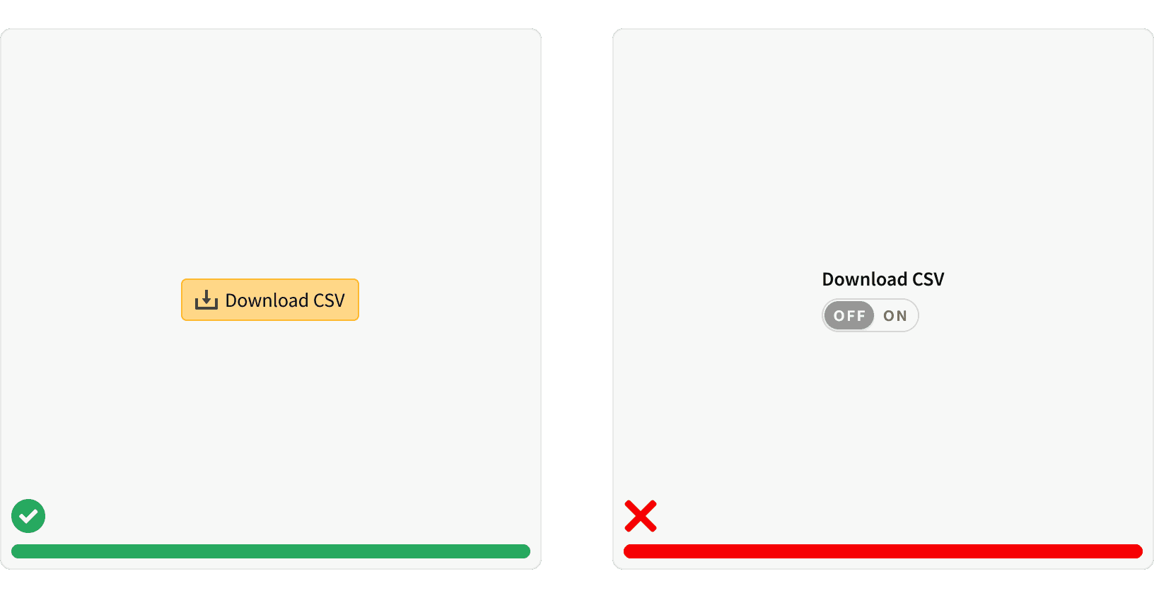
5. Don't use for actions
Toggle switches should not be used to trigger one-time actions. Buttons should be used instead.⁴
More
Related Pages
Accessibility
The toggle switch colors follow contrast ratio AA standards, based on Web Content Accessibility Guidelines (WCAG) guidelines.
Benefits: People with low vision often have difficulty reading text that does not contrast with its background. This can be exacerbated if the person has a color vision deficiency that lowers the contrast even further. Providing a minimum luminance contrast ratio between the text and its background can make the text more readable even if the person does not see the full range of colors. It also works for the rare individuals who see no color.¹
Additional Reading
Toggle-Switch Guidelines https://www.nngroup.com/articles/toggle-switch-guidelines/
Toggle Switch: 5 Simple Design Tips For Better Design https://uxplanet.org/toggle-switch-5-simple-design-tips-for-better-design-b4046eff4a2f
The good, the bad and the toggle https://uxdesign.cc/the-good-the-bad-and-the-toggle-2abc0fbbd099
Stop Misusing Toggle Switches https://uxmovement.com/mobile/stop-misusing-toggle-switches/