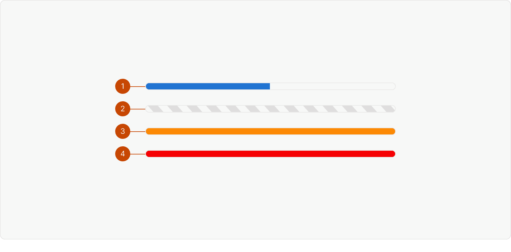
States

Default: Action is in progress
Indeterminate: The system is currently unable to display action progress
Warning: Total progress is complete but certain actions were not able to be completed
Error: An error has occurred and no actions were completed
Best Practices
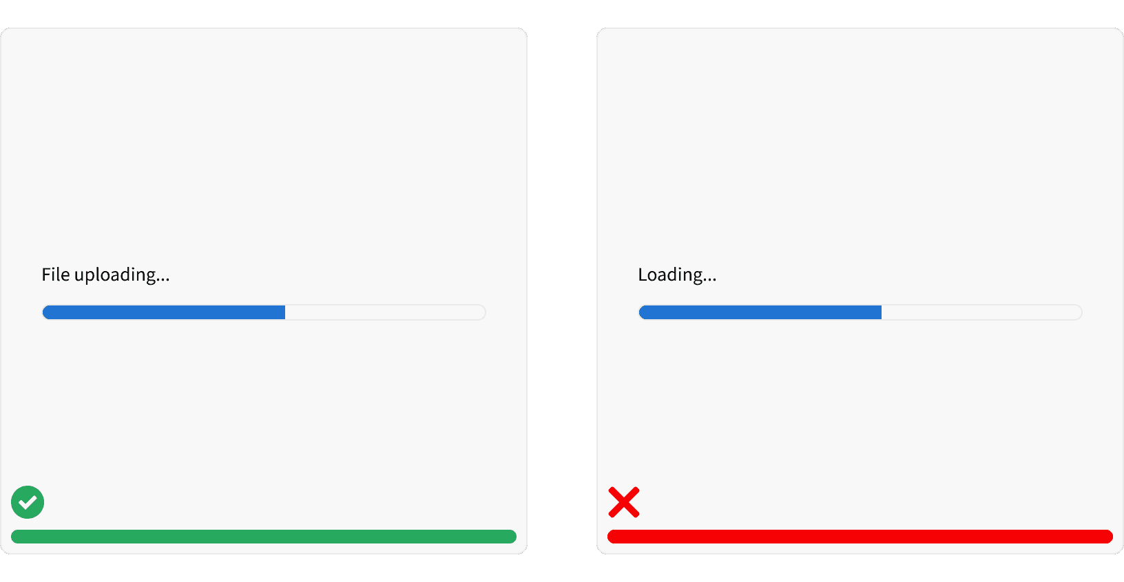
1. User Initiated
The progress bar is used for user-initiated actions that take longer than 1 second.¹ ² The progress bar should not be used for content loading. See Loader.

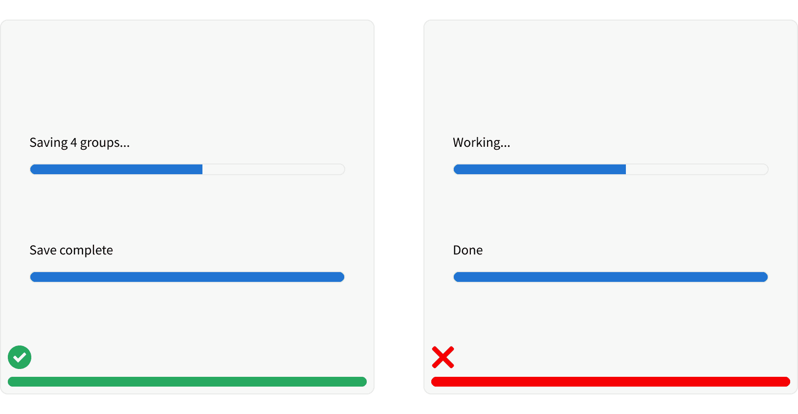
2. Label
The progress bar should include a label that describes the action being performed.

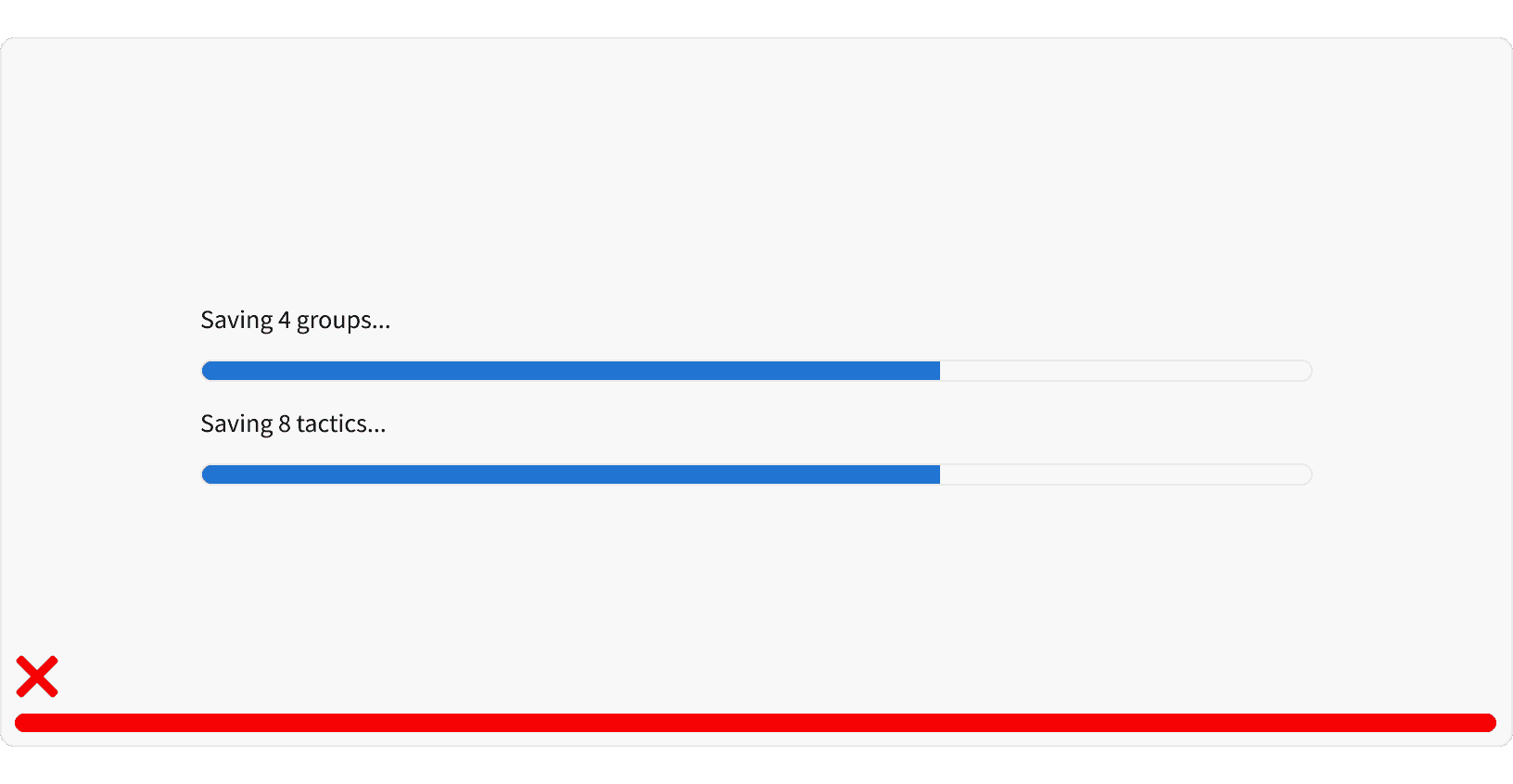
3. Multiple Actions
The progress bar should not be used to communicate the working status of multiple actions at once.

More
Related Pages
Accessibility
Color contrast ratio for our Progress Bar components meets AA standards, based on Web Content Accessibility Guidelines (WCAG) guidelines.
Benefits: People with low vision often have difficulty reading text that does not contrast with its background. This can be exacerbated if the person has a color vision deficiency that lowers the contrast even further. Providing a minimum luminance contrast ratio between the text and its background can make the text more readable even if the person does not see the full range of colors. It also works for the rare individuals who see no color.¹
Additional Reading
World Leaders in Research-Based User Experience. “Progress Indicators Make a Slow System Less Insufferable.” Nielson Norman Group, https://www.nngroup.com/articles/progress-indicators/.
Best Practices For Animated Progress Indicators https://www.smashingmagazine.com/2016/12/best-practices-for-animated-progress-indicators/
Improving the UX of Progress Indicators and Feedback Notifications https://usersnap.com/blog/progress-indicators/
