Anatomy
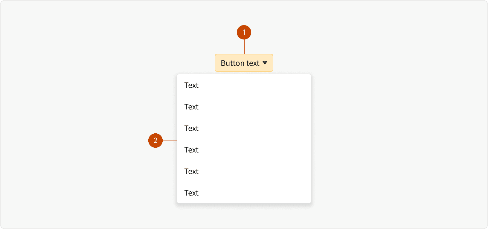
Button
Picklist
Variants
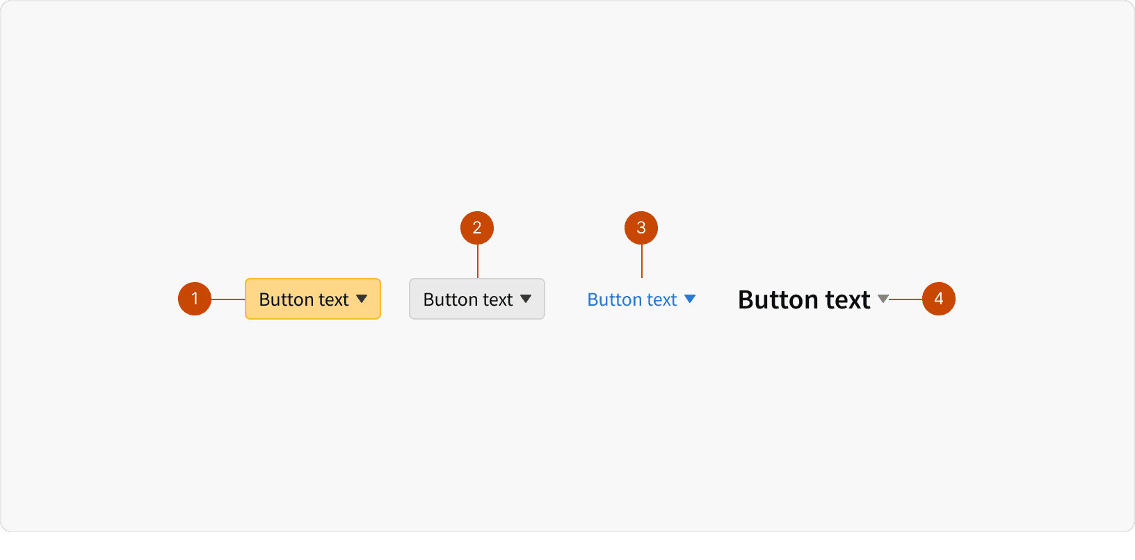
Primary
Secondary
Transparent
Heading
States
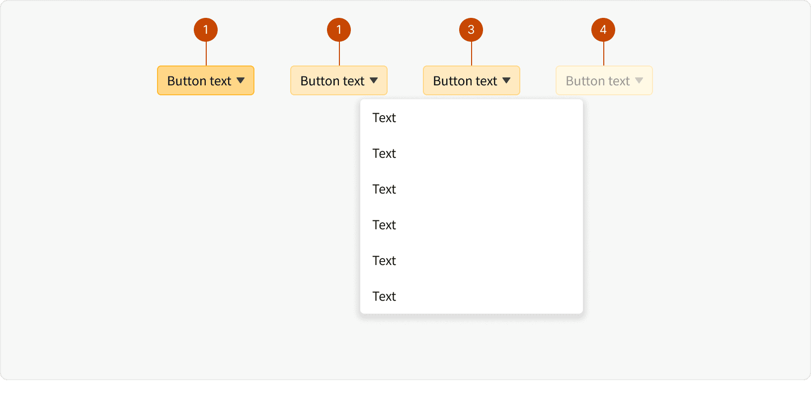
Default
Hover
Pressed
Disabled
Best Practices
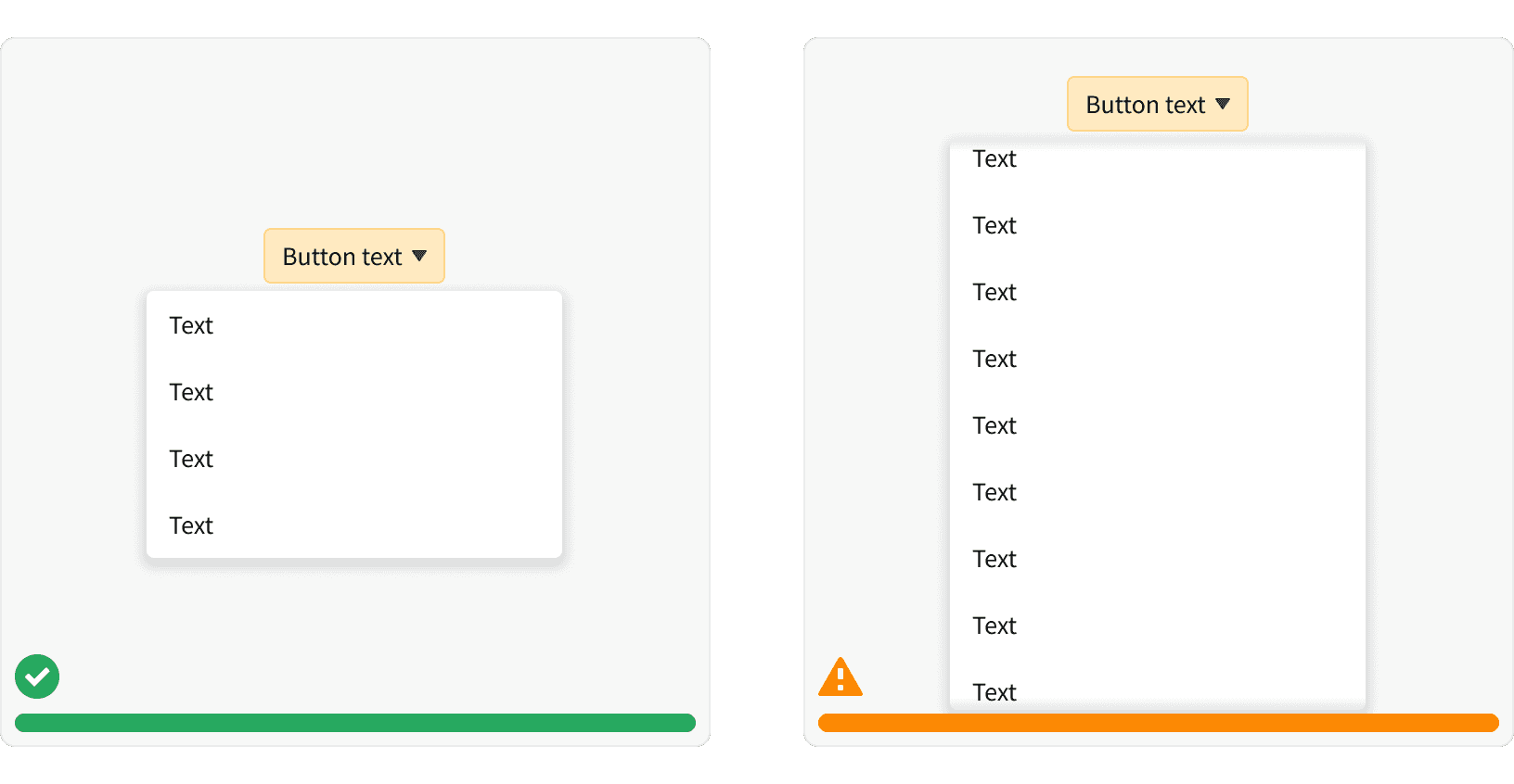
1. Long Dropdowns
Avoid dropdowns when there are more than 10 or fewer than 5 options. Long of dropdowns will require scrolling and will not allow users to see all choices. See Fitt’s Law. Too few options in a dropdown could be better suited for a different treatment to get to context more quickly (button, button group, toggle).
2. Visibility
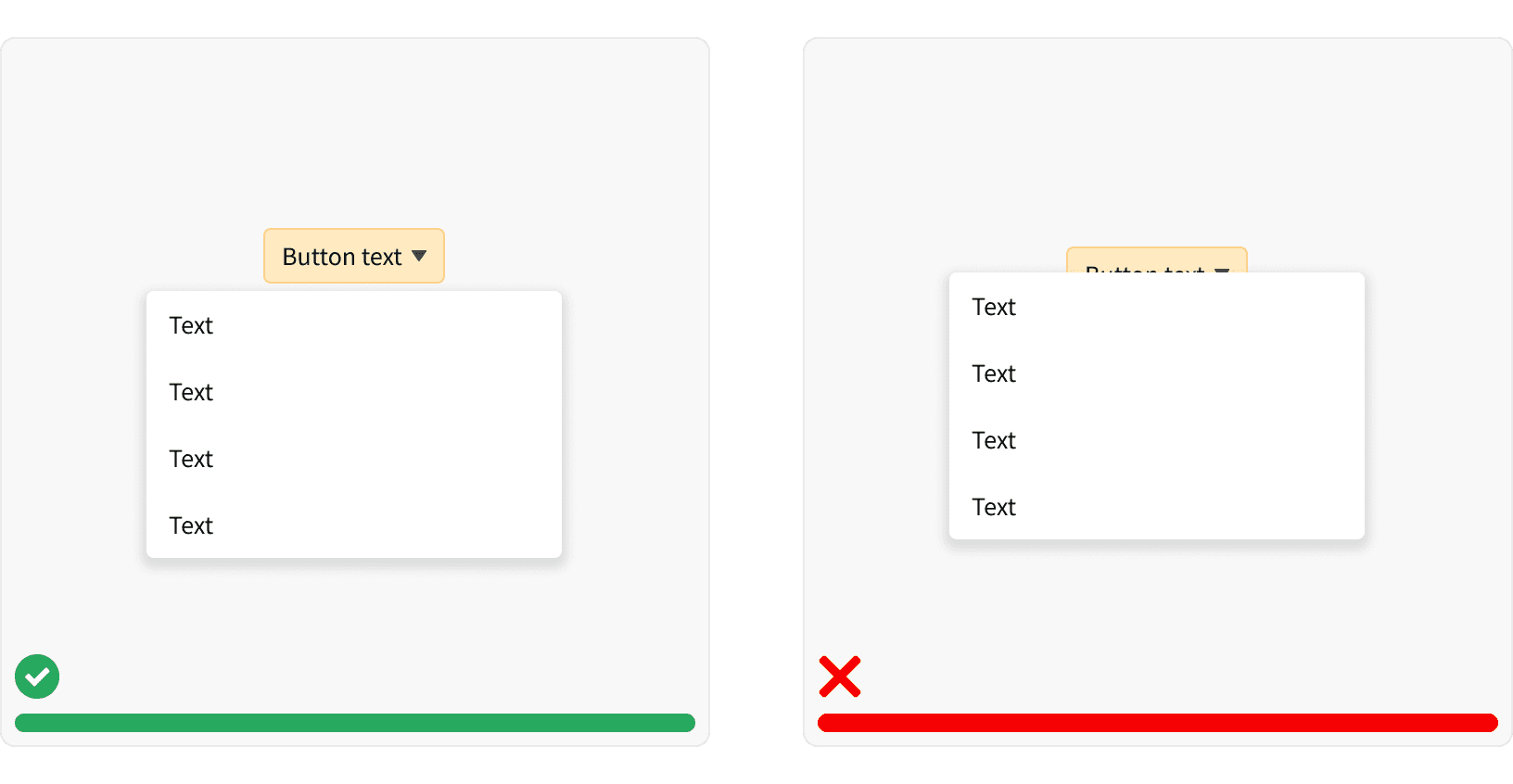
Give the user context to the button when making a selection in the dropdown. Titles provide context and direction when they are choosing from a list. Whenever the labels are hidden or removed when the menu is open, users may not recall the origin of the selection.¹
3. Choice Visibility
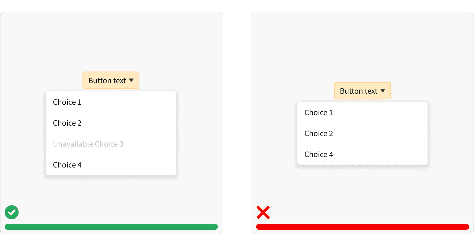
Keep dropdown button choices in view even if disabled.¹ If disabled items are removed, the interface loses consistency and hinders the learning curve for the user.
4. Labels
Write concise labels that clearly indicate the purpose of the selection.Use verbs and verb phrases to describe the action that occurs when the selection is chosen
More
Related Pages

Accessibility
Color contrast ratio for our Dropdown Buttons meets AA standards, based on Web Content Accessibility Guidelines (WCAG) guidelines.
Benefits: People with low vision often have difficulty reading text that does not contrast with its background. This can be exacerbated if the person has a color vision deficiency that lowers the contrast even further. Providing a minimum luminance contrast ratio between the text and its background can make the text more readable even if the person does not see the full range of colors. It also works for the rare individuals who see no color.
Support keyboard input to navigate within a dropdown. Dropdowns should support mouse and keyboard input.¹
In a dropdown, users should be able to type a letter and navigate to selections starting with that letter.