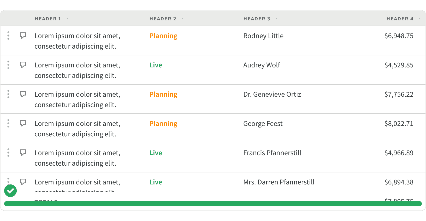
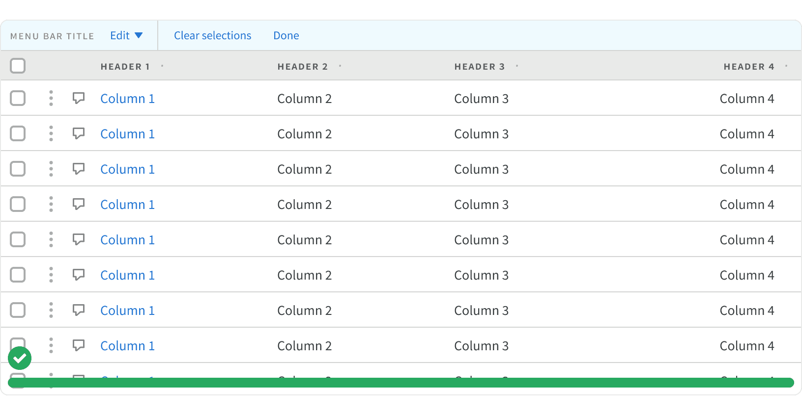
Anatomy
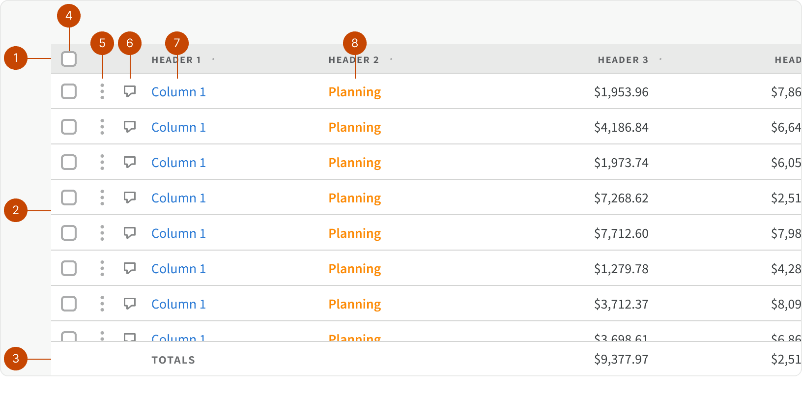
Header Row
Data Rows
Footer Row
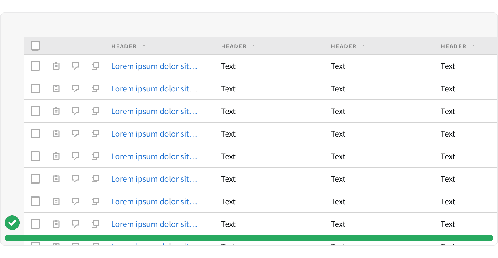
Row Selection
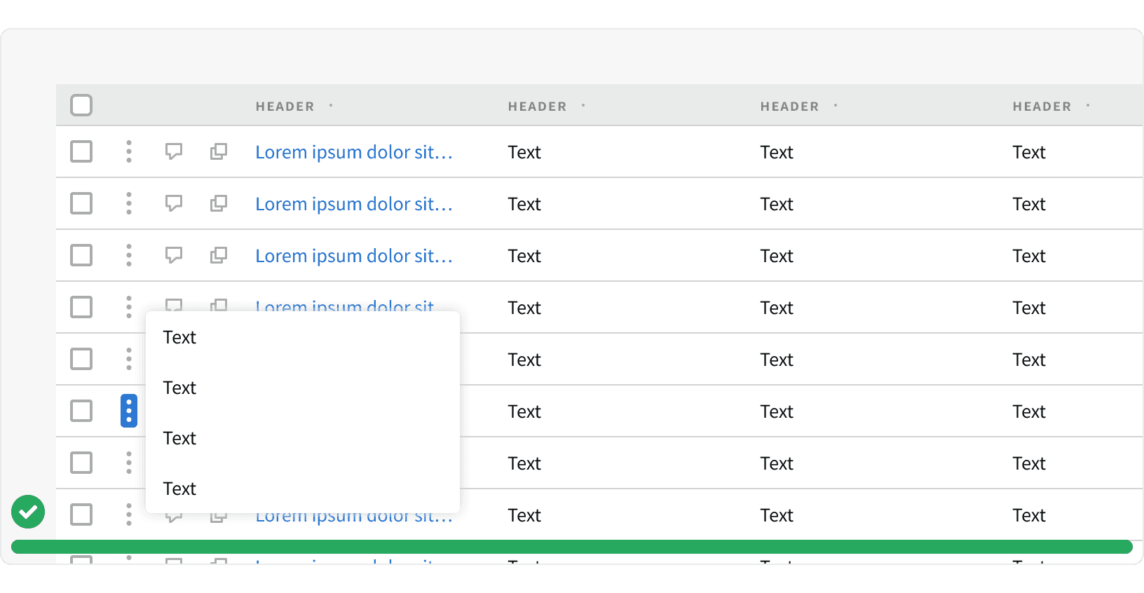
Contextual Menu
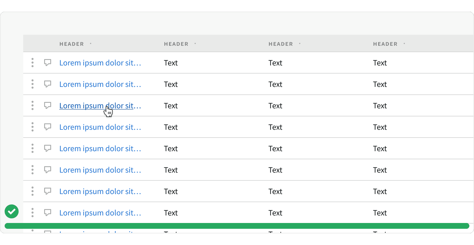
Comment Button
Data Cell
Status Cell
States
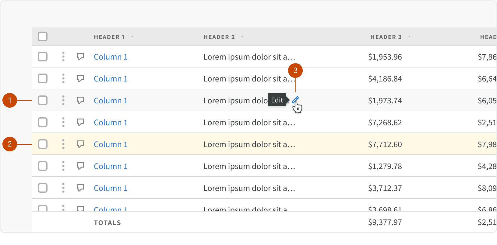
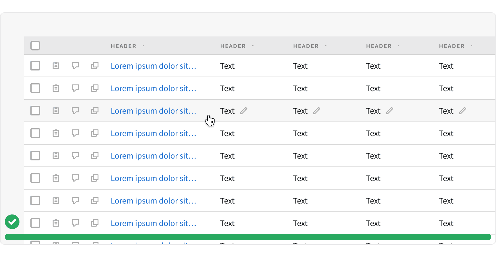
Row Hover
Row Selected
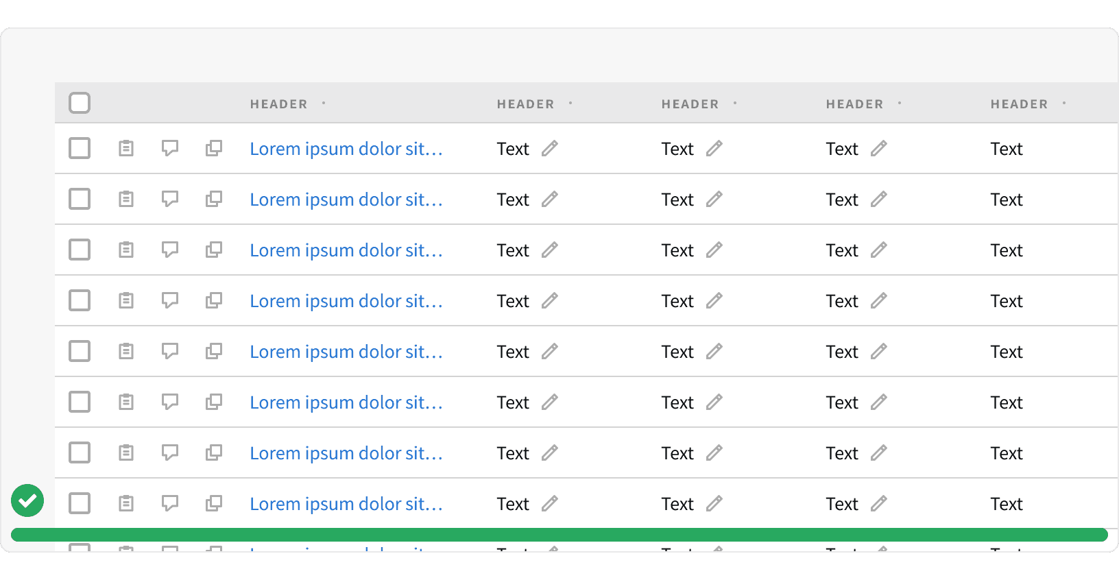
In-line Edit Hover
Behaviors
In-line Edit Popover
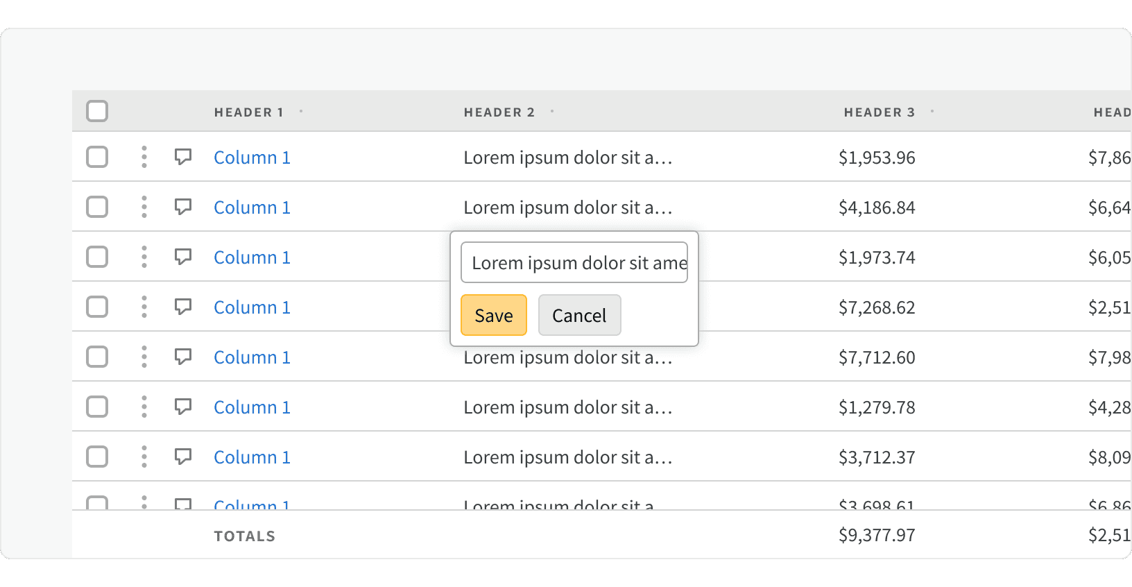
When the in-line edit button is clicked, a popover will be shown containing the editable field.
Best Practices
1. Row Actions
For actions that apply to the whole row, or don’t apply to a specific cell, place the actions on the left side of the row to the right of a checkbox if one is being used.
2. Contextual Menu
If there are more than 3 row actions (not including a checkbox), consider placing them in a contextual menu to avoid visually overloading the table. When using a contextual menu, 2 additional actions can be placed in the row to the right of the menu.
3. Cell Actions
For actions that apply to specific cells, place the actions to the right of the cell’s content.
If there are more than 3 cell actions per row, whether in one cell or across multiple cells, the actions should appear on hover of the row rather than being always visible to avoid visually overloading the table. These actions should appear while hovering anywhere on the row and not just while hovering on a specific cell, as this can make them hard to discover.
4. Links
Links should be used to bring users to a new screen or view by clicking on a value within the table.
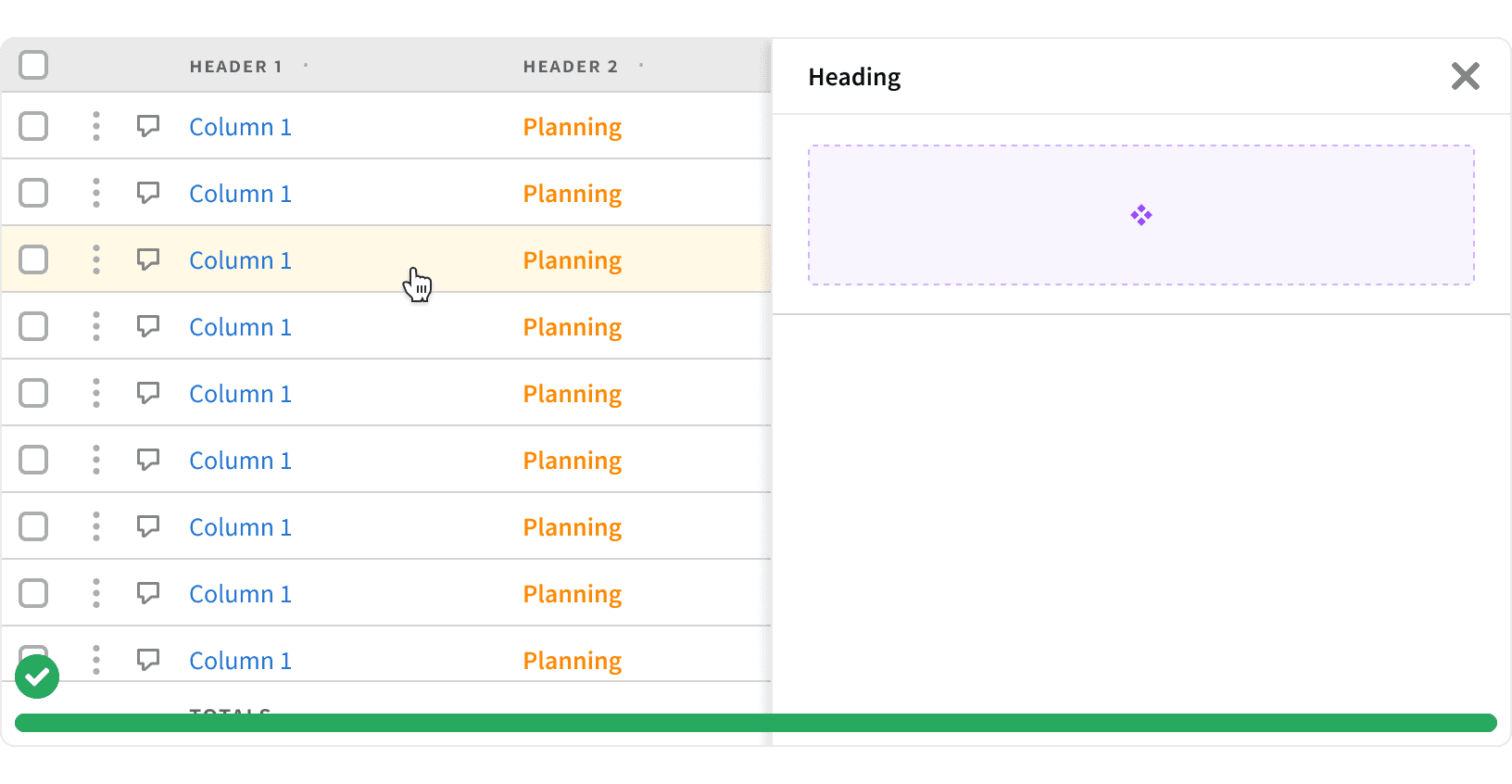
5. Selected Row
A row should be selected to display additional information through a panel or secondary table. When selected, a row will become highlighted and cause the panel or secondary table to appear.
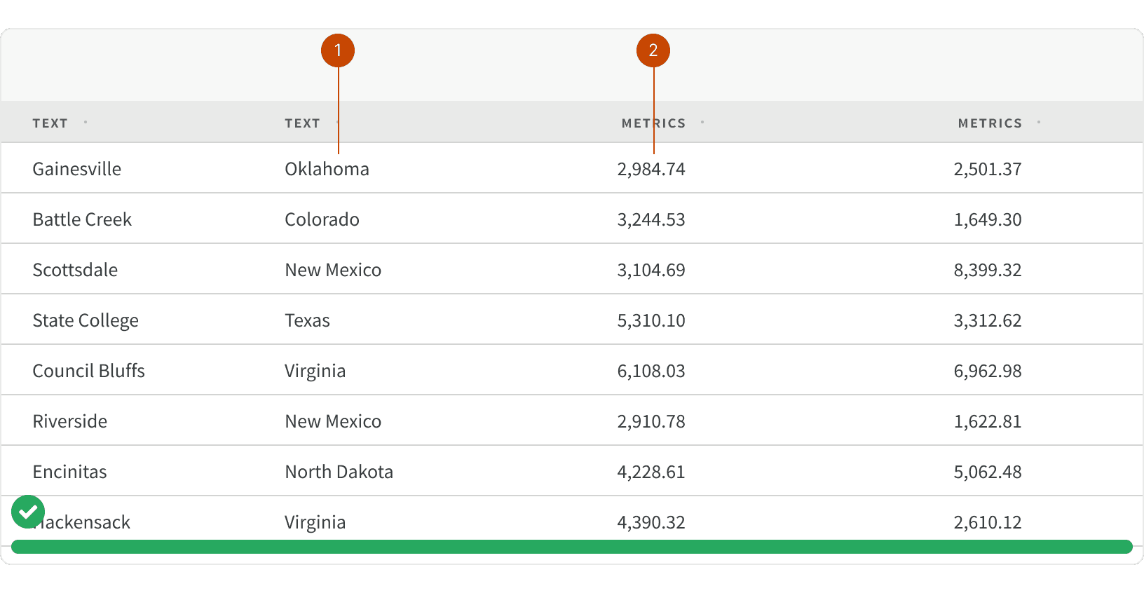
6. Text Alignment
Always align metrics to the right for improved scan-ability while text should always be aligned to the left.
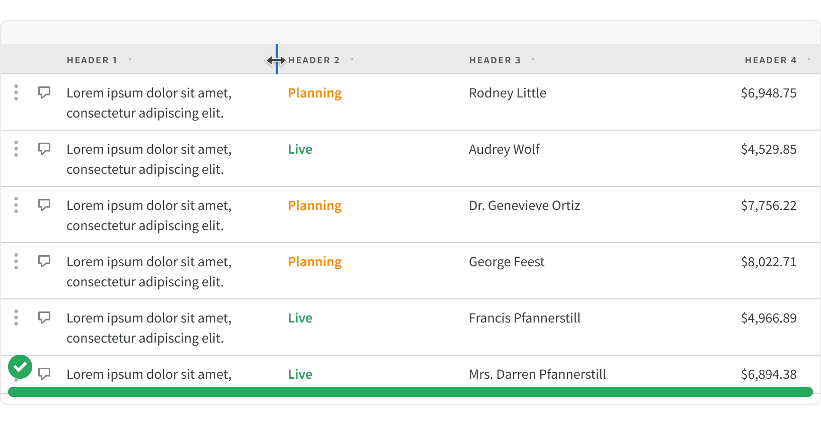
7. Column Resizing
If the data table contains long strings of text, allowing the user to manually expand the width of columns to adjust the text wrapping or truncation.
8. Bulk Edit
Row selection should be used to allow users to be able to batch process tasks. See Bulk Editing for additional guidance.
9. Text Wrapping
If text contains critical information, allowing text to wrap to multiple lines.