Anatomy
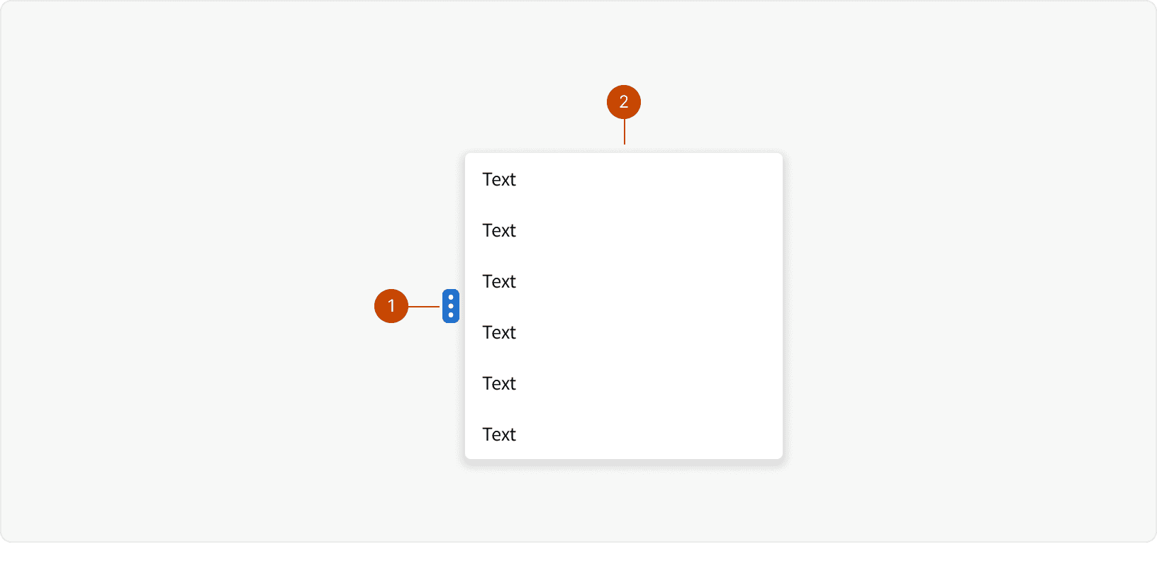
Contextual Menu
Picklist
States
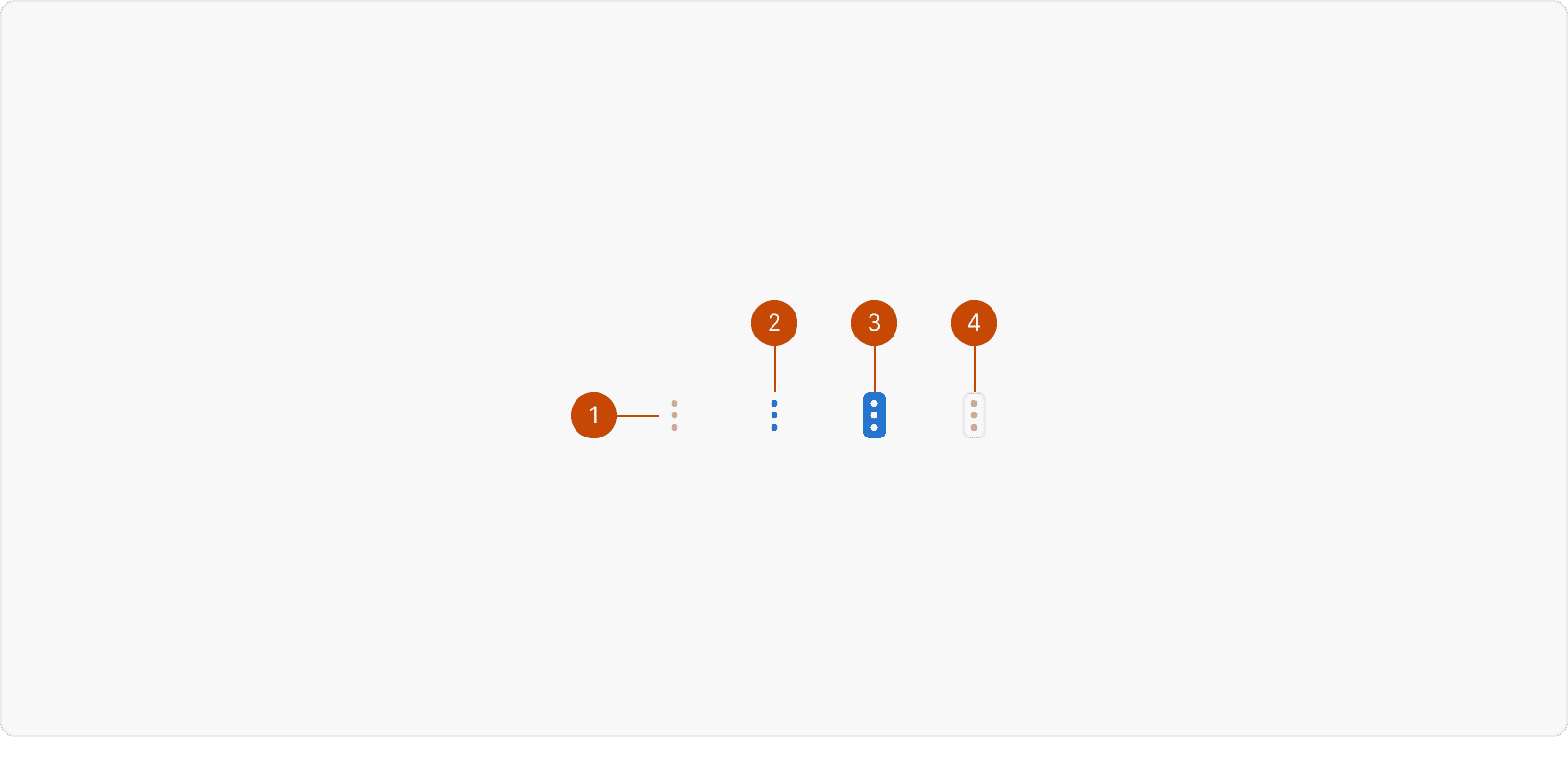
Default
Hover
Active
Disabled
Best Practices
1. Placement
Contextual menus should appear on the left side of the content they relate to. Consistent placement makes them easier to discover.¹
2. Visibility
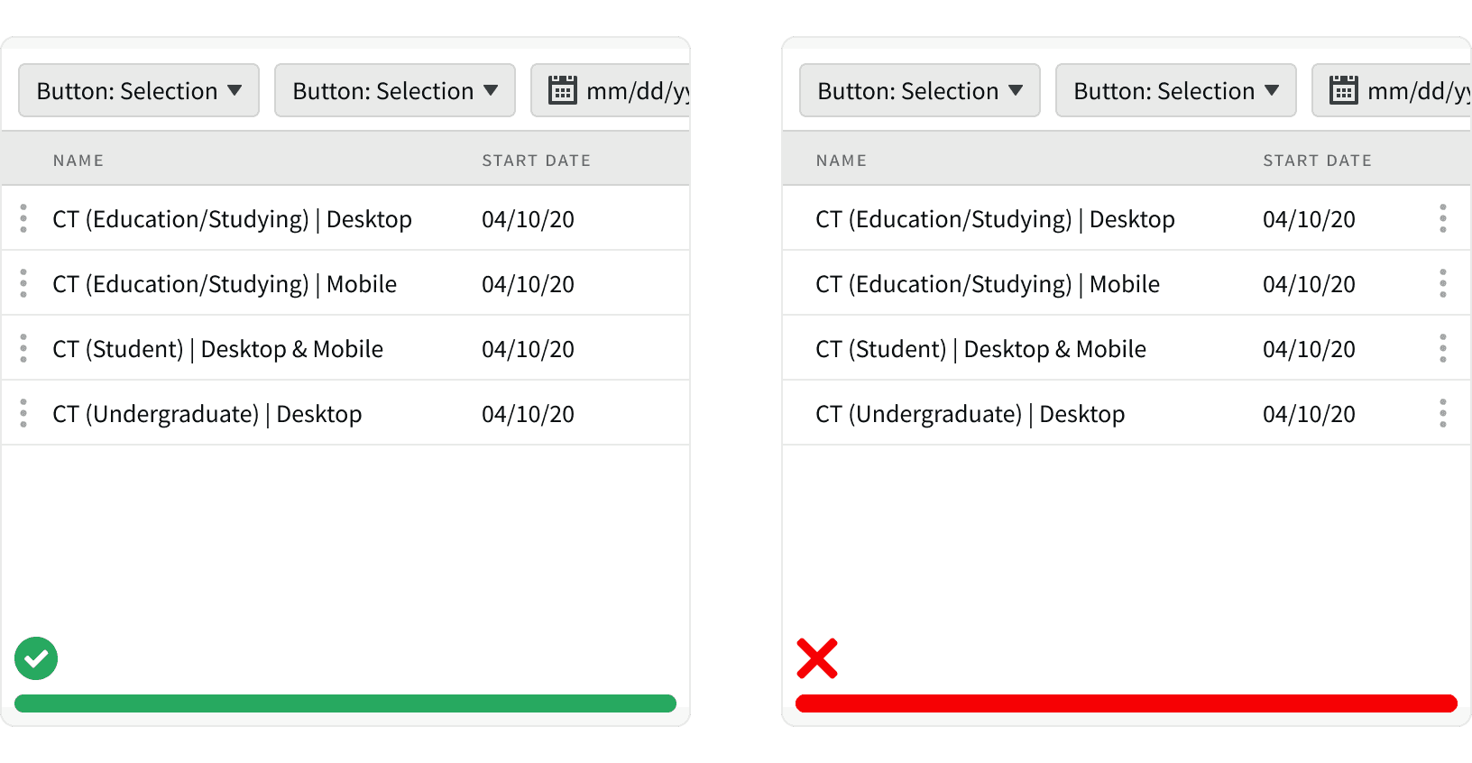
Contextual menus must be visible without the need to hover on content.
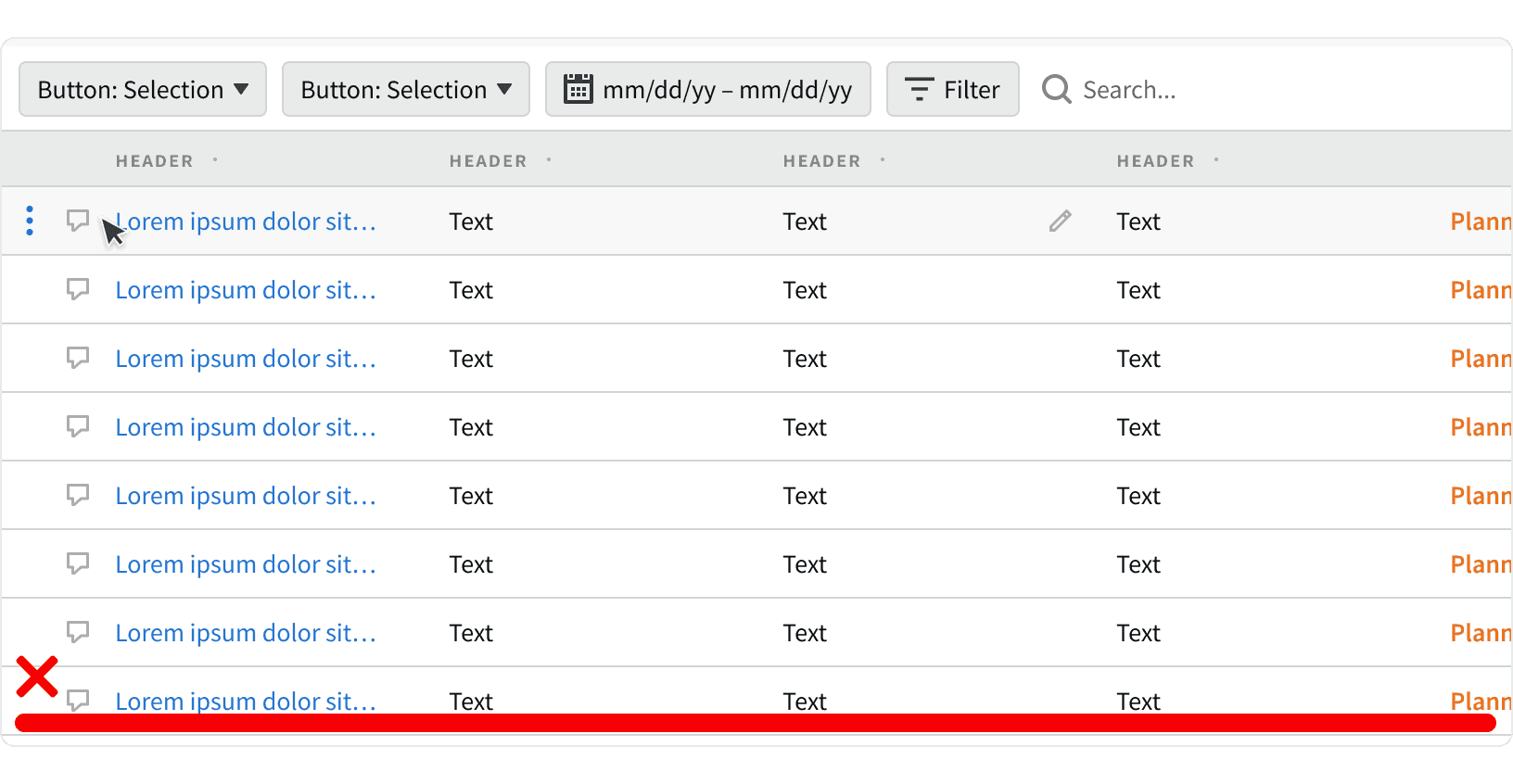
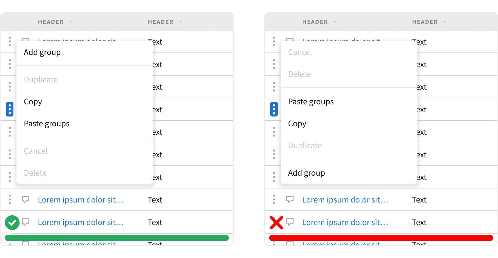
3. Limit Options
Limit the number of options in contextual menus to around 10. Don’t overwhelm users with a large number of choices. All options should be visible without having to scroll.²
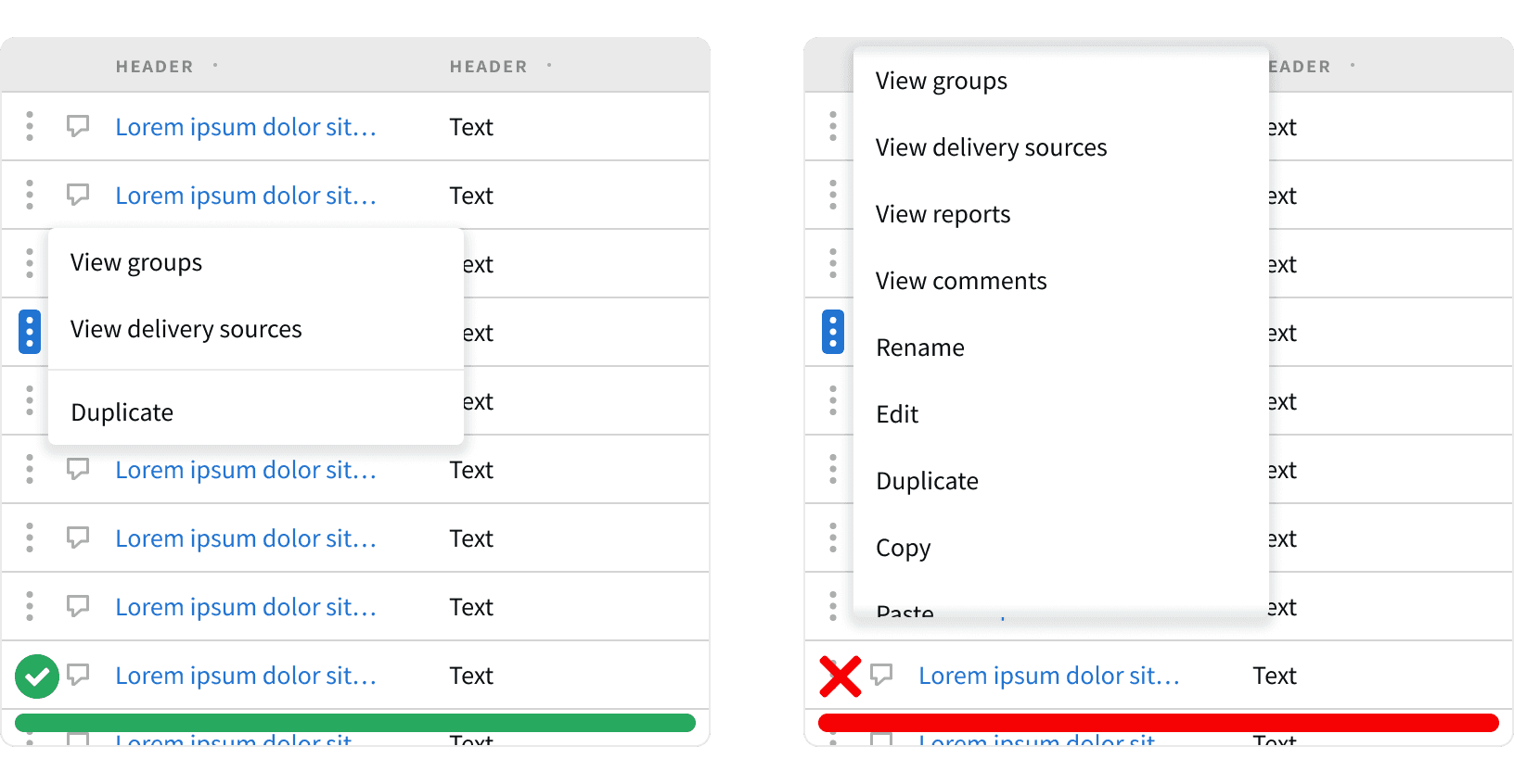
4. Option Order
Options within contextual menus should be ordered by frequency-of-use. To help users find the most relevant options, place the ones used most often at the top.²
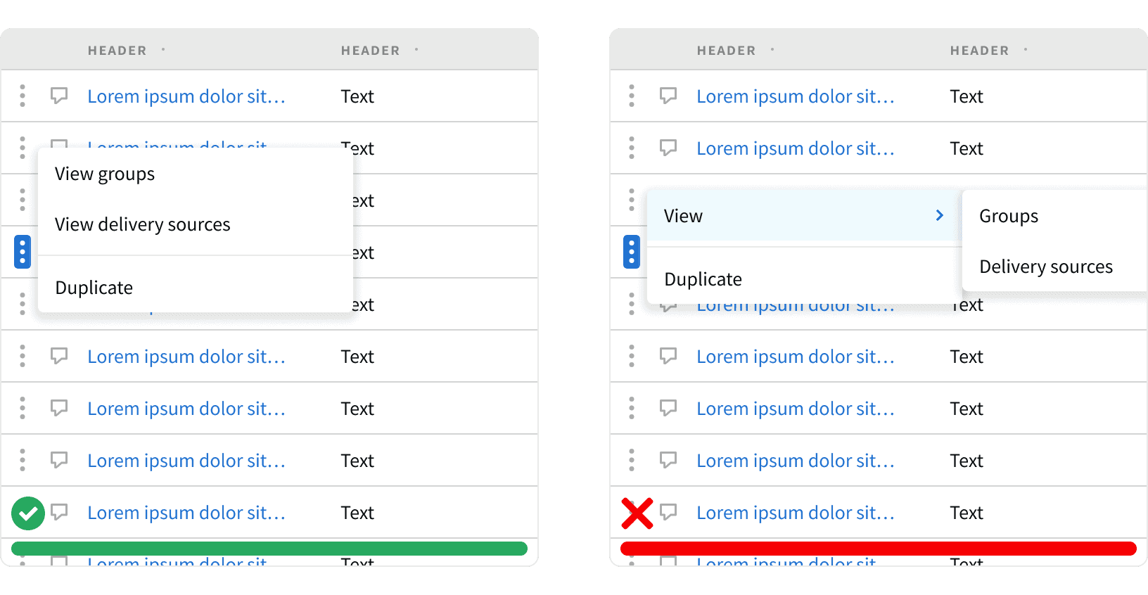
5. Nested Menus
Avoid using nested menus within contextual menus. Nested menus triggered from contextual menus can be clumsy to operate. Consider grouping several options between dividers as an alternative. If a submenu is needed, none of its options should contain another submenu.²
More
Related Pages

Accessibility
Color contrast ratio for our Contextual Menu components meets AAA standards, based on Web Content Accessibility Guidelines (WCAG) guidelines.
Benefits: People with low vision often have difficulty reading text that does not contrast with its background. This can be exacerbated if the person has a color vision deficiency that lowers the contrast even further. Providing a minimum luminance contrast ratio between the text and its background can make the text more readable even if the person does not see the full range of colors. It also works for the rare individuals who see no color.
Additional Reading
World Leaders in Research-Based User Experience. “Menu Design: 15 UX Guidelines to Help Users.” Nielson Norman Group, https://www.nngroup.com/articles/menu-design/.
World Leaders in Research-Based User Experience. “Contextual Menus: Delivering Relevant Tools for Tasks.” Nielson Norman Group, https://www.nngroup.com/articles/contextual-menus/.
World Leaders in Research-Based User Experience. “Hamburger Menus and Hidden Navigation Hurt UX Metrics.” Nielson Norman Group, https://www.nngroup.com/articles/hamburger-menus/.